Kahbahbloom!
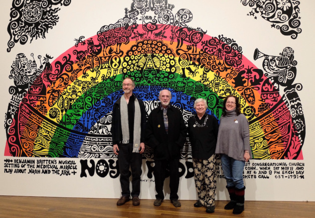
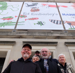
For the first time in its 120 year history the Worcester Art Museum just outside Boston is hosting an exhibition of a children’s book illustrator, and that illustrator is Michael’s dad, Ed Emberley. We went to see it in January with Ed and Barbara and some good friends.
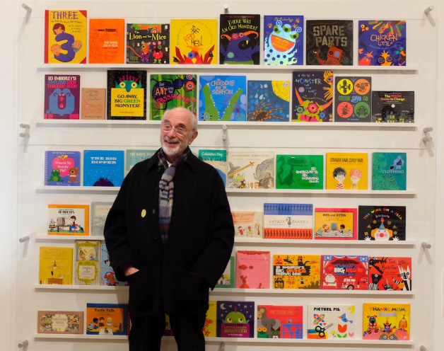
Ed has written and/or illustrated more than a hundred books over his long career, working in various mediums and many styles, always experimenting and exploring. The exhibition in Worcester displays a wide variety of his art, rough sketches and finished pieces for some of his most iconic books, including Drummer Hoff (Caldecott Medal 1968), the best-selling and innovative Drawing Book series and many more.
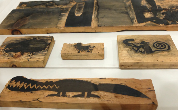
The art for One Wide River to Cross (Caldecott Honor 1967) was created using woodcuts, some of which you can see pictured below:
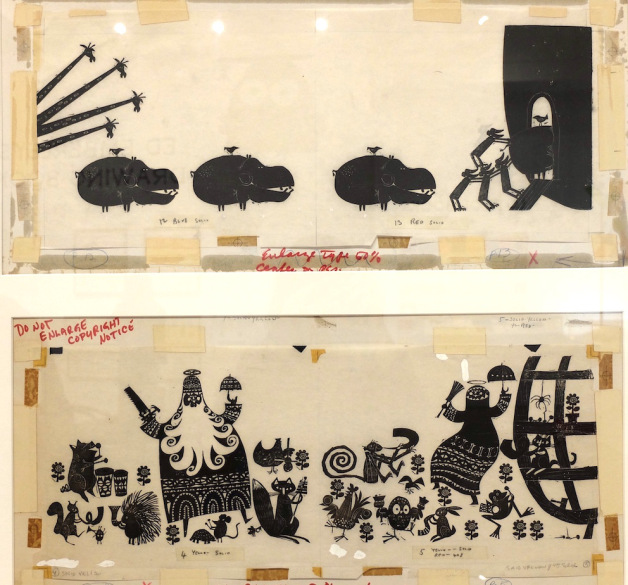
 Woodcuts are always carved in reverse so you can see the animals are marching in the opposite direction on the prints (below). This is final art marked up with instructions for the print run.
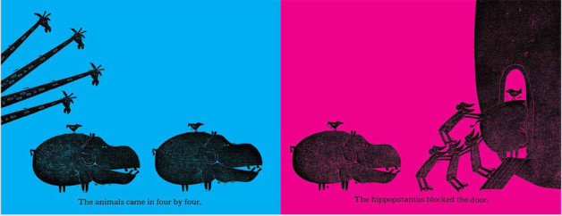
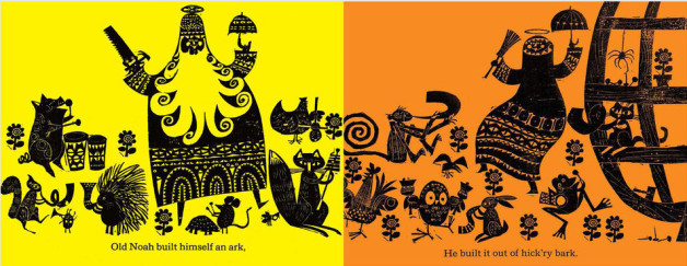
In the printed book there are colourful backgrounds, like so:
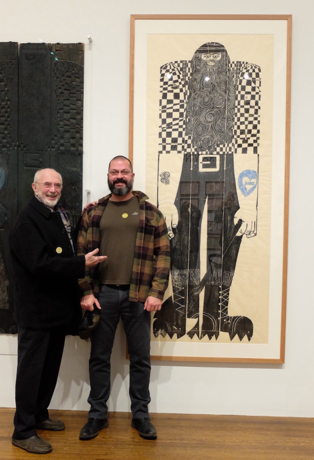
The art for The Story of Paul Bunyan (1963) was also created using woodcuts. Below is a print pulled from the ginormous woodblock Ed made as a promotion for the book – that’s the woodblock you can see to the left of the image. We all laughed when Rick stood in front of it, having unintentionally dressed the part!
Part of the joy of walking around the exhibition with Ed was being able to ask questions about the techniques he used. Here is a small selection of pieces from the exhibition – click on an image if you’d like to read how it was made. (You will need to roll down a bit below the image for the info, if you’re using a phone.)
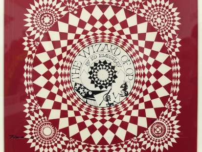 This is original art for the cover of The Wizard of Op (1975). Ed created these eye-watering pieces of Op art using Rubylith film. Rubylith was red film attached to a clear backing film. You cut shapes on to it using a scalpel and peeled away the pieces you didn’t want. It was usually used for colour overlays but Ed used it here in order to achieve razor-sharp lines, rather than draw the piece with a radiograph pen which wasn’t giving him exactly the control he wanted. He has drawn the central section with a pen. The image was printed in black.
 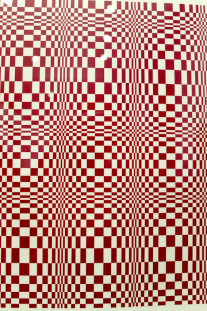 Again, original art for The Wizard of Op (1975). Ed created these eye-watering pieces of Op art using Rubylith film. Rubylith was red film attached to a clear backing film. You cut out shapes on it using a scalpel and peeled away the pieces you didn’t want. It was usually used for colour overlays but Ed used it in order to achieve razor-sharp lines, rather than draw the piece with a radiograph pen which wasn’t giving him exactly the control he wanted. In the book the image was printed black.
 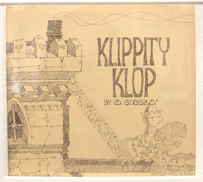 Klippity Klop (1974). The art is pencil line with plenty of cross-hatching.
 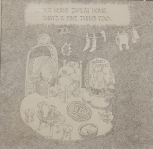 Klippity Klop (1974) Pencil.
 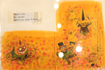 Night’s Nice (1962) The art is watercolour on paper. Ed says he has only created two books as hand-painted full-colour art – Night’s Nice and Rhinoceros Preposterous. You can see the text has been taped on – before computers, text was set by a print-setter and printed out in ‘galleys’. The illustrator ‘cut and pasted’ it into place on an overlay. Here, this piece of text is jus a ‘sample’placement.
 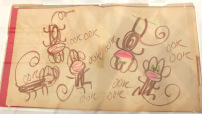 Rough sketches for Rosebud (1966) The final art was created using 4 colour pre-separated art.
 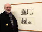 Ed with art for Simon’s Song. Again he’s used woodcuts but this time he didn’t carve into a block of wood (see the One Wide River blocks). ‘The prints for Simon’s Song were prepared using cut balsa wood sheets of the kind commonly used to build model airplanes.’ Ed cut the detailed shapes out of the balsa wood and then glued/mounted them onto illustration board, inked the assembled woodblock and created a print.
 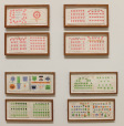 Dummy art for The Great Thumbprint Drawing Book (1977) and Ed Emberley’s Drawing Book of Faces (1975)
 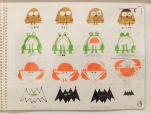 Dummy art for The Drawing Book of Animals (1970). A ‘dummy’ is what is presented to an editor to show what the book will look like. The actual art for this book was created using 4-colour pre-seperation process.
We also heard some family memories. Barbara, Rebecca and Michael were often drafted in to help finish art and Barbara and Michael tried to recall who did what on which book. Most of Ed’s pre-computer book illustrations were created using the “pre-separation” process – a technique which involved using Ed’s original black line art combined with three additional paper overlays indicating colour placement. Michael explained that for a book like the ABC, he might have created the overlays on say, an alligator, Rebecca a bear, Barbara a cat. Meaning, with a felt-tip pen, Michael would have marked the areas which Ed intended for the alligator as yellow, red and blue, literally ‘colouring them in’ (on overlays) like a highly detailed coloring book. Yes, it’s confusing if you’ve never seen it done! Ed’s studio is in the family home, Barbara worked on many of the books and in more recent years Rebecca and Ed have created books together, so all the books are deeply woven into everyone’s memories.
It was really interesting to see Ed’s work explored in this way. He has created so many great books that it can be overwhelming, but the exhibition doesn’t try to show it all. Curator Caleb Neelon and Worcester Museum director Adam Rozen chose some favourites from across Ed’s work and the result is terrific.
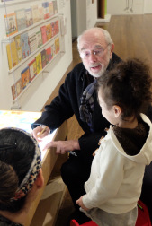
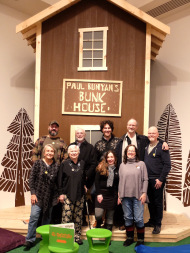 Paul Bunyan’s house – where Paul B kept ‘all the books in the world’.
And it was great fun going to see it with friends – Tom and Rick, Anne, Sika and Susannah. We made a party of it! The show runs at Worcester Art Museum (MA) till April 9th.
http://www.worcesterart.org/exhibitions/ed-emberley/
Share this:- More
