After months of research and debate, my family welcomed a second Honda into our garage late last year. Naturally, Honda wants to know more about my shopping experience so they sent me a survey. Knowing the marketing struggle, I was only too happy to oblige their request. I clicked the link to the survey and then I saw something that made my digital immigrant heart stop.
The survey wasn’t mobile friendly.What in the heck? I couldn’t believe that in 2017 a major car company would email me anything that didn’t work perfectly on my screen. Turns out, they are not alone. Many companies are behind the times when it comes to mobile-first design.
A HISTORY LESSONSit down kiddies, I am going to tell you about the internet before smartphones.
In 2006, the internet was hopping with fancy Flash intros and landing pages about landing pages. It was a load time nightmare.

Then in 2007, Steve Jobs dropped the iPhone and future-minded developers and webmasters alike sat up and took notice. Mobile was going to be huge, they knew, and the design of web pages and experiences would need to be changed to accommodate this brave new world.

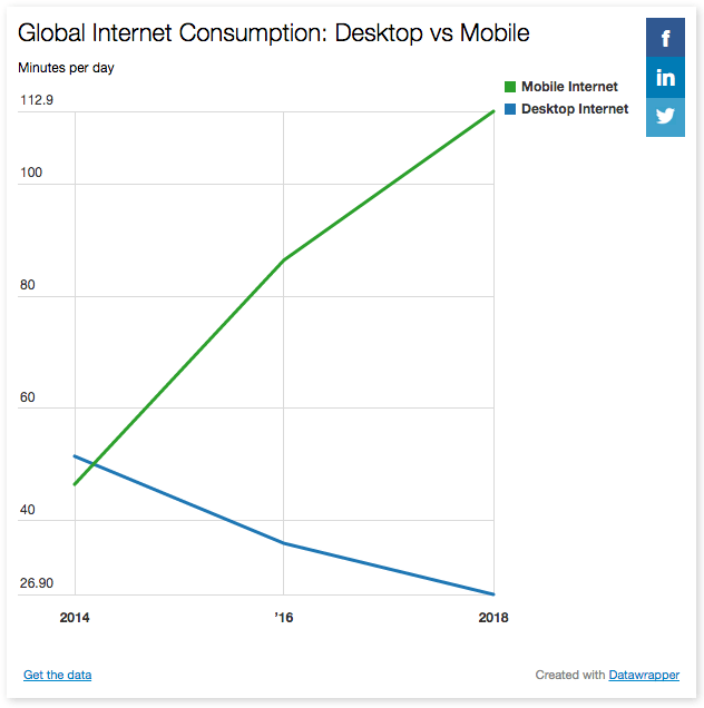
“Mobile internet is now growing at the expense of all other media,” said Jonathan Barnard, Zenith’s head of forecasting told “Digiday.” “Seventy percent of internet use is now on a mobile, and the use of a desktop for internet will fall by almost 16 percent, this year.”
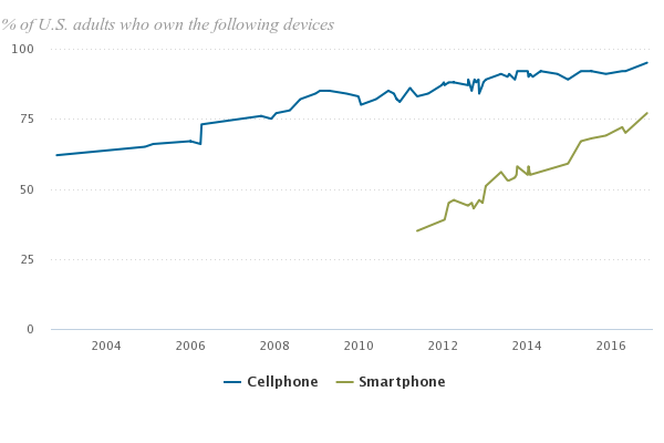
THE METEORIC RISE OF THE SMARTPHONEPew Internet has been tracking cell phone ownership since 2002. At that time, 62% of Americans reported owning a cell phone. Then in 2011, Pew began tracking the number of smartphone owners. Keep in mind, the iPhone wasn’t even 4-years-old yet but already 35% of Americans had made the switch to a smartphone.

Six years after Pew started tracking, smartphone penetration has grown 117%. Now 77% of Americans own a smartphone.
In the early days of the smartphone revolution, a mobile-optimized design was nice to have but today all digital touchpoints should not only be optimized for mobile but rather perfected for all screens.
EMAIL, IT’S NOT JUST FOR DESKTOP ANYMOREThe patterns of email users are changing. According to Litmus’ 2017 State of Email report, 54% of email is opened on smartphones. But does it look good?
The old ways of communicating to your email list aren’t working anymore. Users expect content that is personalized and beautiful wherever they choose to read it.
Research shows that marketers are struggling to engage with their on-the-go audience. The Relevancy Group reports that 32% of consumers say the emails they get are too small to read.
WHAT TO DOHere’s some tips for maximizing your mobile strategy:
As for Honda, I wrote them back and let them know that I won’t be filling out any surveys for them until they get their mobile user-experience house in order. I really hope they do.
Advertisements Sharing is caring


