As if it ain’t hard enough to slog through a wet, cold & gritty Canadian early Spring, Maclean’s Magazine published Cary Wu and Rima Wilkes’ article, “The stats bear it out: In Quebec, trust is low” on March 30th of 2017 just to bum us all out even further. Well, that, and to present statistically defensible quantification of Andrew Potter’s incendiary assertion, in an earlier Maclean’s article, that “Quebec is an almost pathologically alienated and low-trust society, deficient in many of the most basic forms of social capital that other Canadians take for granted.”
That’s pretty strong stuff. It remains to be seen what will become of Potter’s career at McGill, but I’m less concerned with the message of the article or its veracity than I am with the graphics that accompanied it initially and, rather conspicuously, the graphics which hastily replaced them. Below, the dreary picture of pathological Francophone hyper-vigilance with which the article was initially published. When asked, “Who do you trust?” Canadians responded:
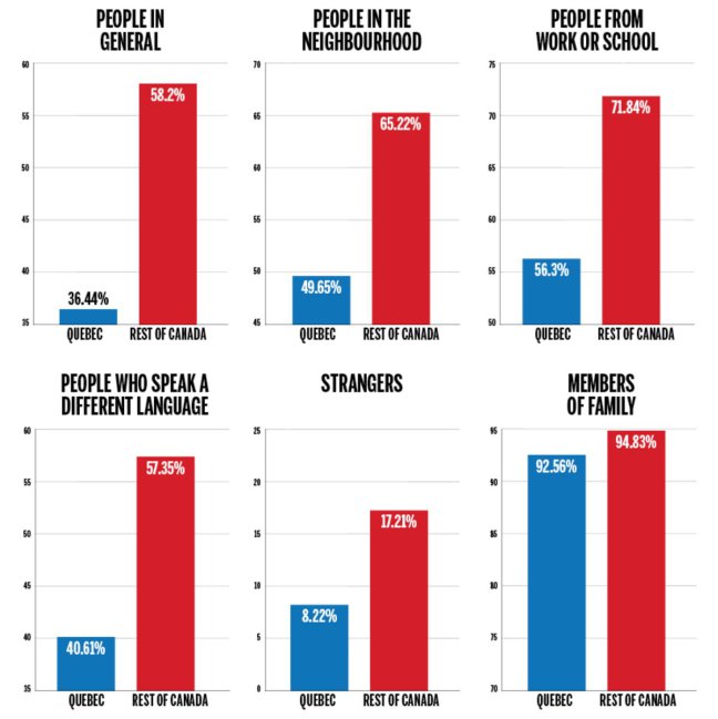
Note the vertical scale. All of the data is presented in percentiles, of course, but the actual range of each graph varies. Some start at the absolute bottom of 0% and go to 25%, while others pick up halfway and terminate at 75%. The reason, or rather, the reason I’m assuming the graphic artist would cite for laying out the data this way, is to feature the relative difference between the Rest Of Canada (ROC) and Quebec rather than featuring the absolute difference between all or none. While the former is pertinent to the question of comparing Canadians, the latter means defining a scale between…
I mean, that’s what “100%” and “0%” would represent on an absolute scale, and such naifs / Tolkienian Gollums are not pertinent to the point the authors want to make. At least, that’s how I’d have made this mistake.
And I would be mistaken because there are in this story characters other (and more important) than the those hypothetical extremes described above. In the graph presented as above, the ROC positively towers over Quebec’s trust-score in all but the “members of family” category. Why, just look at that great, amicable red stripe of mostly English-speaking friendliness dwarfing those tiny, paranoid blue stubs of Quebec. As you might expect, people complained.
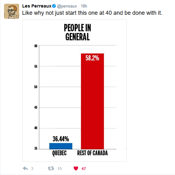
And the magazine reacted. They replaced the relative-scale graph with one which showed the same data in an absolute scale:
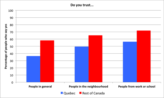
Well, that puts things in a different light. Even the printer can see this is a fairer representation just by looking at the ink reservoirs when the job finishes.
What can we learn from this? Was the first chart an attempt to deceive or obfuscate the facts? Edward Tufte sagely observed that “data graphics are no different from words [in so far as] any means of communication can be used to deceive.” Indeed, he cites as an example of such deception a graph using non-zero Y-axis values in Visual Display of Quantitative Information (2001), but he does so because the graph at issue compares quanta from two dissimilar Y-axis starting points (dirty pool!). More to the point, he laments later in the chapter that he finds it “particularly disheartening […] that the reported perception of something as clear and simple as line length depends on the context and what other people have already said about the lines.” Or, as Donald Rumsfeld famously put it, even the most elemental data visualization is subject to distortion from “that which we don’t know we don’t know.”
So: know. That’s the lesson. Know, or know that if you don’t know, somebody smarter than you will let you know. I don’t believe the graphic designer who produced the initial graph for Maclean’s was “deceptive,” nor intentionally trying to dwarf Quebec with cloying Anglophonic bonhomie. But the fact that the graph had to be replaced shows they did that anyway, which must have been mortifying, and for which they have my deepest sympathies.
But with the article already hot like a hot potato in the world of Canadian letters (having just got Andrew Potter dealt the Spanish Archer* at McGill), the editor should have known that their position just might be read graphically as a bit defensive concerning their accuracy in assessing how trusting are Quebeckers relative to the rest of Canada vs. Quebeckers relative to Tolkein’s Gollum.
If they didn’t, it’s safe to say they do now.
*El Bow
Advertisements Share this: