Hello people!
Today I am bringing you a review of one of my Christmas presents, the Kat Von D’s Saint & Sinner palette. With all the studying I had to do during the Holidays I did not have the chance to play with it, but now that 4 out of 6 exams are out of my way, I have decided to play a bit with its colors and make a little review for all of you out there who are thinking of buying it.
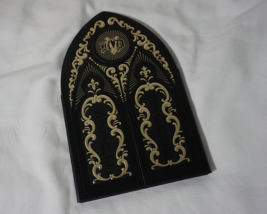
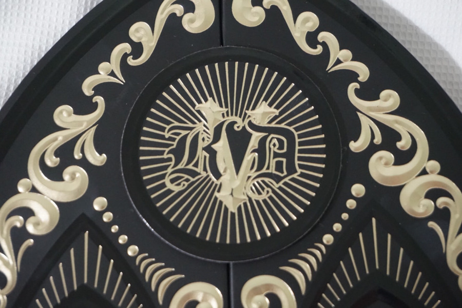
The packaging of the palette is absolutely stunning, you can see in the pictures it is all black with a lot of gold detail. At the top of the palette you can see the initials KVD with a different font but equally stunning. When you open the palette, there are 24 different colors, 12 being on the saint part, and 12 on the sinner. You can clearly notice which ones are which. What I really like is the fact that you get matte, glittery and metallic colors. I hate when palettes only have one type of eye shadow textures so this is ideal for me.
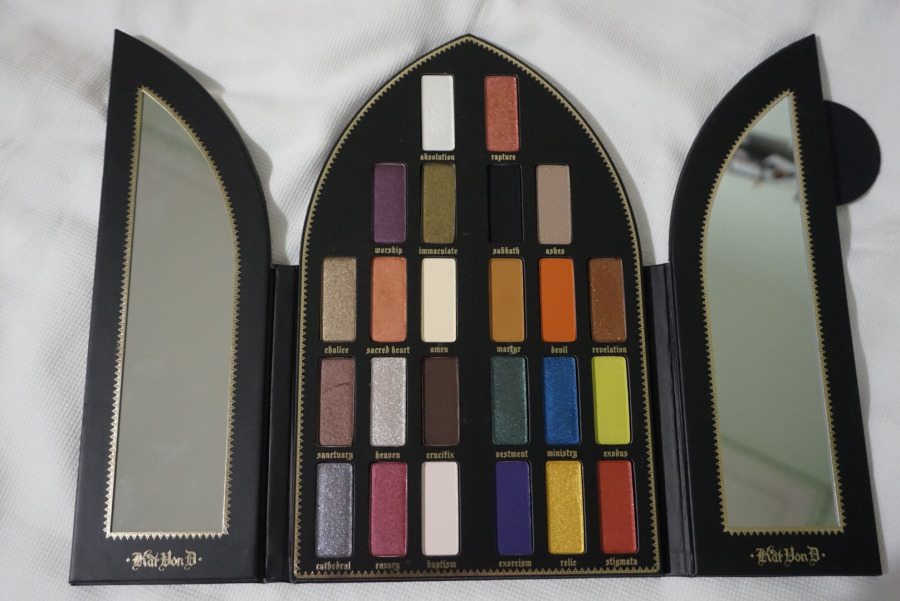
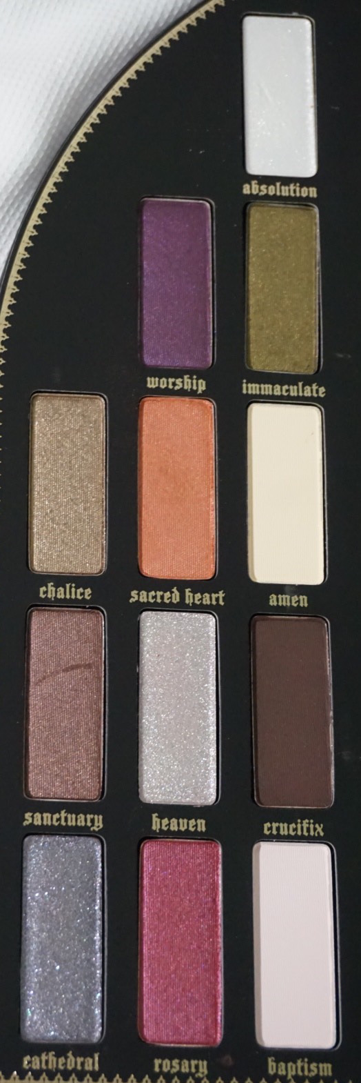
SAINT
This side of the palette is way more neutral than the sinner one, what I did not expect were the two deep colors at the top, a violet (worship) and a military green (immaculate) color. The first color at the top is absolution, a white glittery shade absolutely great for the inner corner or the brow bone ( I personally like matte white for the brow bone but some people prefer the glitter). The third and forth line of eye shadows are very neutral, great for an everyday makeup look, all very wearable colors. An the three at the bottom, I would say these are a little bit more “out there” in a way, you can make an eye look more dramatic with those colors or transform your day look to night look.
SINNER
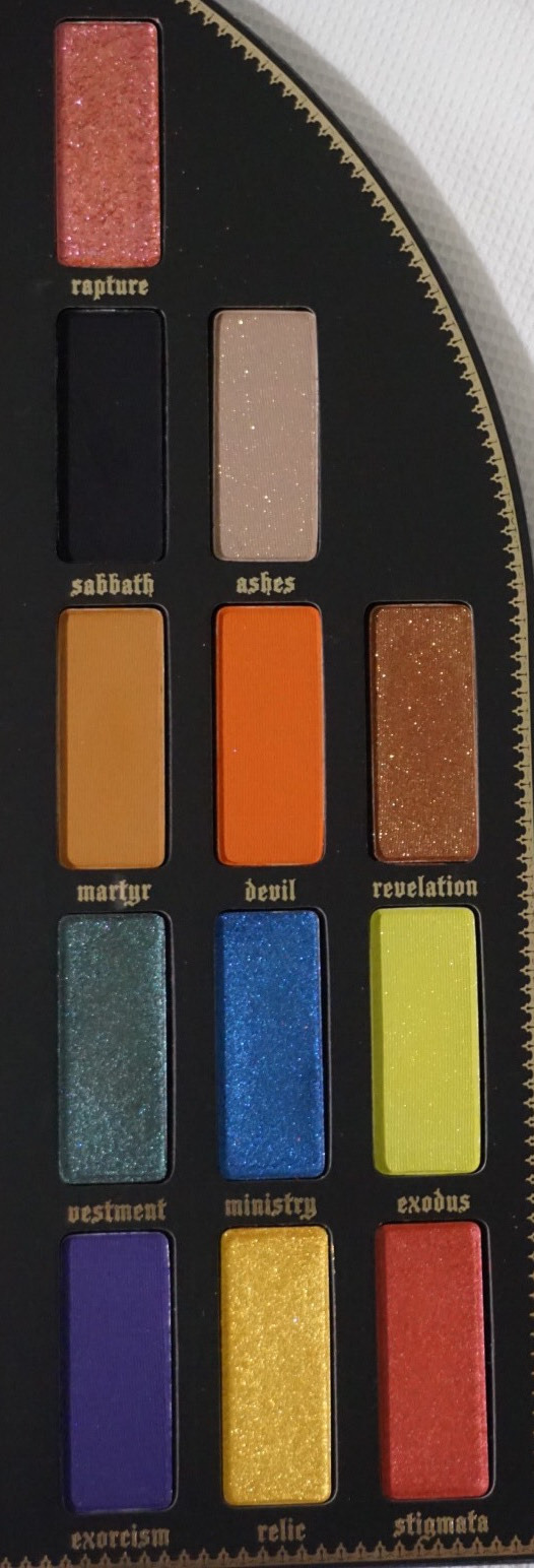
I call this side the side of the crazy colors, just for the fact that I am not used to wear this type of colors. From the third row up the colors are not extremely vibrant, they are more wearable but less natural than the colors on the saint side. There are three colors that are absolutely stunning, all of them glittery: rapture, ashes and revelation. I am IN LOVE. They are so stunning, I have no clue when I would wear them but they are stunning. The forth and fifth row, that’s where the vibrance is. You get a green, blue, lime, purple, yellow and red color, most of them are metallic in exception of the lime and purple. I would really have to play with those colors to create a look that made sense but I think some very interesting and over the top looks can be done with them.
I would like to say that all of the colors are incredibly pigmented, which I LOVE. But watch out with the crazy colors as it’s not like other palettes that you have to go through the color 10000 times in order for the shadow to start showing on the lid. When I was swatching them, I thought they would be like a lot of brands, not super intense, so for the vibrant colors I went full on so I could see the colors and O-M-G, took me ages to get rid off the color, so I thought I would warn you, JUST IN CASE!