Gray (or grey) means a colour “without colour”… and it is a colour. But in terms of image processing we more commonly use gray as a term synonymous to monochromatic (although monochrome means single colour). Now grayscale images can potentially come with limitless levels of gray, but while this is practical for a machine, it’s not useful for humans. Why? Because the structure of human eyes is composed of a system for conveying colour information. This allows humans to distinguish between approximately 10 million colours, but only about 30 shades of gray.
The human eye has two core forms of photoreceptor cells: rods and cones. Cones deal with visioning colour, while rods allow us to see grayscale in low-light conditions, e.g. night. The human eye has three types of cones sensitive to magenta, green, and yellow-to-red. Each of these cones react to an interval of different wavelengths, for example blue light stimulates the green receptors. However, of all the possible wavelengths of light, our eyes detect only a small band, typically in the range of 380-720 nanometres, what we known as the visible spectrum.The brain then combines signals from the receptors to give us the impression of colour. So every person will perceive colours slightly differently, and this might also be different depending on location, or even culture.
After the light is absorbed by the cones, the responses are transformed into three signals: a black-white (achromatic) signal and two colour-difference signals: a red-green and a blue-yellow. This theory was put forward by German physiologist Ewald Hering in the late 19th century. It is important for the vision system to properly reproduce blacks, grays, and whites. Deviations from these norms are usually very noticeable , and even a small amount of hue can produce a noticeable defect. Consider the following image which contains a number of regions that are white, gray, and black.
Now consider the photograph with a slight blue colour cast. The whites, grays, *and* blacks have taken on the cast (giving the photograph a very cold feel to it).
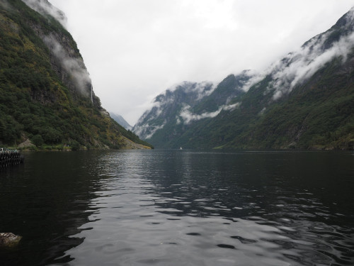
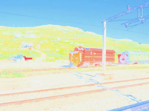
The grayscale portion of our vision also provides contrast, without which images would have very little depth. This is synonymous with removing the intensity portion of an image. Consider the following image of some rail snowblowers on the Oslo-Bergen railway in Norway.

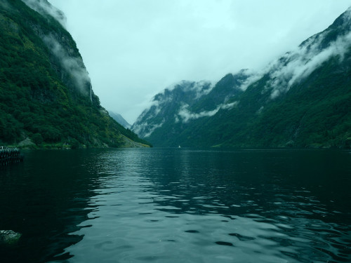
Now, let’s take away the intensity component (by converting it to HSB, and replacing the B component with white, i.e. 255). This is what you get:
The image shows the hue and saturation components, but no contrast, making it appear extremely flat. The other issue is that sharpness depends much more on the luminance than the chrominance component of images (as you will also notice in the example above). It does make a nice art filter though.
Advertisements Share this: