Book covers matter to me.
That’s not to say that I only read books that I find attractive, and I’ll read something recommended to me no matter what its cover looks like if I am intrigued and inspired by what I hear about it. But if we readers know nothing about a book, then it’s title, cover and blurb are, naturally, all we have to go on to decide whether we’ll purchase or borrow it, and ultimately read it. And I find myself in bookstores and libraries (far more often than is healthy) making massive and immediate decisions about books after just a casual glance at their covers. I’ve written off authors because I didn’t like the look of the one book by her/him that I’ve seen. In some instances this is no bad thing. I mean, I don’t think I’m wrong about Jilly Cooper for example, she’s not for me. But what if I’m missing something that is totally and completely my kettle of fish just for want of a cover that shouts, “Hey you! Yeah, you! You’re gonna love this …”?! That’s a lot of power that jacket artists wield, right there. (The whole publishing industry thing is interesting, but this bit of it fascinates me: Are jacket decisions made by one individual, or by a team? Who has final say over which design is used for a title? Are there alternative designs that don’t make the cut? Is more time and money spent on that first cover by a new author? Or is it saved for the big guns with established readers and sales figures? Do different publishers value cover design differently? Am I overthinking this whole thing?)
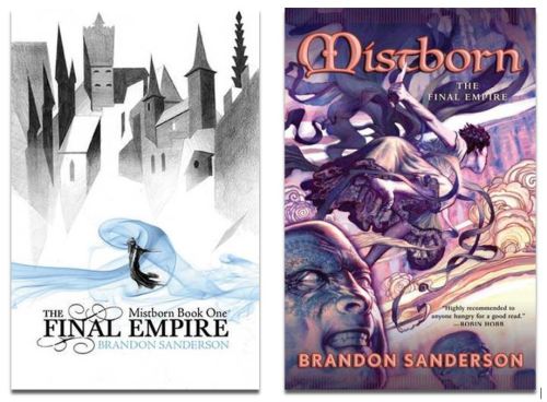
The very first book I wrote about here is a good example of what I’m trying to say. I had seen Brandon Sanderson’s Mistborn trilogy around for a few years and had it recommended to me plenty, but the covers always left me cold. These covers were not aimed at me, and I knew it. When I did finally start reading The Final Empire, thanks to R and her husband, I loved it so much that the covers ceased to matter and I happily chugged through the trilogy without giving them another thought (well, that’s not quite true: I spent a lot of time studying all three covers – a habit I have when reading anything – and they definitely grew on me). It wasn’t until later, when tootling about on Goodreads, that I saw the 2006 jacket artwork that had been drawn for me. If I’d seen this cover I may have started reading the Mistborn books earlier. (I hope it doesn’t sound like I’m dissing the very classy minimalist covers designed by Sam Green. I’m really not. While checking my facts I found Sam Green’s website and he is an awesome artist that I really like – if you’ve any interest in such things, go see his stuff here – I just felt that his designs were aimed at someone other than me).
So, for your own private amusement, if you had to choose between the left-hand and right-hand covers below, which would you choose? Do you know why?
There are so many things that will inform your decision. Your age, background, sex, personal taste, the movies you like, what mood you’re in, will all have a bearing. There are people out there no doubt who won’t be bothered about either cover, it just won’t be on their radar. I can’t imagine who those people are, but they’ll be out there … and I’d love to know how they pick books.
If a book jacket’s role is to capture something of the book’s content and to attract and entice readers, then I get that a lot of decisions about a book’s visuals will be based on who is perceived to be the audience. If we’re still looking at the Mistborn covers, I’d say the right-hand cover is aiming itself at established lovers of high fantasy who’ll pick up books with dragons, swords-persons and unicorns on the cover (me, in short), whereas the left-hand cover is trying to get the attention of those readers who maybe don’t consider themselves fantasy fans, or people who’ve read and enjoyed Game of Thrones or anything by Joe Abercrombie or K J Parker (I’ve heard the term ‘low fantasy’ to describe this more gritty, realistic strain … ?). This potential audience would likely be put off by anything too romantic or overtly magical (no sparkles, please), but Green’s cool clean-lined cover might just grab their attention.
There is an established visual language for fantasy at least. Dragons, unicorns, witches, wizards, elves, dwarves, castles can be easily expressed visually. We have history and folklore, myth and legend, to draw upon (‘draw upon’! Ha! Unintentional smart-assery!), to flesh out any artistic impression of a fantasy world. So, let’s take a moment to salute science fiction cover artists/designers who don’t have it quite so easy. While I have nothing whatsoever against hostile and/or alien environments and spaceships, it’s got to be difficult to be original when those are the easiest parts of a SF story to express visually:
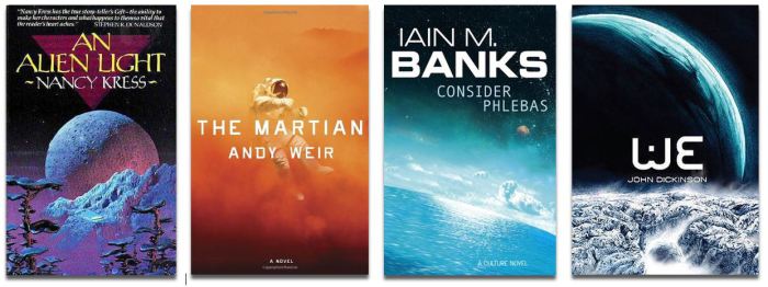 Variations on the theme ‘hostile and/or alien environment’
 Variations on the theme ‘spaceships’
(Please note: I have been using all my favourite authors/books/covers here so far and am in no way criticising or mocking these authors/books/covers. I can’t stress this enough).
When science fiction deals with concepts, technology and lifeforms we have yet to encounter, how difficult must it be for the cover designer to convey any real sense of the story? I went back to some of my favourite older sci-fi just to see if any of their many covers ever tried to capture some of the less tangible ideas that those books dealt with:

Nope. But I suspect the environment in which this book is set will be hostile and/or alien … maybe sandy.
Let’s try again:
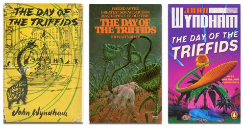
OK, Triffids. And idea that didn’t exist until John Wyndham put it out there. Artistically rendered on the first edition jacket by Patrick Gierth, and then stuck to pretty loyally throughout most reissues. That’s a successful imagining of a previously unknown concept, if you ask me. Incidentally, I had bad dreams about Triffids for YEARS.
Finally, possibly my favourites were these covers (1976, 1982 and 1995 respectively, as far as I can verify) for Anne McCaffrey’s The Ship Who Sang:

I love the literalness of a woman’s eyes in the cockpit of the spaceship in the centre picture, it’s a kind of natural progression from the cover on the left, (for those that don’t know The Ship Who Sang is about a woman’s brain being implanted into a spaceship, creating a sentient vessel). Not an easy idea to render, but the artists tried.
The picture on the right was the edition I bought and I remember pouring over that cover a lot while I was reading the book, taking in the details of this pretty unusual spaceship (does anyone else feel that this cover feels a bit underwatery?) even though I didn’t really feel any connect between this image and the ship McCaffrey describes. The cover had nothing to do with my decision to buy the book, Anne McCaffrey was my Favourite Author Ever by the time I got round to reading this, and I couldn’t have been choosey even if I’d wanted to be, this was the only copy I could find (I was in college, had very little money and I bought my books from a second-hand stall at my local market).
I will probably never be done with the things I have to say about book covers, so I will continue with these ramblings another time, (the beautiful thing about it is that you don’t have to read it if you don’t want to!). In the meantime, if book covers are something that interests you, and you enjoy gentle fun-poking, take a look at Good Show Sir which pays homage to some of the more adventurous book covers in the world of SFF.
To be continued …
Advertisements Share this: