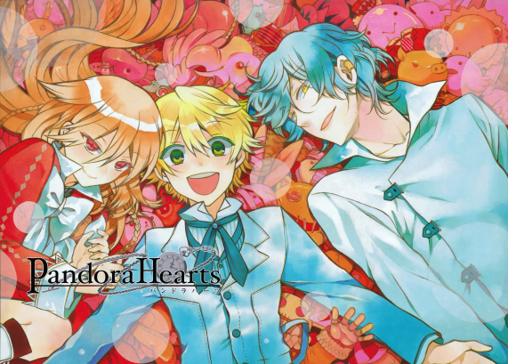
 A nice, thrilling fantasy manga. What on earth could go wrong? (Hint: everything) (Mochizuki, J. (2013). 2013 Calendar)
If there’s one manga that I have consistently rated in my top 3, it has to be Pandora Hearts. Mochizuki proves not only to be an expert storyteller, but also a captivating artist of that which is magical.
It’s not surprising that I’ve taken huge inspirations from Mochizuki’s art style, due to its incredible distinctiveness. The main thing that stands out is the fine lineart in regards to clothings, accessories and hair. Mochizuki is painstakingly observant to detail, leaving nothing untouched. By making the linework extremely thin, it emphasises on the flow of the composition, making it appear natural and dynamic rather than stiff and lifeless.
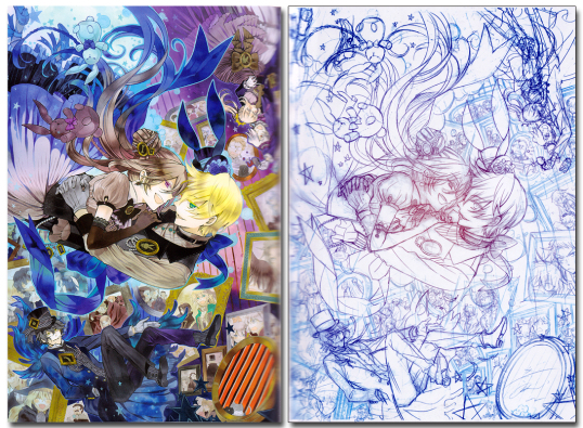 Look at that flow! And that hair! And the clothes! You get what I mean. (Mochizuki, J. (2015). Jun Mochizuki 2nd Art book Pandora Hearts “There is”. Square Enix.)
Another thing to note is the colouring technique; Mochizuki makes them blend with each other smoothly and evenly. The subtle gradients in her art give the impression of trying to emulate watercolour, something that stands out in the manga ridden world of cel-shading. The watercolour effect gives off a childish air that plays into Pandora Heart’s fairy-tale inspirations, which include Lewis Carroll’s Alice in Wonderland and (occasionally) The Velveteen Rabbit.
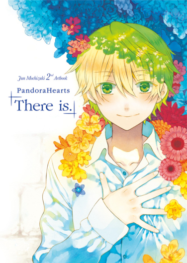 Someday I need to get this art book. Someday. (Mochizuki, J. (2015). Jun Mochizuki 2nd Art book Pandora Hearts “There is”. Square Enix.)
 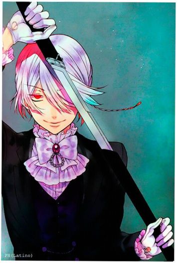 Beloved Xerxes Break. You will be missed. (Mochizuki, J. (2015). Jun Mochizuki 2nd Art book Pandora Hearts “There is”. Square Enix.)
Mochizuki knows how to use colour schemes, and use them well. Characters are often associated with specific colours, which usually denotes the groups they are affiliated. In most official art, the composition is often dominated by a specific colour that matches the overall emotional tone; purple for mysticism, gold for joy, blue for loneliness, etc. This is no doubt a reason why her artwork makes such a huge impression on viewers.
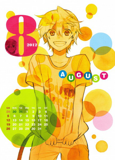 Oz dear, if only you knew what was in store for you… (Mochizuki, J. (2012). 2012 Calendar)
 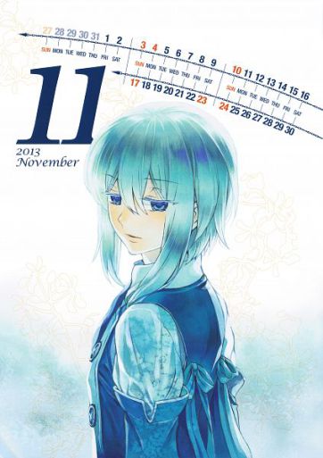 Echo, you deserved better. (Mochizuki, J. (2013). 2013 Calendar)
Most interestingly, Mochizuki’s artworks are rife with symbolism and foreshadowing, which makes sense in hindsight when you re-read it. The subtle placements of the flowers in a bouquet, the repeated animal motifs and water imagery, the frequent chess pieces that appear…
 What is this? Foreshadowing? Totally not hahahaha. (Mochizuki, J. (2011). Volume 14, chapter 55)
 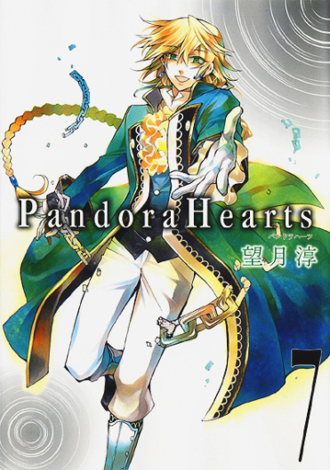 Just what on earth are you, Jack? As pure as water… (Mochizuki, J. (2008). Volume 7 cover)
Though I’m afraid you’ll have to read it first before I spoil too much of anything for you!
-JPR
Advertisements Share this: