So…what if this was true – what if the national polling showed that when the Comey letter came out, Hillary’s support increased.
What if national polling showed that instead of there being scorn heaped on her for having her emails on a then-accused, now convicted scumbag’s laptop, what if people said enough is enough.
What if the Comey letter HELPED Hillary reverse a downward trend in national polls? Well, here is the most used graphic to show how terrible the Comey letter was.
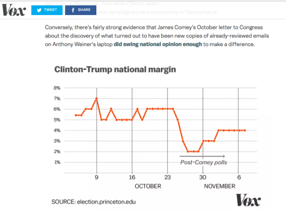
Matt Yglesias included it in his article (good article but) as others have done, the graph seems to show a clear story – the gap was 6%, the letter came out and boom, she plummeted and just scraped back up at the end but she never got back to where she was and her lead was devastated by the letter.
Nate Silver certainly agrees –
Hillary Clinton would probably be president if FBI Director James Comey had not sent a letter to Congress on Oct. 28. The letter, which said the FBI had “learned of the existence of emails that appear to be pertinent to the investigation” into the private email server that Clinton used as secretary of state, upended the news cycle and soon halved Clinton’s lead in the polls, imperiling her position in the Electoral College.
On the Princeton Graph, however, the black line that shows you when the Post Comey letter starts….on October 25. The 28thm actually, is when Hillary was in the middle of the 2% spread.
Her lead INCREASED after the letter came out.
I emailed and Tweeted Matt. No response.
I emailed the gentleman at Princeton in charge of this project. This was his response.
Obsolete graph. Need new one, will send it. Please correct when you receive.
And yes, I will share the new graph when it comes out but the one most used and most cited, shows the opposite of what everyone has used it to show.
Share this: