It’s finished! We’ve been doing some work on our home to modernize it a little and make it more to our taste, and the biggest project yet, renovating the kitchen, is finally done! (Ok, the biggest project time-wise was painting. Holy cow, that takes forever. But this is one we’ve been saving up for and I’m so thrilled with the transformation!)
So you can really get the full effect: here’s a before from when we moved in.
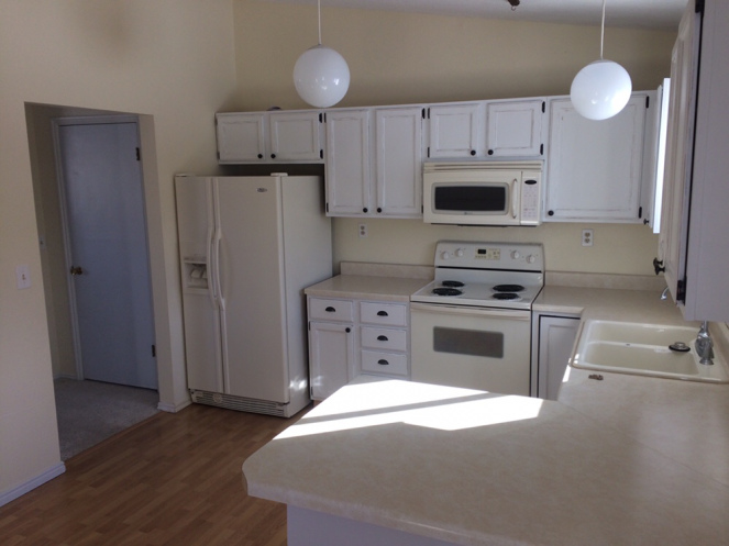
Really, it already had charm. What immediately made me fall in love with this place was the sunshine and warmth — we visited it in the dead of a very snowy Wyoming winter. Previous owners had repainted the cabinets from an icky orangey-brown laminate wood color, which was awesome. But all that yellow and cream and more off-white… no thanks! And the sink was beat-up porcelain and stuck out from the counter quite a bit so there was always grime building up around the edges and water trapped behind the sink.
It just didn’t make financial sense to tear out and redo the kitchen completely — the cabinets are small and old, sure, but that’s a lot of money to throw into a townhome! But, we felt like we could do something. So we decided to just switch out the counter tops and add a back splash. We’ve been working on repainting the whole home from that buttery yellow (it’s actually a color that wasn’t so awful — at least it’s warm and sunny — but definitely dated and not my style), so that was going to help, and then we got a quote from a nearby contractor (these guys, if you’re local!) who came highly recommended. They were awesome to work with, and they helped us take it from that photo above…
to…
drumroll….
This!
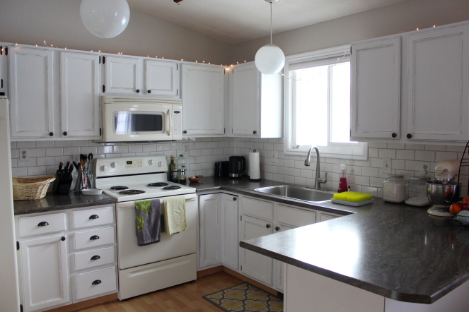
We were going for “bang for our buck” here, so I chose an upgraded laminate, and seriously, it looks so much like actual stone! It’s gorgeous!
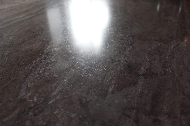
(It’s Wilsonart “Bronzite,” if you’re curious, with a premium finish — it has a little texture instead of being completely smooth)
As for the back splash, good old subway tile was a classic look and nice and cheap, plus I love it so I was happy to go with that option. The gray grout is what really helps it tie everything in, and I think it turned out just gorgeous! (Funny how little things make such a big difference)
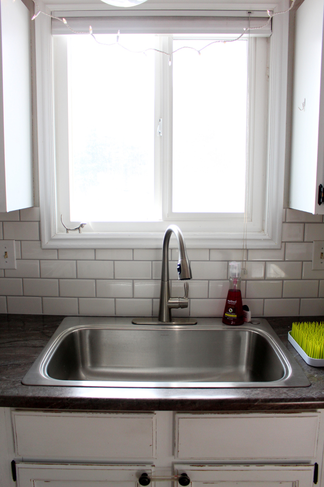
(Yes, we’re keeping the twinkle lights. Until spring comes back. Gotta hygge things up!)
The biggest usability improvement was swapping out the old sink with a stainless, single sink and a taller faucet. It makes SUCH a difference! For one, I can fit a casserole dish AND several pots and pans — at the same time! It also has very low edges, so cleaning around and behind it is easy. And the faucet is awesome. When we were renting our previous apartment it had an awful, super low faucet which made it really hard to do dishes in the already-tiny sink. We actually bought this same one and installed it there and it dramatically improved our quality of life (you laugh, but I’m not kidding. I was also super pregnant and it was a really hot summer and that small thing brought quite a bit of relief!) The owner reimbursed us for the faucet too! So something to consider, even when renting: you can do small things to improve the place you’re living.
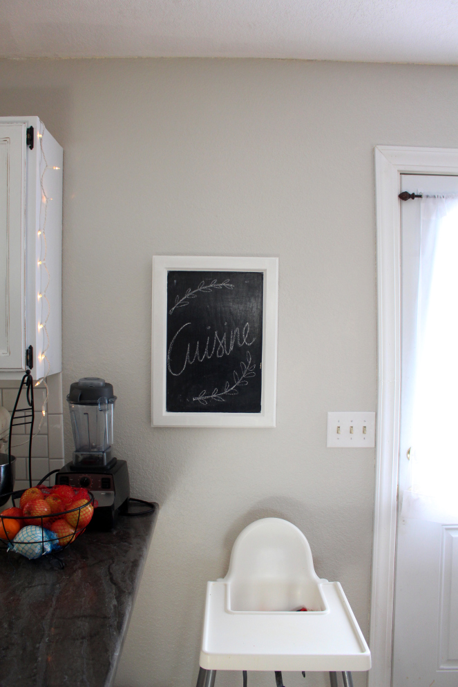
That’s kind of our philosophy about home stuff with Andrew: we generally agree to not take massive risks and keep resale in mind (OK I’m usually pulling for the crazier ideas and he’s reining it back to normal territory ha), but the other one is taking the pains to do it right and take care of what you have. Maybe this isn’t our forever home, but it’s worth making it into a cozy space and making it work for us with our family’s current needs. The cloffice is a good example of this!
The only thing we changed to the layout was to extend the counter top on the “peninsula.” There’s not a ton of storage space in this kitchen so I wanted to eventually add shelves beneath the end of the counter top, kind of like this.
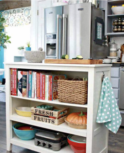
(Source) And I found the PERFECT, super cheap IKEA hack for it! (No seriously, it’s a $15 fix) I’m so excited, we’re picking it up this weekend! Of course it’s nice to have the extra ten inches of counter space. And pretty to look at, too!
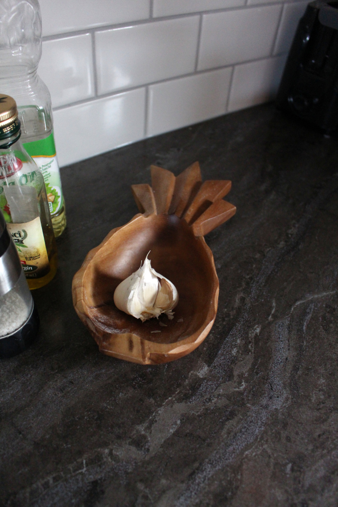
There you have it! A major kitchen upgrade without having to redo the whole thing and spend who knows how much on all that work. I think it was absolutely worth it, even if it might be considered putting lipstick on a pig. In this home, it was the perfect fit, and it really does feel like having a whole new kitchen. Even just swapping out the sink and faucet is huge! And removing the “back splash” ledge from the old laminate counter top gives us an extra inch of space, plus the white tile gives some more light to those corners. It’s just perfect for us. ❤
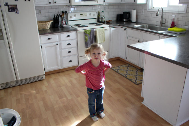
Adelina agrees, and insisted on being in the picture

