Before I start to construct my photo book, I need to consider layouts. Although I have a rough idea of what i’d like already, I have decided to look into some photo books that I own for ideas and inspiration. I may also find things I don’t like. I am hoping that this will make my idea more solid, so when I come to constructing the book, I know almost exactly what I want.
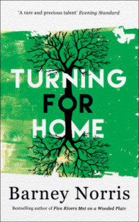
Hoxton Mini PressThis is a company mentioned in my last photo book research blog when I was looking at book sizes. Because I want the book to be small and compact to keep the intimacy of the imagery included, I thought it would be beneficial to see how the photographers and producers have positioned and laid out their work in smaller books, so that the imagery is as effective as it can possibly be.
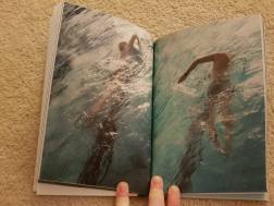
East London Swimmers
I love this book, and the aesthetics involved in it. As a rule, most of the images have similar composition and structure. The narrative of this book is largely in the uniformity of the images. This is not relevant to this project, as I don’t want repetitiveness and uniformity. However, there are some techniques that the photographer/producer use which I think may work for my book.
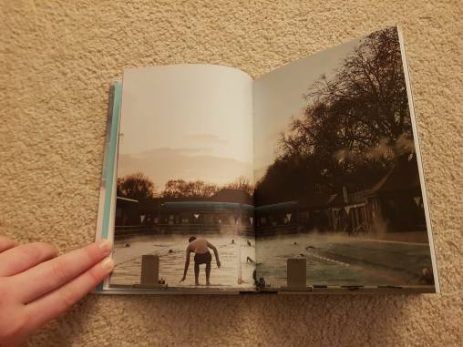
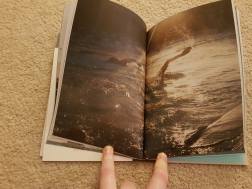
The book uses several full bleed landscape shots which help to establish the location and time of year. I think this works very well, and it helps to break up the uniformity of the portraits within the book. I think this would be beneficial for me to consider for my own landscape shots. I think this would help to make my images flow more.
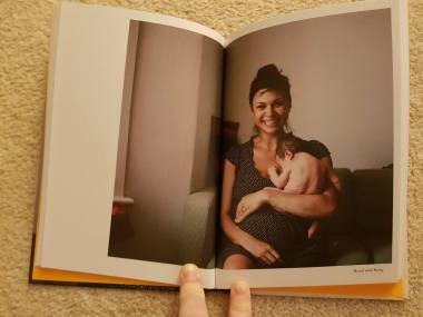
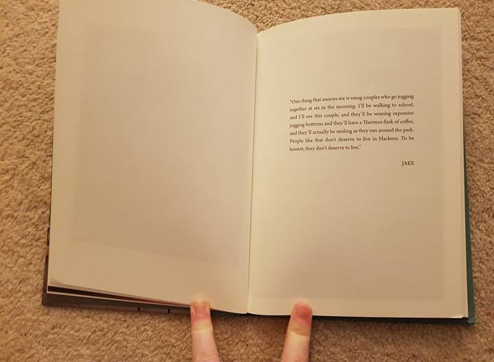
As well as the landscapes, the portraits occasionally have quotes from the person in the following image next to them:
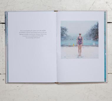
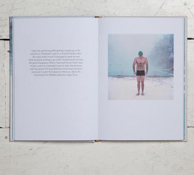
As I intend on interviewing my subjects to get quotes, I think this layout is strong. I don’t think that the text makes the page look too cluttered because there’s still a lot of negative space.
Although some people don’t think that text is needed in photo books, I think it’s interesting to find out more about the subjects of the photos. I think for my photo book in particular, the quotes will be important to making the project more personal, and for giving my subject more personality and sympathy from the intended audience.
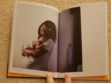
One Day Young
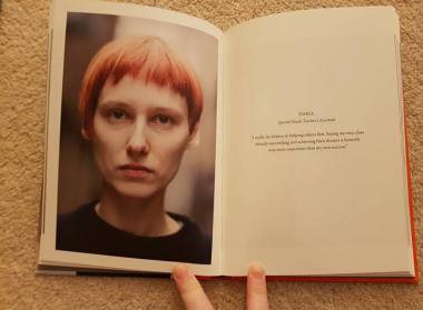
This book has a very different layout to East London Swimmers, and tends to use larger images:
A common theme throughout the book is to use this 3/4 layout. I think this is because a lot of the portraits are landscape. I think this is a very aesthetically pleasing way to layout images, however, depending on the picture, a lot of it may be lost in the gutter. This is something I’d need to consider before using this layout in my photo book.
I also like the use of the minimal text at the bottom of each image. It’s not too distracting, but still informative. There isn’t much text in the book as a whole, but there are occasional quotes:
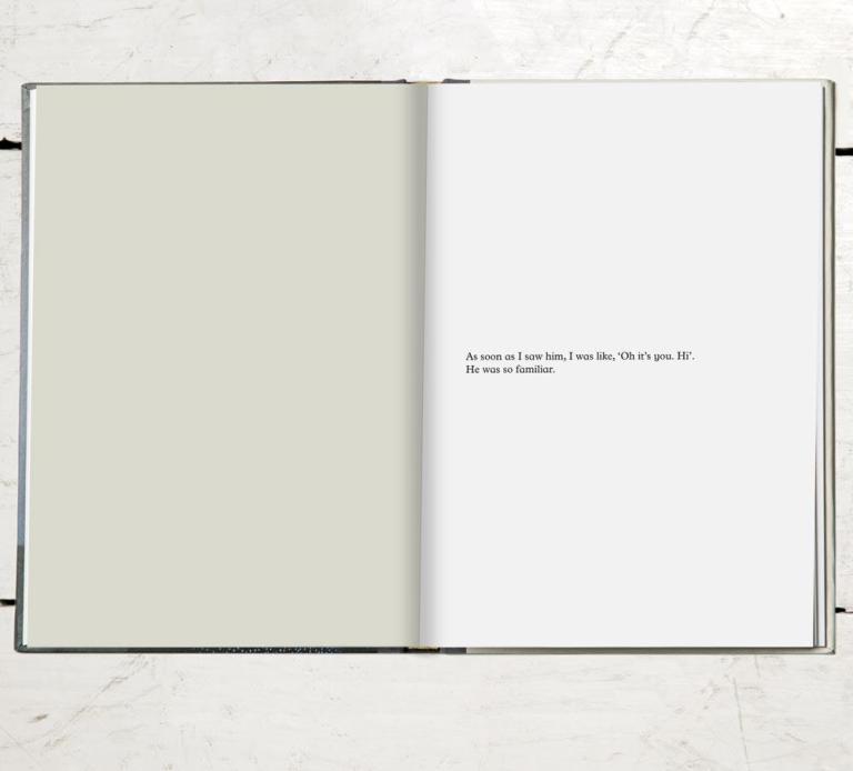
I think the use of 2 blank pages for a piece of text works well. It strongly encourages the audience to read the text, and suggests that it’s important for the context of the following images. I think I may use this technique if I use quotes within my book.
London Youth
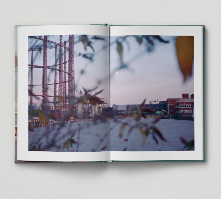
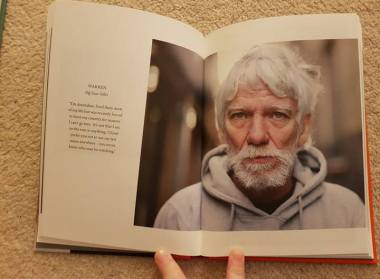
This is one of 3 slightly larger Hoxton Mini Press books that I own. Similarly to the East London Swimmers, the book uses several landscape shots to split up the portraits, and establish the location.
However, with the exception of the first image, they are not full bleed: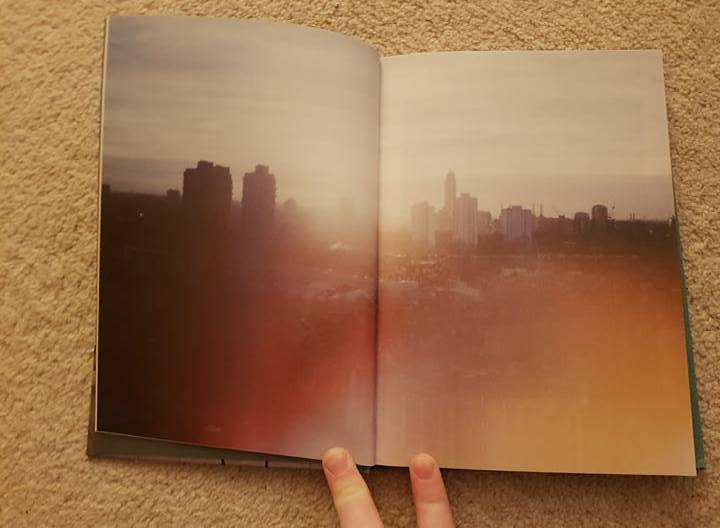 (First image)
Although I think both are effective, I personally prefer more continuity within the book. I think they should either all be full bleed, or all have a boarder. Equally, I don’t think that a warmer toned image would work as well with a white boarder, whereas the cooler toned one does. I think for my book, I will maximise the use of space by using full bleed landscapes to establish the location/time of year.
There are also several quotes used throughout the book, and generally, they are presented as above; with 2 pages for one quote. This is similar to One Day Young’s layout. I think it works well as it allows the audience to contemplate the text before moving on and seeing who said it. Equally, as previously mentioned, I think quotes help to make a book feel more personal, so the audience gets more of an idea of personalities.
People Of London
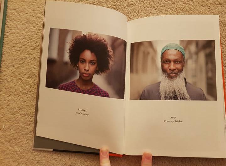
This book is primarily made up of portraits, taken in both portrait and landscape. The layout of each portrait is fairly similar, but dependent on the way its been shot:
The same 3/4 technique as in One Day Young has been used for a lot of the landscape portraits within the book. I like this, and I think the addition of having negative space at the side lends itself to being suitable for quotes. This is definitely a style I should consider when constructing my own book.
The book also includes several images laid out as diptych’s:
Personally, I prefer this style, so I will likely use it in my book. However, I think it’s important to have variety in layout’s within a book to keep variety and make it seem less repetitive.
On the Night Bus
This is one of the books with the most variety of image layout’s from the Hoxton Mini Press books I’ve looked at.
A lot of the images in the book are laid out across 2 pages, but with a border:
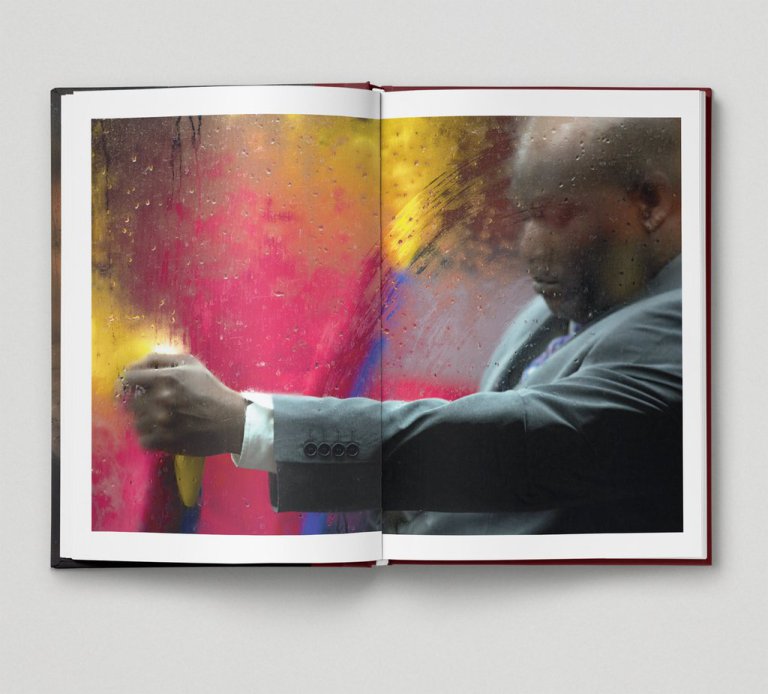
I think that as all of the images presented in this style include a boarder, these work. Again, I need to consider the gutter, and how much of the image will be ‘lost’ if I choose to use double page spreads.
This style is also used frequently:
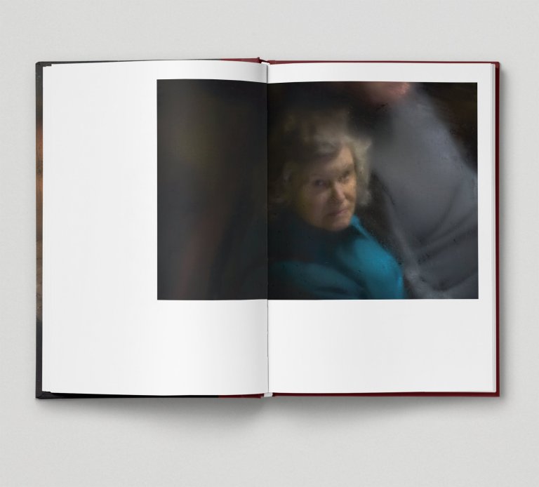
I’m personally less keen on this layout. I feel like there is too much negative space. Although this is similar to some images in One Day Young, the images aren’t as blown up. I think this style is more effective with a slightly larger image.
The book also includes a couple of layouts of different diptych’s:
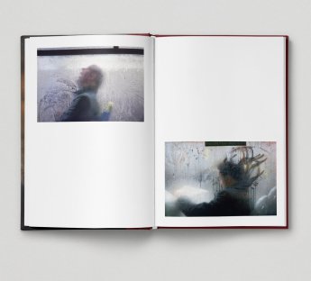
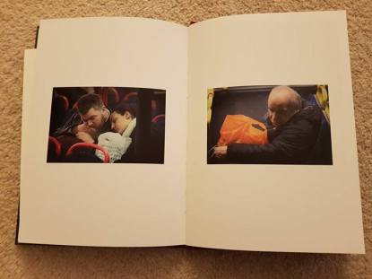
I like the use of diptych’s and triptych’s within photo book. I think that if 2 images work well next to each other, they can be very effective when viewed together. However, I personally prefer the example on the right (above). I think that this is more symmetrical and aesthetically pleasing. Although the example on the left works well because of colour palette, I think it’s a bit too ‘abstract’ for my project.
Humans of New York
This book is not a part of the Hoxton Mini Press company, and therefore has a very different style of presenting images.
As the book is based on telling people’s stories, there is considerably more text in it than most other photo books I have looked at here, and in the past. I personally find the book to look too cluttered, and it feels like each image is competing for space that isn’t necessarily there.
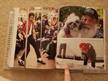
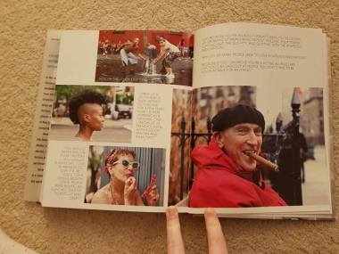
Aside from the use of multiple images per page, the use of text makes the page seem too crowded in my opinion. I am likely to use text in my book, but I am hoping to use considerably less, and to use negative space more effectively. I think that minimalism will display my work in a clearer way for my narrative to be conveyed more clearly.
Although, occasionally within the book, there is a double page spread. I think this reoccurring theme throughout most photo book’s I’ve looked at is key to use in the book:
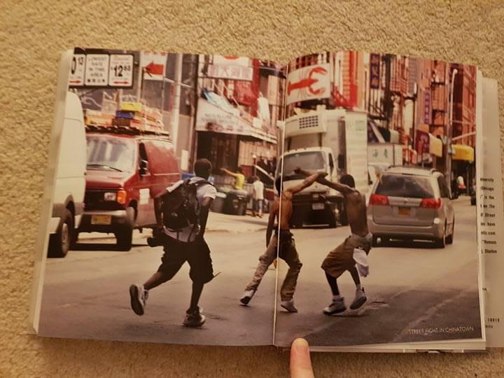
To conclude, I think that my book needs to use negative space where possible to make it seem less crowded, and more intimate. I think minimalism is key in achieving this. I also think that grouping sets of images with similar content, themes or colours is something I need to consider, as this may make it more visually appealing for the audiences.
Advertisements Share this: