Notes from OCA Handbook (PH2lsc040413; 71 – 73)
- The works by Liz Nicol, Ian Brown and Chris Coekin can be seen in relation to ‘land art’.
- Land Art is a more conceptually-based approach to making artwork. The focus is not on describing the place itself but representing the artists experience of visiting or traveling through it. (Different to earth art, which involves a direct intervention with the raw materials of the landscape)
Clarrie Wallis, Richard Long: Curator’s Talk’ (14 September 2009) http://www.tate.org.uk/context-comment/audio/richard-long-curators-talk Accessed 13.12.17
This lecture would probably have been good to listen to live but I got less out of it listening without seeing any of the images that were shown during the presentation. Some points I picked up:
- Long was testing the boundaries of art
- His start was the track made by rolling a snowball
- His work involves an intervention in the landscape
- ‘Located in the landscape and made of it’.
- Walking leaves a track
- Long used only lines, cross, circle and spiral – natural shapes
- Interested in the creative process rather than the end result.
- Used photography to record his art
- 1969 – did Text Art
- Sculptures are also done over space and time
- Concentric circles, each walked in an hour
Sean O’Hagan, ‘One Step Beyond’, The Guardian (10 May 2009) https://www.theguardian.com/artanddesign/2009/may/10/art-richard-long Accessed 12.12.17
O’Hagan interviews Long who made art by simply walking in the wilds. Sometimes in circles and others in a straight line. Sometimes using stones and other times using other natural products easily found on the walk. The important element is that his art is made through walking and making something in less than half an hour. In the end the work is photographed as it will over time be modified by nature and then disappear.
Long’s work provides some interesting perspectives for me. I have been thinking of the use of people in the landscape but Long modifies the landscape through an intervention. His changes are not enough to be permanent and will in time be taken back thorough the forces of nature.
His ‘textworks’ reminds me of poetry. His text is not in complete sentences but phrases that convey a concept. The layout of the text is also structured as it is in poetry and this gives one a feeling for the work too. One is reminded that the whole text is important, the font, the words and the structure.
It has made me wonder a little more about how we all have an impact on the environment and the degree of permanence that this impact may have. There is of course plenty on the media about plastics and their impact on marine life. However, I see evidence of the pollution by plastic every day. Although maybe a bit too radical, I now believe that the total banning of plastic bags and bottles would be a good thing for the environment. The impact of plastic on the landscape is huge and here in South Africa where waste management is poor this is especially the case.
I have been tempted to use the topic of waste in the environment as a project and have been taking images of waste in areas that should be classified as wilderness areas for a while now but am concerned that this is a project that has been tackled by too many photographers. However, I will not totally discard the idea yet.
Exercise 2.5 Text In Art
Similar to Richard Long’s ‘textworks’ write down 12 – 24 brief observations during a sort walk or journey.
Consiider how you may present your observations
- Ed Ruscha http://edruscha.com/featured-works/
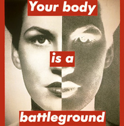
The images on his site show large letters & words on large canvases. Typically acrylic on canvas. The background appears to be a photograph with text in top of it. Some however are paintings only with the text. What is notable is the size, both of the artwork itself and the text. The font used for his text is very bold and usually in capitals. - Barbara Kruger, http://www.barbarakruger.com Accessed 18.12.17
Mention of Barbara Kruger immediately brings to mind images with white text set in a red background. However, she has used other formats of text too.
- Mark Titchner, http://marktitchner.com Accessed 18.12.17
- TateShots: Mark Titchner, Studio Visit http://www.tate.org.uk/context-comment/video/tateshots-mark-titchner-studio-visit
- He is an artist who makes bigger works and incorporates text in many ways, often quite complex and ornate fonts.
Sarah Hyndman, ‘Wake up & smell the fonts’ https://www.youtube.com/watch?time_continue=9&v=OXc-VZ4Vwbo Accessed 18.12.17
Sarah shares with us a story of type and invites us to consider our emotional response to the printed word. Each font/typeface has a personality that influences our interpretation of the words we read by evoking our emotions and setting the scene. We all understand this instinctively but it happens on a subconscious level. Sarah shows us that conscious awareness of the emotional life of fonts can be entertaining and ultimately give us more control over the decisions we make.
- I think the most important concept that she talks about is that ‘fonts turn words into stories with influence’. Type fonts influence the subconscious.
Summary
Thinking about fonts takes me back to my teens when I learnt the Gothic Script from a booklet I found on handwriting. Also, at school I had to learn to write in Italic scrip with a pen that had an italic nib. Then also, I recall my first photo album, which had black pages and I had to write the captions in a white ink with a fine nib in the pen.
So, subconsciously I have had an interest in typography for many years but never really fulfilled this interest. Computers obviated the need for handwritten texts and so maybe surpassed the interest.
With books written on the topic the few words above can hardly scratch the surface of this topic. One can only note that there are many fonts and each of these will convey a different meaning or impression depending on the context in which it is used. Also, I am sure that each person has a preference for how they perceive a font and what they find pleasing on the eye. In my computer I have typically used sans-serif fonts as I find them cleaner but this is my opinion and I am sure others feel differently.
There has been some debate as to whether serif or sans-serif fonts are easier to read. Research it would seem is not fully aligned on this as it is also dependent on the medium in which it is being used: LCD computer screen, print media, or digital media.
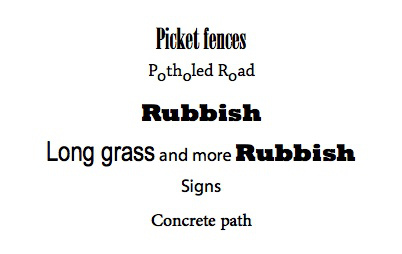
Considering now the observations from my walk, the sam one along which I took photographs in Exercise 2.2
- Picket fences and neat gardens
- Potholed road
- Water leak
- Broken electrical fittings
- Rubbish
- Empty plot and more rubbish
- Long grass
- Open excavation
- Signs
- More plastic rubbish
- Concrete path
Considering how some of this may be presented in another way results in the following:
There is an infinite number of options and the skill comes in knowing what these options are – this is a field I know little about and would have to spend a significant amount of time to really come to grips with it – time I do not plan to spend now.
Advertisements Share this: