Developing on from the ink splat patterns I created on water colour paper, I decided to work on digital illustrations, by first scanning the images in photoshop. Using the paintings as a background layer, I used the line drawings as the imagery to overlay with. Having scanned the line drawings onto photoshop, I traced over using the pen tool. At first I was using the track pad on my laptop which was very rigid and limited my movement so I then used my apple mouse instead. Being less constricted meant that it was easier for me to follow the lines. I chose to use white ink and with the choice of dark colours within this painting, I feel the white would stand out and be more effective.
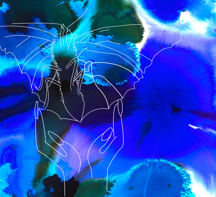
Fragile. – This first illustration I developed only involves two out of the four possible line drawings I could use. The reason for this being I see less shapes in this painting and more movement. This makes me feel like I am on a journey, I am going somewhere so the fragile hands indicate that I have been let go but also be gentle. I’m ready to flutter away and begin my next journey but I am still a butterfly. I am still vulnerable. This butterfly in particular has her wings open and the body and legs exposed. This mirrors that I am ready to be more open, more trusting, take more risks. As an external viewer this illustration can be seen from two angles, the hands are letting the butterfly go, just as i see it, or as the butterfly is ready to land. Coming into the hands, it has completed the journey and is now ready to settle.
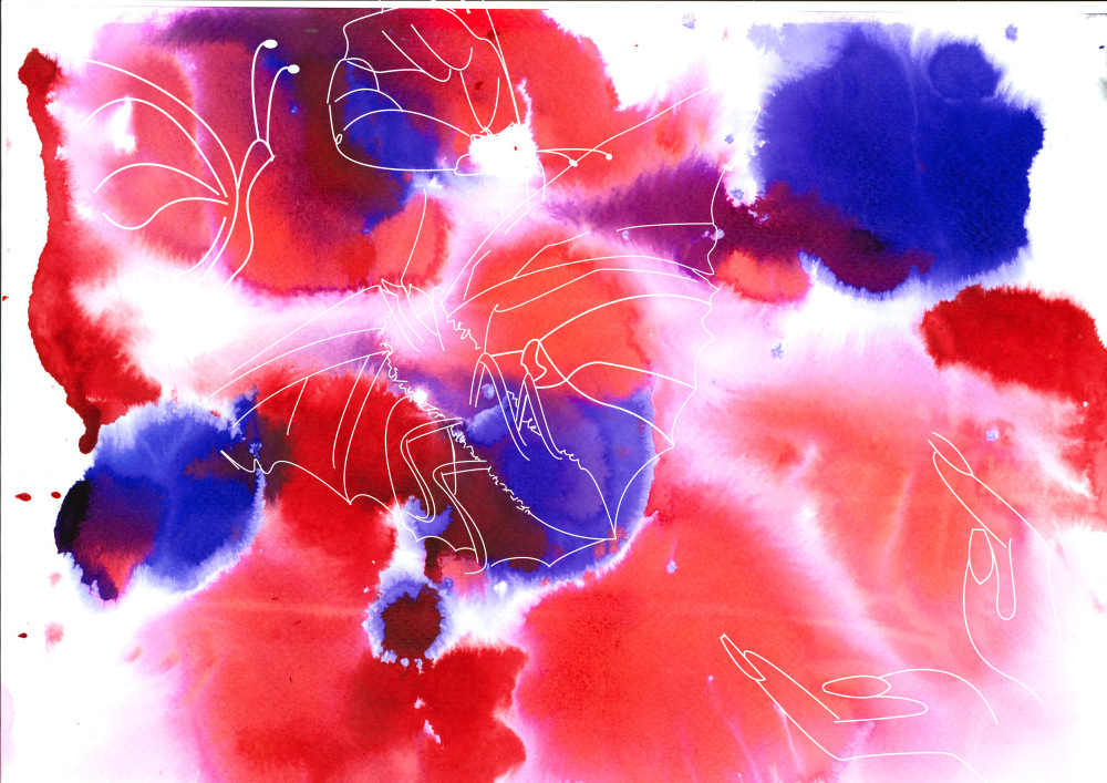
I feel free – This second illustration was originally portrait. Visually, something wasn’t quite right. Rotating it 90 degrees anti clockwise gave me this image. The movement in the image is now much clearer and it appears that the hands have let go of butterfly, marking the beginning of a journey, similar to that of ‘Fragile’. However unlike fragile, I’m able to view different shapes within the inks. The butterfly on the far left was free handed with the pen tool. The markings I saw were similar to that of a butterfly’s wing so using that as a starting point, began drawing the butterfly around it. It is easy to see I was drawing from memory, due to the poor quality of the drawing. If I was working off of primary sources, the imagery would be a lot stronger and more detailed. With the butterfly in the centre, I first noticed the white shape which to be appeared to be the butterflies body so I drew the figure around this shape and kept the white ink. By using the white within the painting and the white ink, wherever there is a feel of emptiness it represents the fact that butterflies can be upon your person without you knowing. Which started out as one of my biggest fear with the butterfly.
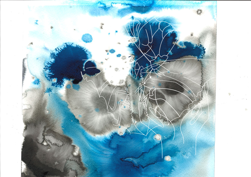
Never Alone – The title for the final illustration came from how connected each of the line drawings appear to be. Beginning with the butterfly with open wings, the placement came from the black ink splats and the stretched oval shape in the middle. Immediately, these were wings and the butterflies body and only this butterfly would fit that shape. When placing the hands, the hands protect the shape the black ink creates. It made me think of my sister and how she is my main protector now. The butterfly place at the top almost looks as though she is placing her hand on my shoulder. I connect this butterfly with my neighbour Trudy. While my sister is my main protector, Trudy has been a huge help in my road to recovery and I feel her forever on my shoulder. This illustration is very personal to me and reflects how I feel at this current moment within my life and whenever I feel down, this will remind me that I am never truly alone.
As a set of illustrations I feel they are all visually pleasing to the viewer however it does not reflect my subconscious mind. After analysing the dream and finding out how important both the butterfly and the colour of the butterfly are, these illustrations have failed to successfully portray the message. I have received amazing interest and feedback from all social media sites for all three illustrations but I fear that these will be viewed as nothing more then pretty pictures.
Advertisements Share this: