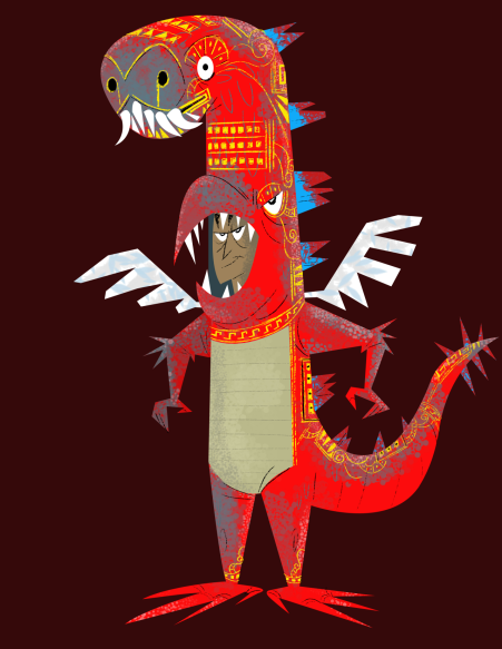
The excitement for Big Hero 6: The Series continues. at D23 last week Disney released a video of the new show’s opening credits. I am completely in love with them and if you haven’t seen them already, you can watch them here. They also released a preview of the series at Comic Con which you can watch here. With all this excitement over the tv show happening, I felt it was time to feature a piece of concept art of another member of the super hero team. Today I will be looking at the Fred, the geeky comic-book loving slacker of the group. This piece of concept art is by Chris Mitchell, and depicts an extremely early version of Fred, then called Fredzilla, in his monster super suit. One of the reasons I really like examining concept art of Fred, is because its a great illustration of both the similarities and differences between Disney’s Big Hero 6 and the Marvel comic book series it was adapted from.
In the original comic books Fred, or Fredzilla as his nickname was, had the power to summon a kaiju, a Japanese Godzilla-like monster, and control it in battle. The animators struggled with a way to retain some elements of the character’s original super power, while still making it suit their film and their version of Fred. For a while they experimented with having Fred himself be able to turn into a Japanese style monster, but this idea was eventually rejected. Then, playing off the films theme of using technology and science to create superheros, the film’s team experimented with having Fred be able to control holographic monsters made of hard-light that would battle for him. This idea was also eventually rejected. The directors then discovered a group in Japan called “Kaiju Big Battle”. These people would make their own monster suits and wrestle each other in rings full of tiny buildings. This sounded like the perfect thing for the nerdy character they were trying to create and inspired Fred’s Kaiju super suit.
The artist of this particular piece of concept art, Chris Mitchell, is not a Disney artist, but rather another outside artist the directors asked to help them with Big Hero 6‘s visual development process. The major reason for Chris Mitchell’s involvement in the film was probably his impressive cartoon show pedigree. Most notably he worked on another team of super heros, The Powerpuff Girls, as well as shows like Dexter’s Laboratory and Samurai Jack. All of those shows have a distinct art style which you can definitely see on display in this drawing. His cartoon experience made him an excellent choice in helping the Disney animators with the early design work on Fred. He helped design both the character’s super suit and mild-mannered alter ego. He created several different designs of multi-headed lizard monsters like this one for Fred’s super suit, many of which bear similarities to the kaiju’s final design. Little of his designs for Fred’s street clothes were retained in the final design though, as Mitchell saw the character as a punk-type with multi-coloured hair and spikey clothes. It was ultimately Shiyoon Kim who came up with Fred’s final design in that regard, by studying the style of Snowboarders and real-life comic book geeks.
Hope you enjoyed this look at an earlier version of Fred from Big Hero 6. I’m now half way through discussing every team member and the premiere of the new series is getting closer and closer. I could not be more excited for it.
Image Credit: http://www.gramunion.com/henshincyborg.tumblr.com/103077459854
Advertisements Share this:
