“A picture is worth a thousand words” or “A picture is worth ten thousand words” as Fred R.Barnard originally stated almost 100 years ago.
Even though photography has changed dramatically in the last century, a picture still can send off the message, unlike something you can explain in words. Some photos make you feel sadness, happiness, fear, and so many other things. Some tell a story of a family or a day on vacation.
No matter what it is, if it is taken well, the photo will end up speaking to you in ways you never realized. The way this is done is through “rules” of photography which will be shown below in a few examples.
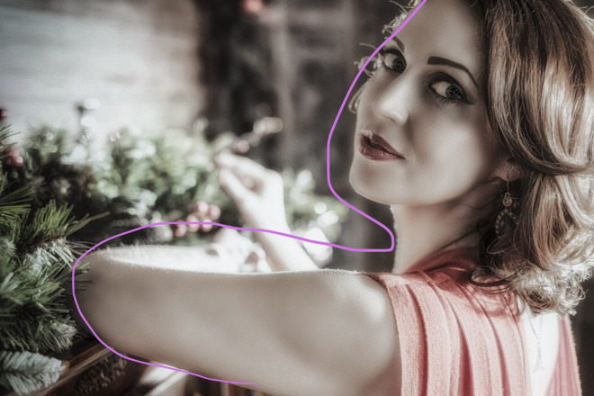
Example 1Below I included a modified portrait taken by a 42-year-old man from Yaroslavl/Россия. The photographer, Alexandr Ivanov, took this picture back in December of 2015 and it was posted in March of 2016. The artist also has a portfolio on Pixabay.
(Click here for original page)

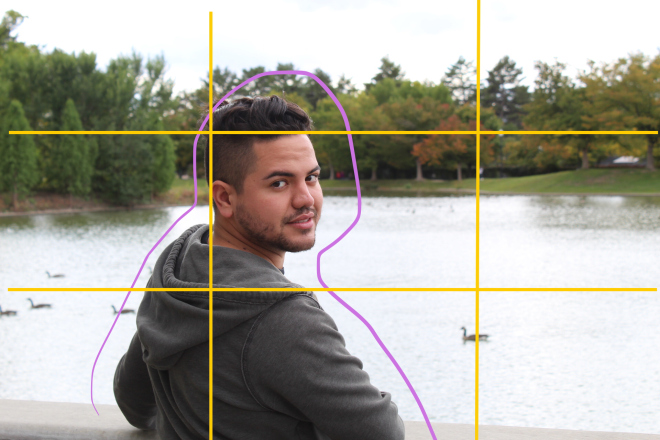
The first thing that stood out to me when looking at the picture was the photographer’s use of depth of field. The subject of the photo is very soft, yet detailed and clear. Whereas the background and “extra” information in the photograph is blurred out to direct your eyes in the right direction. I used the purple line to separate the blurred out background and the clear subject.
Additionally, you can see an indirect correlation between the lines in the shot. The lines of her arm lead toward the mantle, and the light hitting her arm deeper into the shot brings you back into the shot and toward her face. I used the blue pen on the image below to show the direction the lines are taking your eyes.
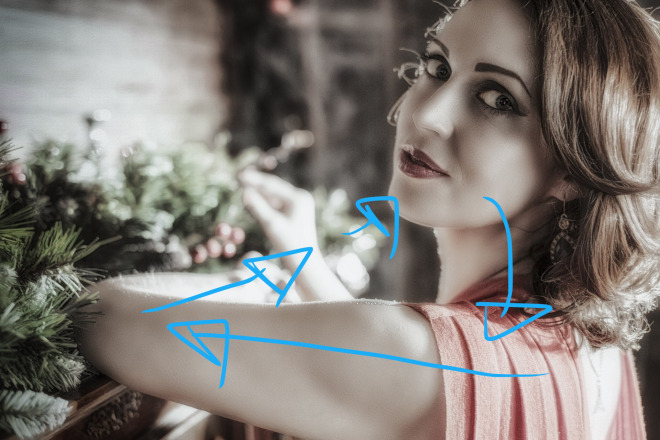
The final feature that I noticed in this image was the use of the rule of thirds. There are actually two parts of that in play within this image. The first being her arm goes directly along the bottom plane. The second is her face and the brightness of certain aspects of her face is at the meeting point for those imaginary lines in the photo. I used the yellow pen over the image below to show where the grid would appear.

I photographed my friend Adiel in order to attempt to recreate the style of the artist above. I chose to follow the rule of thirds as well as include depth of field in the shot. My attempt to use the leading lines was poorly executed but the other two aspects were seen in the photo below. I included the original shot, as well as the photo that shows which style aspects were applied.

Below is the photo showing a combination of what rules were applied in this shot. You can see the blurred out background with the purple lines, and the yellow lines show how the left plane goes through the subject.
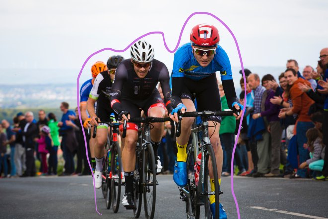
Actions shots are easy to make errors with, especially when attempting to get just the right shot, at the right time, from the right angle. The photographer for the photo below is Markus Spiske from Bavaria, Germany. It was taken at what it looks like as a bike race in Marloffstein, Germany.
(Click here for the original post)
 The first aspect that I noticed in this image was the diagonal lines across the helmets of the bikers. This is something commonly used to show action and that is absolutely perfect for this image. In the image below, the pink colored line shows that line going diagonally through. The picture below also shows a green line where the bottom plane of the rule of thirds would be located.

This photo also uses depth of field in order to focus in on the center subject, which would be the bikers. It is obvious what is in the background, but your eye is directed toward the bikers. Below is an image outlining the point of clarity, and the blurred background. There are also a lot of design principles used in this shot such as repetition and alignment with the tires and each other, as well as the tires and the road.
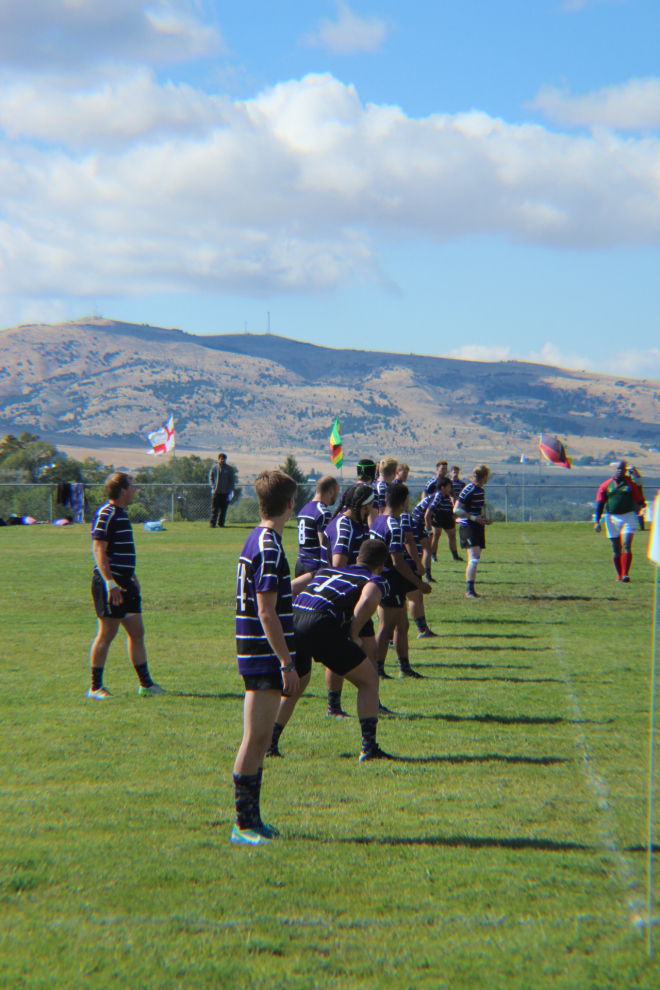
The photo I took was at a rugby game that my cousin was playing in. This was a sporting event and even in times that were calmer, I wanted to use the same effects to show the action that the sport holds. There are two diagonal lines (in pink) leading you deeper into the photo, as well as the horizontal line (in green) that is located on the top plane for the rule of thirds.
There are two diagonal lines (in pink) leading you deeper into the photo, as well as the horizontal line (in green) that is located on the top plane to separate the forward and background.
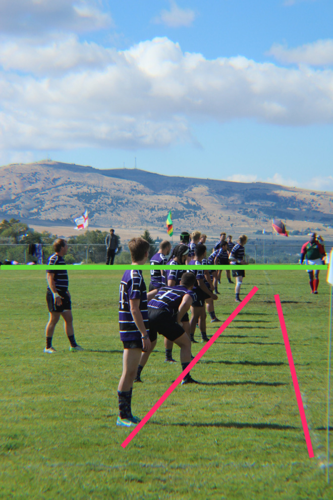
The photo also includes minor depth of field details. The players in the center are more focused on than the grass and other details surrounding them.

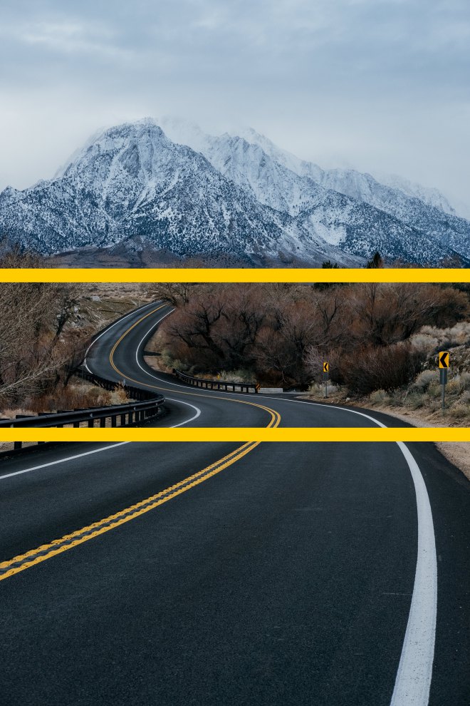
This photograph is a still shot by Matt McK found on Unsplash. There is no additional information in regards to the photographer on the website. There is information though, that states the photo was taken on Whitney Portal Road, Lone Pine, United States during the winter months.
(Click here for the original post)

The main element used here is the use of leading lines. The photographer used the brightness of the road, as well as the paint on the road to draw our attention and then follow the road up toward the mountains.

The photographer also separated the different grounds in the image. This creates depth to an otherwise 2D shot. There is a foreground, midground, and background to the image. They are outlined in the image below.
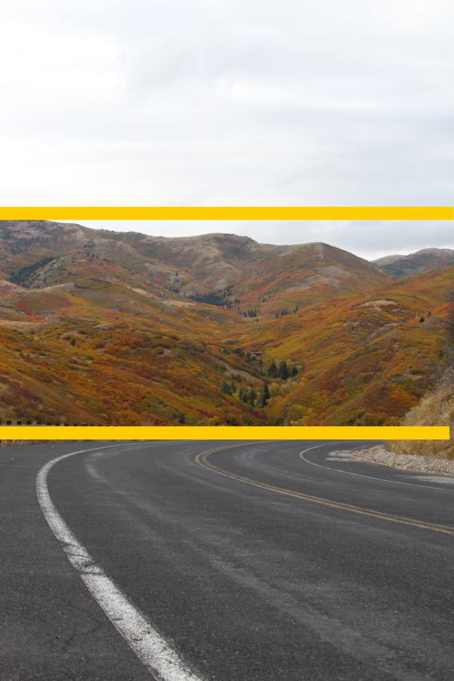
The image I took was something similar. It actually took me quite a few shots to have it line up the correct way to have the road lead your eye up the canyon in the mountain. The image is below.

You can see in the image the use of the leading lines to direct you up the mountain within the trees. I highlighted this below to make it clear exactly where it was going. The angle had to perfect within this shot to have those two line up.

I also made sure to include layers in my shot as well. Showing a foreground and background mainly, but the sky could also be considered as one of the extra layers as well. Splitting the image into three sections.
Overall, the challenge to recreate the images was not the most difficult part, but really analyzing the elements and why the photographer chose to include them. It was an interesting experience for me to realize why things looked better by following these rules. I really enjoyed learning about the rule of thirds especially because before I simply did not like to center things because I did not like the way it looked. Knowing these principles has already helped me to look at photography and pictures in a much different way. I caught myself trying to frame my subjects and complaining about how much better the shot would have been if I had certain elements to plan the shot around.
Advertisements Share this: