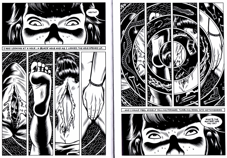
 Fig.01: Pages 4 and 5 from Charles Burns graphic novel Black Hole. The novel opens with a vision: experienced by the character, Keith, as he faints dissecting a frog in biology class. The images in this vision foreshadow many of the events that unfold later in the novel.
In this post, I will complete a visual analysis of the opening vision from Charles Burns’ graphic novel ‘Black Hole’ (Burns, 2008).
For those unfamiliar with the graphic novel, the story follows a group of high school students in Seattle area in the mid-1970’s. The story is told from the point of view of two teenagers, Keith and Chris, in the aftermath of a sexually transmitted plague. The plague or “bug” manifests itself as grotesque mutations with the worst infected shunned by society and forced to hide in the woods.
For my visual analysis, I will research Burns’ art-style and influences before examining the visual themes presented in the vision sequence. I will investigate Burns’ use of visual devices and procedures to garner an uncanny sense in his readers. Finally, I will examine his use of page layout and composition for the sequence.
Art Style and Influences
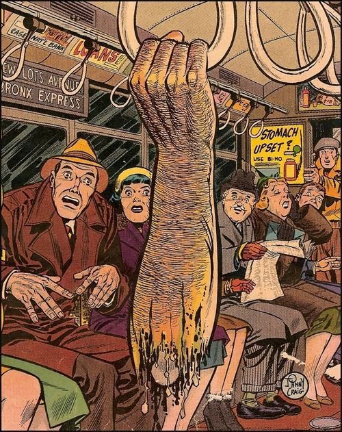 Fig.02: The Vault of Horror No. 30 Cover Image (1953) Published by EC Comics Pencils by Johnny Craig. Burns cites Johnny Craig as an influence along with other EC Comics alumni George Evans, Al Feldstein, and Reed Crandall. This image is particularly relevant as disembodied limbs play a key role in his graphic novel ‘Black Hole’.
In his graphic novel Black Hole, Burns uses his trademark retro 1950’s art-style. The style is reminiscent of American horror comics of that period, such as EC Comics, Eerie and Creepy. However, Burns differentiates his style by rendering his characters and environments in stark black and white, using razor-sharp edges to the imply shape and form. Speaking of his use of stark black and white, Burns tried to “achieve something that’s almost like a visceral effect. The quality of the lines and the density of the black take on a character of their own—it’s something that has an effect on your subconscious.” (Chute and Burns, 2008)
This stark quality is reminiscent of Japanese woodblocks, a key influence on his style. Burns learned the method when taking a college course in printmaking. In an interview with Darcy Sullivan for the Comics Journal, Burns spoke of his introduction to woodblock printing.
I’d always liked the look of Japanese woodblocks, and in a college course in printmaking, I learned how to do the traditional method of woodblock printing. Some earlier comics of mine have that crude Japanese perspective with no vanishing points, and Japanese-type characters. (Sullivan and Burns, 1992)
 Fig.03: Panels from an early Charles Burns’ comic ‘Big Baby’, an example of the Japanese woodblock influence on his style and characters.
In Black Hole, the character designs have realistic human proportions and are not heavily exaggerated or overly stylised. They do, however, have an odd quality, an uncanniness, in part due to the shape and placement of the facial features.
In Fig.01, the shapes of the eye design are unusual, a semi-circular design on an otherwise realistic rendering of a face. The placement of the eyes are also unusual, they are twice the distance apart of standard proportions in a human face.
Black Hole is a clear progression in Burns art style but also designed for the needs of the storytelling. The novel is a realistic style of horror but also plays out like a teen drama, the art style reflects this.
Visual Themes and the Uncanny
In Black Hole, Burns continues to visit the themes of his earlier work. Alienation, peer pressure, puberty angst and sexual anxieties are all major themes in the work. From a horror perspective, body transformation and physical mutation are central to the plot.
The setting is a typical suburban American neighborhood but something horrific lies underneath. Burns establishes a mundane suburban existence to create a sense of familiarity in the reader. The characters of Black Hole then undergo uncanny, unfamiliar experiences to create a sense of unease.In her article on the uncanny, Laura Perna (2009) proposes that Ernst Jentsch’s and Sigmund Freud’s essays on the topic provide insight into Burns choices. According to Perna, “both note that the uncanny operates on a dynamic of uncertainty: the feeling arising from an oscillation between the familiar and the unfamiliar.” (Perna, 2009, P. 7)
Applying this theory to the opening vision, Burns first establishes a mundane setting of a high-school science lab. The main characters, Keith and Chris, sit together in awkward silence. They’re tasked with dissecting a frog; a familiar but unsettling experience for most high-school students.
Burns then shifts to the unfamiliar, a vision from Keith’s mind’s eye. As Keith loses consciousness, Burns presents the reader with four images. The frog sliced open, a wound at the bottom of a foot, a person’s back tearing open and a hand covering genitals. As the vision progresses, these images intertwine with natural and man-made objects such snakes, tadpoles, guns and broken glass. The reader will revisit these images throughout the work. This initial vision “exemplifies how Burns integrates internal visions, the scrambling of the narrative sequence, and the repetition and distortion of specific images to destabilise the reader’s certainty about the sequence of events and to create a sense of déjà vu.” (Perna, 2009, P. 13)Layout and Composition
Using Frank Santoro’s layout grid method, I will ‘break down’ the opening vision sequences page layout and composition. While Burn’s does not use a traditional panel grid arrangement for the two-page spread, however, he has clearly considered the static and dynamic symmetries in his compositions.
For most of the novel, Burns uses a three-tier layout, occasionally switching to four-tiers but these panel grids vary are varied depending on the needs of the story.
However, for this vision sequence, Burns uses a two-tier layout, a narrow rectangle showing a close up of Keith’s eyes and a square subdivided into four panels illustrating his mind’s eye.
 Fig.04: Frank Santoro’s Layout Grid applied to the live area of pages 4 and 5 from the graphic novel ‘Black Hole’. Santoro recommends this method to help “break down” the compositional devices used by the comics artist.
What is particularly interesting is his mirroring or doubling of the page layouts. Page 5 is a reversed or inverted mirror image of Page 4’s page layout. This theme of doubling is used throughout the novel. According to Perna (2009), Burns places doubles throughout the narrative, with character resemblances, events, and images used to create a temporal disorientation to create a sense of déjá vu.
Not only does Burns apply this device to characters and events but also his page layout and panel compositions.
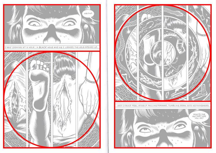 Fig.05: A simplified layout grid, isolating the rectangle, square and circle composition devices used in Burns page layout. This clearly illustrates how page 5 is an inverted mirror of page 4’s composition, playing on the use of doubles throughout the novel.
Final Thoughts
I have only scratched the surface with this visual analysis as the opening vision foreshadows much of the later events, visuals, and themes found in the novel. As I write this, I can see that the recurring motif of the cuts, tears and the visual representation of the ‘Black Hole’ itself require further analysis and interpretation of meaning. But that’s for another day.
References
Burns, C. (2008). Black Hole. New York, NY: Pantheon.Perna, L. (2009). “THERE WAS SOMETHING SCREWY GOING ON . . . ”: THE UNCANNY IN CHARLES BURNS’S GRAPHIC NOVEL BLACK HOLE. The Birmingham Journal of Literature and Language, [online] 22, pp.7-15.Harkham, S. and Burns, C. (2010). Charles Burns. [online] Vice. Available at: https://www.vice.com/sv/article/xdvyxn/charles-burns-640-v17n12 [Accessed 5 Dec. 2017].
Sullivan, D. and Burns, C. (1992). The Charles Burns Interview by Darcy Sullivan | The Comics Journal. [online] Tcj.com. Available at: http://www.tcj.com/the-charles-burns-interview-by-darcy-sullivan/ [Accessed 5 Dec. 2017].
Chute, H. and Burns, C. (2008). The Believer – Interview with Charles Burns. [online] The Believer. Available at: https://www.believermag.com/issues/200801/?read=interview_burns [Accessed 5 Dec. 2017].
Figures
Burns, C. (2008). Black Hole. New York, NY: Pantheon, PP. 4 – 5.
EC Comics (1953). The Vault of Horror No. 30 Cover Image. [image] Available at: https://www.pinterest.co.uk/pin/326229566732235331/ [Accessed 5 Dec. 2017].
Burns, C. (1992). Panels from Charles Burns’ Big Baby. [image] Available at: http://www.tcj.com/the-charles-burns-interview-by-darcy-sullivan/ [Accessed 5 Dec. 2017].
Advertisements Share this: