Having (pretty much) finished my literature degree, I decided it was also time to finish my blogging break. There’s a whole world of books still to read! And let’s face it, no one has time for sub-par stories, so here are my top five creative covers to books I probably haven’t read. They look great, though.
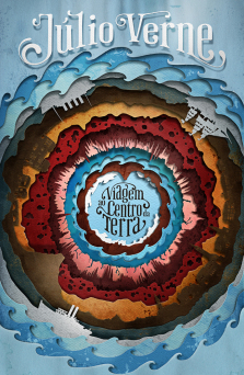 It’s 3D and beautiful and 3D. And we all thought Jules Verne couldn’t get any better.
2. Ray Bradbury – Farenheit 451 (Design by Elisabeth Perez)
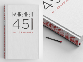 It’s a literal matchbook. This design is smart and cool and a little terrifying. (Spoilers just so we’re all on the same page – it’s a Dystopian about burning books)
3. Lauren Beukes – Zoo City (Designed by Joey Hi-Fi)
 How amazing is this typography, though? This blows my mind.
4. Mary Shelley – Frankenstein (Designed by Pol Alert)
 Why yes, that is real meat. This one is so grim that I nearly didn’t include it…but someone spent all that time sewing slabs of raw meat together, and I think we have to honour that.
5. On Such a Full Sea – Chang-Rae Lee (Designed by Yentus and Markerbot Studios)
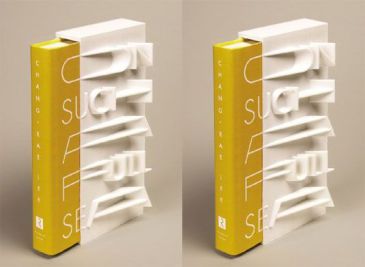 I just can’t get over the 3D stuff. It’s just a slip, so you can take it off and still have a wonderful reading experience, but I guess you’d have to store it by itself rather than on a shelf? It looks cool, but maybe not practical at all?
So there were my top five creative book covers – what books would have made it onto your list? And how are we feeling about 3D covers?
Thanks for reading, and have a lovely day!
Dani
Advertisements Share this: