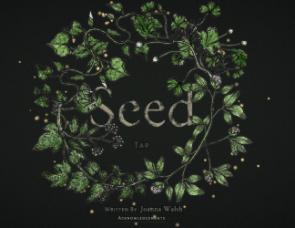
The first thing one notices about Joanna Walsh’s online novella Seed is the quality of the design. Seed’s aesthetic is very consistent, and was obviously designed with an eye to the material at hand. For all this we have its illustrator Charlotte Hicks to thank, as well as the digital publishing company responsible for designing the platform on which the text is hosted. Seed is optimised for iOS, and, as the site tells us, is probably better viewed there, but it can also be read on a laptop or a PC.
The reader begins by being presented with seventeen different plants which open up onto different lexia, with suggestive and minimalistic titles such as ‘Baby’, ‘Touch’ or ‘Red’. Each one gives a brief insight into the life of an eighteen year old woman living in a middle-class housing estate in suburban England, coming to terms with herself, her environment, the people around her and the reality of her incipient young adulthood. By presenting the reader with seventeen different starting points (ignoring the opening explanatory remarks for a moment), and the means of proceeding in any way they might choose, the text emulates the same provisional and tentative steps that the narrator concurrently takes in the development of her own identity. In an interview, Walsh explains that the rhizoidal orientation of the text provided her with the opportunity to disorientate the reader, and perhaps engender in them the same uncertainty that the protagonist of the novella may be feeling at any given time, so that the reader has:
no sense of reading left to right, of the weight of the book, of how far they were through, or, sometimes, of the direction within the narrative.
Seed is therefore doing very deliberate and self-conscious things with the particularities of its format, typical of texts which, overtly or otherwise, draw attention to their digitality. Insofar as a firm distinction can be drawn between these two facets of the work, Seed therefore introduces a coherence/tension between its form and its content.
In a design quirk which enables this sense of openness that Seed conveys, the reader has the option of changing the text’s visual interface in order to display differently-coloured vines intertwined between each of the plants. The colours refer to each lexia’s subject matter, and inverts the standardised and industrial nature of colour-coding, a tendency, or obssession, that the narrator exhibits throughout the text:
Fruits in the supermarket. They’re a different species. Those strawberries all white in the middle all the year round, like crunchy peaches. Everything so shiny. Not a speck of earth anywhere. Why would there be? It goes straight from the formica shed to our formica kitchen. Once cut my mother wraps it in cling film and puts it in the fridge.
The narrator’s sustained attention to post-industrial artefacts, the symptoms of contemporary, or then-contemporary suburban living, is the strongest aspect of Seed. The narrator’s oscillation between a tone of matter-of-fact inventory and syntax-rupturing anxiety, enacts the very process of interpretation and the fact that so much narrative time is deployed in coming to terms with such quotidian objects, made to seem strange by their presence in a narrative medium known for attention to other, less strange things, intensifies the effect:
The doves in our garden say something else no they say somewhere else from their tall perspective looking down on lawns mowed with stripes, somewhere nature isn’t the same kind we have round here.
The site’s drawing together of Seed’s structure and content, finds a corollary in the text’s actual word usage. Walsh uses leitmotifs, particularly the names of plants or descriptions of colours in order to string each unit of text together with one another in more subtle ways, without making use of an overt visual interface.
It should be noted that the text is not as radically discontinuous as it might at first seem, or certainly was not regarded as such by Walsh, who said the following in an interview:
I’ve been thinking about the authority I’m still claiming as an ‘author’ in Seed; despite the degree of reader-control offered by the project, it’s still a fairly traditional ‘authorial’ work.
I had to write Seed as a linear text to ensure it will read ok for anyone who wants to follow the temporal narrative. That said, I never write in a ‘linear’ fashion, but in one that resembles the Seed reading experience: I write phrases, notes, paragraphs, then brings them together on shuffle, until they work.
Walsh’s comments may be surprising for those familiar with her writing methodology, which involves the use of cut-ups, or other aleatoric methods which introduce an element of chance into the composition process. It is surprising also, for those who are familiar with the somewhat niche history of digital or hypertextual literature. For many of hypertext’s trailblazing practitioners, such as Shelley Jackson or Michael Joyce, the crux of hypertextual literature was the game-playing that new digital formats allowed the author to engage in as an absent centre of meaning, which expedited the then-extremely trendy dalliances with post-structuralist philosophy and critical theory in a digital context. Within Seed’s units of text after all, there is no opportunity for interaction, except insofar as the text requires you to turn the page. In an interview with Review31, Walsh described how Seed barely resembles a hypertext in the original sense of the term at all, and that it is much better understood as a traditional work focalised around the author’s vision.
This is true, firstly for the structural reasons already outlined, but also because Seed’s formal architecture is best understood as functioning in the same way as literary works in print do, in that they imply, or gesture, far more readily than they state directly. This is axiomatic for all novels worthy of the name, but it presents an interesting means of thinking about how narrative works in the context of Seed in particular. While it might seem to present some amount of freedom or capacity for interaction, Seed is in fact circumscribing you even as it offers the chance of liberation. This has a nice visual metaphor in Seed’s visual interface which deliberately places a number of other flowers beyond the reader’s reach in darkness, suggesting both the thwarted ambition to move beyond the text that we’re presented with, and, as I’ve said already, the myopia of the narrator in her own environment:
it’s a fairly tight work, and I’ve said what I wanted to say in it. I love the idea of locked passages: part of my intent was to create a feeling of implied space beyond what is described (isn’t that the intent of most novels, to create, in however abstract a sense, a ‘world’, even if ‘world’ means a set of conceptual parameters?). I’d like to do a print edition to see if and how the circle of nonlinearity could be squared.
Though we have the ability to read Seed in any order we might like, each section is up to five pages long, and therefore requires us to read chronologically for a far greater length of time than hypertexts of the nineties do. Whether this can be attributed to the now mainstream nature of micro-textual formats, which requires literature to aspire to something else is probably a question for others to answer. Personally speaking, if writers working digitally can produce works as good as Seed, I won’t be unduly detained by the sociological reasonings why.
Advertisements Share this:- More


