Another day, another Makeover Monday. Eight days into the New Year and we are onto Week 2 in which Eva chose the topic of “Looks v. Personalities” in which it’s based around the dataset from YouGov on the characteristics of the twenty countries that were part of the study.
On a personal front, I really struggled with this dataset to find an interesting story but at the same time I enjoyed it because it pushed me to think outside the box when coming up with a viz.
Here is the original visualisation from YouGov which shows the ranked British relationship characteristics.
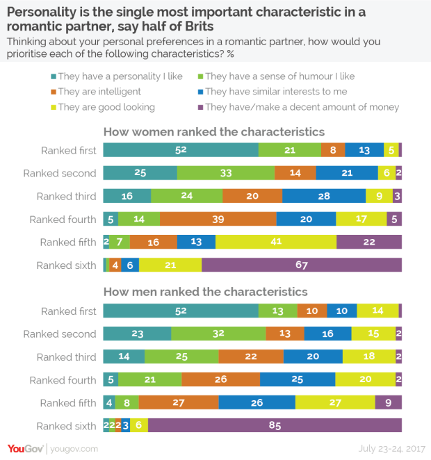
- Each of the legends is easily corresponded to the characteristic in the ranked sections below in the bars.
- A nice, concise headline which goes straight into the subject matter of British relationship characteristics.
- Separating the charts for both men and women makes it easy to identify the characteristics of both genders.
- The colours that form the bar portion can be quite overwhelming to look at and can make it difficult to identify what portion of the bar is adding up to 100%.
- Instead of having a stacked bar chart, think about alternative charts that add up to 100% without it being too difficult visually (i.e. donut chart).
With that said, I really enjoyed this week’s Makeover Monday dataset. I focused on the value of intelligence within Asian and Arabian relationships which was quite an interesting area to look at.
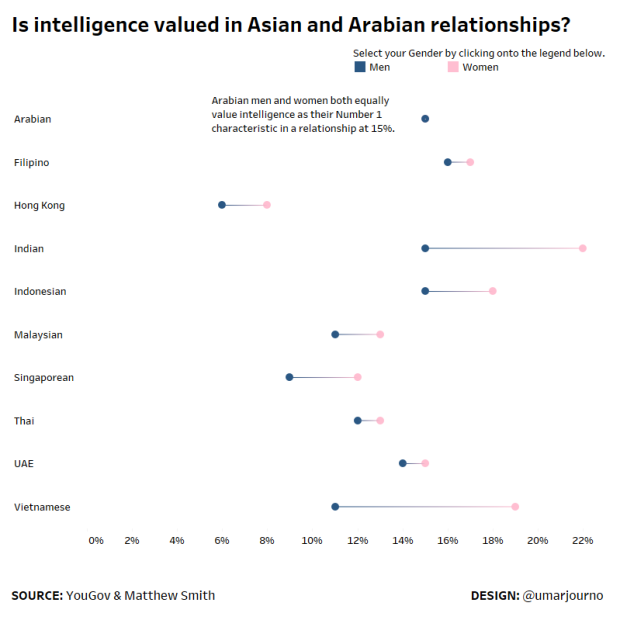
When I did publish the first iteration of my viz, I immediately got some feedback from Charlie Hutcheson on the ways I could possibly improve it for the viewer.
I'm not sure the highlighter brings anything to the table Umar. I'd consider losing it, and just find a way to incorporate the legend in a subtitle to save a bit of space.
— Charlie Hutcheson (@CharlieHTableau) January 8, 2018
Following on from Charlie’s feedback on Twitter, I removed the highlighter from the dashboard. But then I had another problem for viewers interacting with my viz, how would they tell by the colours which is men or women within the barbell chart?
 Charlie once again gave me more feedback that proved very valuable towards my dataviz development on Twitter.
Without interactivity, how could viewers determine what the different colours mean? I'd look to find a way to overcome that information gap, and maybe find a non-annotated way to overcome the Arabian equal value issue.
— Charlie Hutcheson (@CharlieHTableau) January 8, 2018
With that said, I looked to highlight the colours in the title of my viz so that the viewer could understand it quickly enough without having to interact with the tooltips in Tableau Public.
Here is the final visualisation which you can view on Tableau Public by clicking on the static image below. Thank you to Charlie for the feedback as I have definitely learned quite a lot about best practice for creating data visualisations either in Tableau or RStudio.

Share this: