I am a little delayed in delivering last weeks post dealing with the critique and examination of my photographs. This is purely because I have been writing like crazy to complete a draft version of my essay for this particular module.
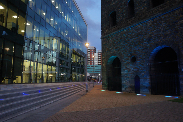
“Contrasting the Old and the New Buildings”
I was was initially unsure about the coloured lights in the right hand building. However, the bluet-green colours compliment the overall composition of the photo. Potentially should concentrate on the modern building as there is possibly too much information in the whole image. Try to zone in a little more so it is instantly known what we are looking at. The idea of empty offices has great potential. The glass works well. Twilight is a perfect time of day for this sort of photograph over true nighttime. Dealing with an impenetrable building but is at the same time very transparent. Almost a façade. Start to isolate the iconography. Colour’s work well.
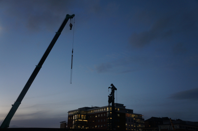
“Crane”
Minimalist shot. Silhouette is attractive. I like the shot, it is nearly there but it is slightly missing something to just complete the image. Silhouettes can get a little bit sentimental. Slight awkward areas and overlaps are not ideal. Beautiful shot but we are more interested in where I am rather than the photograph itself. Maybe needed to be even more extreme in the minimal sense. Cut out the building and show only the crane? Good capture of the sky.
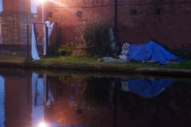
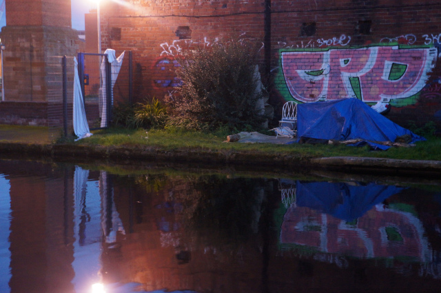
“Evidence/Evidence pre-edit”
The original image of course showed the graffiti. Edited it out because graffiti is not suitable at all. Showcasing someone else’s work is not showcasing your own work therefore is poor. When critiqued, the white sheets were of most interest. Sheets were like curtains parting a window or leading the way into the next room where of course a room doesn’t exist. Again, could have zoned in the focus to just show the sheets and the fence. Moderately successful.
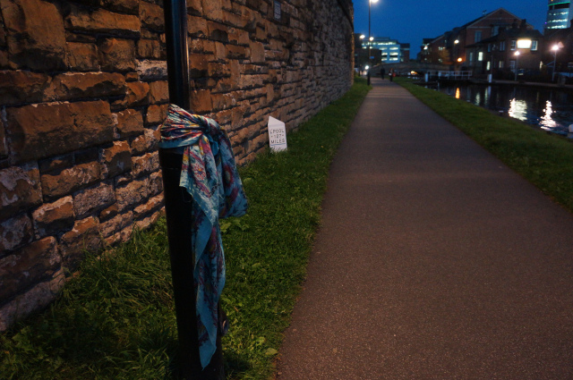
“Scarf Tribute”
More like the idea of how I need to progress. Really push the message and show us my idea. Give the audience this kind of certainty. Sometimes I give to wide a view and you can loose an audiences’ focus. Bare this in my mind when going forth into next weeks’ shoots.
