(From a 8/24/17 webcast on uie.com’s All You Can Learn section, soon to be posted on their site)
Stephen identifies 6 kinds of friction:
- Bad friction
- Is negative and noticeable
- Example: When you click a link on Twitter for a LinkedIn article, and you get a popup making you sign into LinkedIn even though you are already logged into the LinkedIn website
- Avoid bad friction using user interviews, reviewing server logs/site date, using plain language, sticking with familiar UX patterns etc
- Unseen friction
- Is negative, but goes unnoticed until fixed
- Example: Photographing your credit card and not having to type that long number in anymore
- To get support to fix the unseen, show rather than tell the issue and test to prove the issue’s existence/validity
- Solve issues via smart defaults; machine intelligence; learning from analogous experiences; exploring newest tech solutions
- Boundary friction
- Is a lack of seamless experience across multiple contexts
- Example: Without being logged in, YouTube can’t remember your place in a video on different devices. Life before iOS introduced its HandOff feature
- Often occurs due to org silos, lack of a shared focus across produce teams
- Solve by focusing on touchpoints and seams/handoffs; taking a services orientation; focusing on intentions and desired outcomes over tasks and features; exploring newest tech solutions
- Intentional friction
- When friction is mindfully added to an experience for a specific reason (often a security reason)—rarely used
- Example: Forcing people to create stronger passwords via password requirements
- Emphasizes quality of experience over speed, ease of use etc
- Solve by role-playing the interaction you are considering to create your “speed bump”
- Learning friction
- Games & play experiences use this extensively
- Can be easy to use while still presenting a fun, challenging problem
- Non-game example: Choosing the best healthcare plan via a wizard that sets up a comparison chart to select from
- We usually shield users from this friction
- Solve with smart interaction design patterns; playful interactions; providing sense of accomplishment as users are learn/master the experience
- External friction
- Usually something we cannot/should not change—beyond our UX ability
- Example: Industry regulations, common legal practices
- Assess whether the cost of hacking this friction is really worth it
Can you use friction to reframe an experience to have richer learning opportunities and stronger user payoffs?
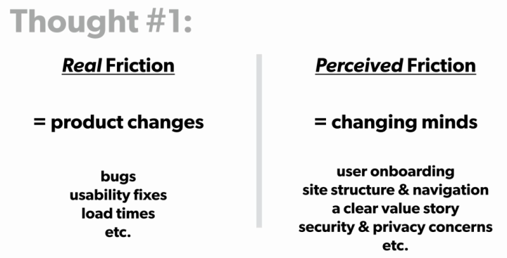
Stephen offered some final thoughts on friction:

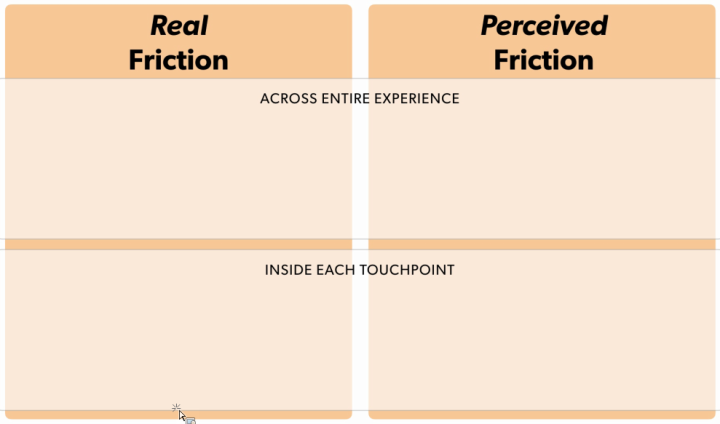
Here’s an method to help define issues:

About Stephen (from LinkedIn): Stephen P. Anderson is an internationally recognized speaker and consultant based out of Dallas, Texas. Stephen is most recognized as the man behind the Mental Notes card deck—a tool that’s widely used by product teams to apply psychology to interaction design. He also authored Seductive Interaction Design, which answers the question: “How do we get people to fall in love with our applications?”
Between public speaking and project work, Stephen loves to challenge and inspire teams through onsite training; he’s presented at some of the world’s largest organizations, teaching product teams about games, play, learning, interactive visualizations, and other fun topics.
Advertisements Share this:


