So far I have been practising putting the film together just using random stills and video clips so I know how Premiere works & what kind of look I need from the final film. I had already decide upon using an overlay of video interference to reference a 1980’s aesthetic and to use coloured slides to mix and merge the content in order to make what was visible less factual and give an atmosphere of dream that merges with nightmare.
After the first interview shoot I discovered my initial attempts at lens whacking were pretty poor. A tripod will definitely help to cut down the awkwardness & camera shake. Even if you are then forced to stay in one spot then re-arrange for the next setup. That being said … I still dropped the short sequence into the Premiere Project and was extremely surprised at how atmospheric it looks. Most of the still images I captured really did not fit the aesthetic … they are too obvious; too easily recognised for what they were. I shall need to be looking for something more esoteric, out of focus maybe; that will create an atmosphere as opposed to describing an object.
The second interview shoot resulted in very little usable dialogue, but I was a lot happier with the still images I was able to capture. Again I cannot put my finger on what sort of images seem to work best when dropped into the film…I seemed to be wandering around snapping at random; just objects and vignettes around his home without any real idea of what may work best within the film. This seems to be the best solution as I cannot tell what gives the best atmosphere until it is combined with the overlay and coloured slides.
Password = FalmouthMA
So after a highly productive week I actually have a first draft of the film to see what works & what needs working on (see above; password is FalmouthMA). I am a little surprised how short 3 minutes is as I have almost filled the time with the voice-over already. As for the still images and short video clips…some are a lot better than I could have hoped for; some just do not work & some of the clips are too long so will need trimming & something captured to fill the space.
The first clip sets the scene in Cornwall with a tender advertising boat trips…it has since been pointed out to me they are run by a notorious local family who are constantly infighting and calling each other ‘paedophile’ on the local pier where they tout their trips; an immense sense of irony here as one of the brothers committed suicide a few years back when the family discovered he was gay.
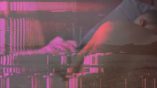
The film is built up of the video distortion, a static video shot of the sea shore, a series of colour overlays all mixed with stills and moving image that help to support the background of the verbal narrative…this consists of scenes that signify Cornwall along with stills taken of the participants home to symbolise their comfort zone. The narrative of the film being what people living with HIV in a rural community have experienced and in particular to educate the viewer about ‘Undetectable = Untransmittable’.
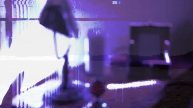
Some of the most effective sections are the following… The married couple displayed lovingly in the photoframe that signifies the bosom of the family we are often excluded from. The cut flowers in a bleached-out overlay…cut flowers were traditionally loathed by prostitutes as they signify beauty cut down in its prime. The reclining naked form appears to be sleeping peacefully as his form merges into the seascape on the right side of the frame. And the still life of lamp frame and form; out of focus and a simple sign of domesticity.