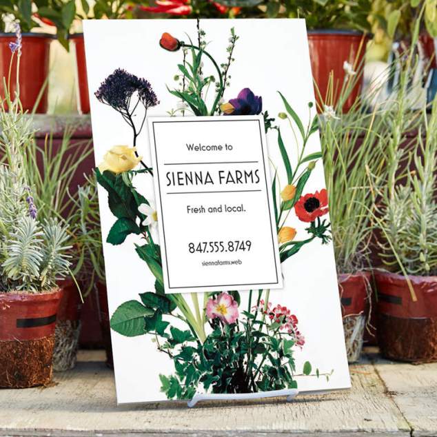
One of my pet peeves – booths who only have their name on the front of their table. The moment a customer steps up to your table you have to keep the name recognition going – on the top of the table, on the wall behind you – on your product and on you! Keep it memorable: Name, logo, website, physical location and telephone number! You might suggest your customers take out their cell phone and take a photo of your signage.
These tips come from Vista Print – one of my go-to printers, with a great guarantee too. 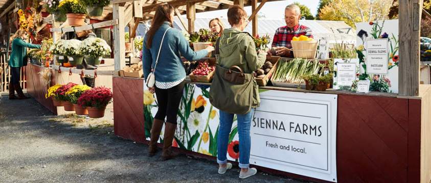
A helpful first step is to get a feel for the event you’re planning to attend – what the space will be like and how other competing businesses are likely to present themselves. Try looking up images of the event if it’s run before, or if it’s a new event, pay a visit to the location and think about how you’ll need to stand out. Will you be on a street or in a more natural outdoor setting? How many other stands or stalls are there likely to be? The more you can picture the scene, the better prepared you’ll be to create the right presence for your business.
Simple tips for looking professional- Embrace space
When you have space to play with, it can be tempting to fill it with text and images just because you can! But you could also do yourself a disservice. Remember that people have many distractions at events so you need to compete for their attention – the best way to do this is to give them clear, minimal information that’s easy to scan and take in. - Be hierarchical
You’ll want to grab people’s attention and quickly get your message across. The way to achieve this through design is by creating a clear hierarchy of information, varying the size of your copy by importance so visitors know where to look. For example, key pieces of information such as your strapline, main offering and phone number should be more prominent. Also, be strict with yourself when deciding what details to include – focus on what customers want to know and make it easily scannable, using bullet lists where needed. - Use fewer fonts
There are so many fonts and typefaces to choose from but when it comes to creating a professional look, less is definitely more. When attending an outdoor event, you’ll want to stand out and create a clean, consistent look. So, when it comes to fonts, stick to one or two maximum. - Limit your colors
The same applies to your color palette. Sticking to just a few colors will help create a stronger sense of identity for your business. Choose the main color from your logo as the “lead”, with no more than one or two to complement it. Also, consider the space you’ll be in – will there be buildings or parkland in the background? If green is your main color but you’re going to be surrounded by trees, you might want to use a white background to create contrast so you’ll stand out. - Choose high resolution imagery
If you’re going to include photos on any of your products – especially if you’re going to print them at a large size, it’s essential that they are 300 dpi (dots per inch) resolution. Don’t stretch or enlarge images to fill a space as this will make them appear pixelated, grainy and of poor quality – which isn’t the look you want for your business.
 Give each product a ‘role’
Remember that when you attend an outdoor event, you’re putting your business on show – with you and your team playing the leading role. So, think about how the different products you take can be your supporting ‘cast’, acting as useful props to help you make the strongest impact, both on the day and later as prospects you meet turn into customers.
- Banners for getting noticed
Large banners should be clean and simple to have maximum impact. Treat them as flags rather than advertisements, making your presence known and confidently inviting people in. Your name and logo should suffice. Once people come closer, you can let your other products do the work. - Posters to draw people in
Hopefully your booth will be buzzing with people – the challenge is being able to attend to every one of them. Posters can help entice and ‘warm up’ visitors while they’re waiting to speak to you or try products. Keep them simple with a clear message. Remember you’ll want people to read them from a few meters away, so keep this in mind when choosing your font sizes. - Flyers to create awareness
Flyers are great for handing out to invite people to your booth or stall, or to visit your store on another day. You’ll probably want to include some details about your products and services – but again, don’t overload them with info as it’s important they stand out amongst the other flyers people are likely to pick up. - Imprinted shirts and hats for everyone working!
- Business cards for keeping you in mind
It goes without saying that you should take plenty of business cards to any event, both for handing to customers you speak to, as well as keeping on display for passersby. Make sure your business card design is up to date and matches with the other products you’ll have with you for a consistent, professional look.
