We spend most of the week talking about TV, movies, or video games. But, at our heart, we really love comic books. In case you don’t know, Wednesday is new comic book day. We celebrate each week by picking a few of our favorite comics to recommend. We hope you’ll check them out, and tweet us @NerdItHereFirst to let us know what your favorite comics of the week were. This is The Pull List.
Iron Fist #1 Marvel Comics Written by Ed Brisson Art by Mike Perkins and Andy Troy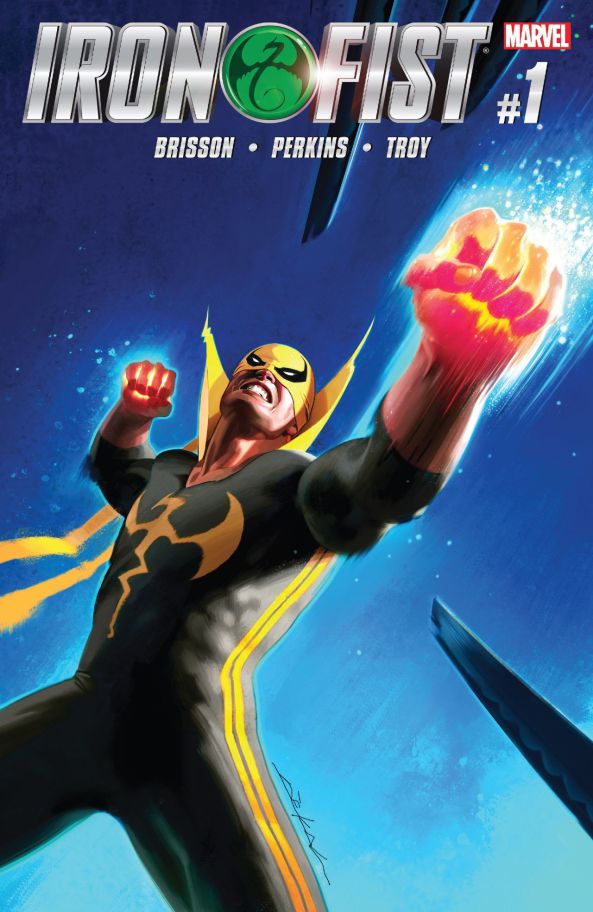
I loved the Brubaker/Fraction/Aja run on Iron Fist. It was one of my favourite comics because it did what all good stories set in a shared Universe do: it added to the mythos, expanded it like no other before it and left the world a deeper, richer place for those that came after.
Since that run, there have been a couple of attempts at making use of the character, but mostly those have fallen flat. They either tried to distance themselves from the character’s roots (He was born out of the 70s and was an attempt to cash in on the Hong Kong kung-fu “fortune cookie theatre” movie craze of the time) or they tried to turn him into more of a standard superhero. But there is something inherently hokey about the character. As a friend of mine said: “Iron Fist been updated in recent years to modernize it… but it’s like trying to paint over a VW van… at its heart, it’s still a VW van.”
This book is the first one that feels like a spiritual successor to the Brubaker/Fraction/Aja run.
At first, I was missing Aja’s art. But Mike Perkins won me over. It’s a little darker. It’s a little grittier. But it has that same sense of kinetic fun in the fight scenes that really epitomized Aja’s work. And is absolutely necessary in an Iron Fist book. You can’t have static stayed paneling. It has to be alive. Fluid. Like a fight.
And Perkins does that.
Brisson is setting up something cool. We have a lost hero in the process of trying to rediscover himself. We have a fading connection to Kun-Lun. Are we seeing the crowning of a new Iron Fist? Is Danny about to be replaced in the cycle? We have a mysterious kung-fu tournament and who knows what crazy participants we’ll be introduced to in that.
I have to say; I loved this book. Count me as hooked. Please don’t let me down.
Underwinter #1 Image Comics Written and art by Ray Fawkes
You either like Ray Fawkes’ art or you don’t. There’s really no middle ground. He has a scratchy watercolour style that blends together elements of Ben Templesmith, Dave McKean, and Jon J Muth. Shake well and pour out onto the page. The art really fits the story. But the story isn’t as strong as the art. The first two pages are brilliant. Disturbing. But then we get into the actual plot, and it is fairly standard supernatural fare.
The thing is… I can’t tell if the series is an anthology title or an ongoing story. The first issue is more or less a complete story on its own. A supernatural Twilight Zone. But it ends with the tag “End Part One” which supposedly means that there will be a part two but I can’t tell if it will be picking up where this one left off or if it will be approaching the story from an entirely different direction.
And I’m not sure what the story actually is.
In this issue, we’re introduced to four musicians who are offered an interesting gig. But are they our main characters? Fawkes does a good job of fleshing them out as real people, but they just sort of float through the story almost like music. One of the characters is clearly the narrator for the issue, but by the end I’m not convinced we’ll ever hear from them again.
Because there’s an outside chance that the real story is the story of the Estate that they go to and the people at the Estate. And I wouldn’t be surprised at all if the second issue of the series touched on other people interacting with the house and the people that live there.
This uncertainty made the issue a little unsatisfying for me. It’s sort of like staring at one of those weird 3D dot images and being unable to bring it into focus to see the sailboat. I’m not entirely sure where I should be looking.
Hopefully, the next issue will bring me a bit of clarity. It definitely deserves another issue.
Michael Recycle #1 IDW Publishing Written by Ellie Wharton Art by Alexandra Colombo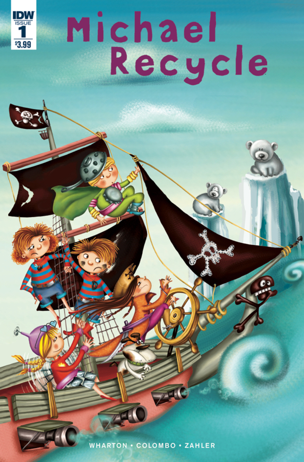
I’ve never seen the childrens’ book series that this is based off. It looks like the comic is being drawn by the regular series illustrator though, so fans of the books will recognize the characters and style. I applaud the educational value in this comic. While the plot points seem pretty heavy handed to me as an adult, I imagine that they function better when being read to a small child.
The art is gorgeous and fun. Bright and engaging. It’s tackling the important issue of global warming. And it isn’t North American-centric, so there’s the opportunity to teach a little geography too.
My only complaint is the clunky nature of the comic. I don’t think Wharton or Colombo have a lot of experience with the medium of comics. It still reads like a children’s book. Each panel is its own thing with little fluidity between them. This happens. Then this happens. Then this happens. Clunky. Hopefully they will improve as they use the medium more and more.
I did appreciate the ‘Did You Know’ factoids at the end of the comic, though. Michael Recycle is unabashedly educational. Well worth picking up for your pre-school to kindergarten kids.
Advertisements Share this:

