Don’t even try to deny that you’ve bought or read a book solely for the cover.
The phrase “don’t judge a book by it’s cover” is total nonsense since publishing housing totally have a specific audience in mind when designing book covers so it’s easier for readers to find things they’re interested in, plus gorgeous covers make it more likely that you’ll buy a physical book rather than an ebook. I mean, all of Jane Austen’s books are in the public domain, so why on earth do I have more than 10 copies of her books sitting on my shelves? Because the publishers repackaged them and made them pretty!
So below are some books that I read in 2017 because of the cover. Yes, they also sounded like interesting reads, and yes, I generally heard people recommend them before I actually read them. But let’s be real here, the cover is what really drew me in.
Jackaby by William Ritter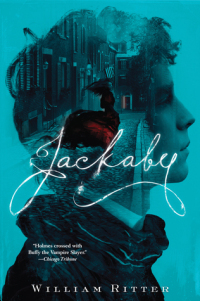 I think Jackaby is the only book on my list that I read almost solely for the cover. The premise of a supernatural Sherlock with a female Watson was interesting, but it was the cover that really got me to read this book. I just love the color and the font and the image within an image, plus it’s just got a bit of red to draw the eye to it, and I think the red dress is shiny, too. It’s just a really cool cover, and I like how all of the books in the series follow the same concept but with different images and a different color.
As for how it went reading a book by its cover? I thought this book was just ok. The idea of it is neat, but the reality is that I didn’t connect to the characters or the world all that much and generally just wasn’t that invested in the story. Which is kind of disappointing because I would have loved to have added this book to my shelf, but I don’t want to hang on to books I don’t love.
Of Fire and Stars by Audrey Coulthurt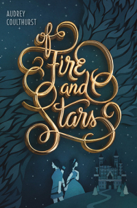 So I can’t say I totally read Of Fire and Stars for the cover, since I also thought the premise of a fantasy in which the princess falls in love with the prince’s sister instead of the prince sounded awesome and it checked a box for the Read Harder Challenge, but the cover was definitely a factor. Again, I really like that it’s monochrome except for the title, which is in a great font, and I really like the style of the graphics used for the girls and the castle on the cover. There’s something about it that’s just really cool.
Again, I was disappointed in this book. I think it had a lot of potential that it didn’t live up to. The characters were kind of indistinguishable for me and the plot felt rather contrived, plus there wasn’t nearly enough worldbuilding for me. It’s still a beautiful cover, though.
The Summer I Turned Pretty by Jenny Han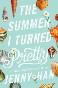 I already wanted to read The Summer I Turned Pretty because I’m such a big fan of Jenny Han’s To All the Boys I’ve Loved Before trilogy, but I think the redone covers definitely convinced me to pick this up earlier than I was planning to. I love the color and how the different books in the series tie in together, and the seashells are a fun touch that make this look like a really summery read. And again, I like the font and how it takes up the whole cover and that they used a different font for the word “pretty.”
Sadly, this book was so disappointing that I actually DNFed it. I think if you enjoy or don’t mind love triangles, this book could be worth checking out. Like I said, I’m a big fan of Jenny Han. But I really, really dislike love triangles, and I didn’t realize how central to the story they’d be when I first picked this book up. I know a lot of people like these books, though, so it just depends on your preferences.
Walk on Earth a Stranger by Rae Carson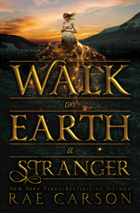
I really like all of the covers in this list, but the cover of Walk on Earth a Stranger might be my favorite. The whole series has excellent covers (and titles). I love that it’s mostly dark but there’s a gorgeous sky overhead, and the gold coming down from the figure at the top. And the font is amazing, again, and really stands out against the dark background. It just looks really mysterious and atmospheric and dark, and I totally love it. They did an amazing job with the covers of this series.
As for how I liked it, I thought it was a decent read, but I was expecting a lot more fantasy elements. The book is set during the California Gold Rush and the protagonist can sense gold, which sounds like an awesome premise to a book, but it wound up reading more as a Western than a fantasy, and Westerns just aren’t really my preferred genre. I am interested in seeing how this series develops, though, and I’m hoping I’ll enjoy the sequel now that I have a better idea of what to expect from the series.
Jane Steele by Lyndsay Faye Jane Steele had the prefect combo of being highly recommended by Joce at squibblesreads, having an awesome premise, and being gorgeous. It’s difficult to say what drew me to this story most, but I think the cover definitely convinced me to read it earlier than I otherwise might have. I just really like the design and the fact that the background looks like it has some texture, plus it’s neat how the knives and skulls and hearts are woven into it, making it more than what you first thought it was. And again, I like the font of the title and the selective use of color on the cover, like the red around the knife at the bottom. It’s just really, really cool.
I was a little disappointed in this book because I thought it was going to be one of my favorite reads of the year and for some reason I just didn’t connect to it and become totally obsessed like I was expecting, but I did really enjoy this book and thought it was a solid read. It’s kind of a Jane Eyre retelling with a feminist Dexter twist, because the heroine of the book murders men who hurt women. Awesome premise, right? While I’m not obsessed with this book, I do think it’s worth checking out if it sounds like something you’d enjoy reading.
The Gentleman’s Guide to Vice and Virtue by Mackenzi Lee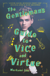 Alright, alright, I’ll admit the hype about The Gentleman’s Guide to Vice and Virtue definitely drew me in. BUT! I think I would have been able to resist longer and not just buy it if it weren’t for the cover. It’s so weird because I usually really dislike covers with people on them, but I think this one did a great job making it seem old fashioned and contrasting the image with a really modern and fun-colored text in the front. Plus I love all of the doodles in the color shadowing the title. And there’s something about the model’s expression that really draws you in. The whole cover is excellent (and the spine is a great color, too!) and I love it.
As for what I actually thought of the book, I really enjoyed it! It’s a historical YA following a bisexual guy undertaking his Grand Tour while trying to fight his attraction to his best friend. It was a fun read but also had a lot of serious elements in it, and I really liked how diverse the characters were. I mean, I’ve read a ton of historical romance set not long after the events of this book, and while there’s a lot of diversity in regency romance in terms of disability, there’s very little in terms of race and sexuality. So I was really impressed, and I’m really excited for the sequel.
The Sun Is Also a Star by Nicola Yoon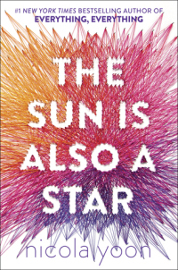 I think this might be one of my favorite covers ever. It’s just such a neat piece of artwork and it’s so unique on a book cover. I love how the title stands out against the colors of the thread and the colors they chose to use and the gradient between them. This cover is seriously flawless and I want to hang it up on my wall as a piece of art.
Unfortunately, I was not a fan of this book. The Sun Is Also a Star follows these two teenagers on the girl’s last day in the United States before her deportation as they try to find out whether a test meant to make people fall in love actually works. I spoke about it in my BookTube Made Me Read It post (now that I’m looking back, there are actually a few repeats from that post on this list…), but I think this book tried too hard. I didn’t think the two protagonists had that unique of voices and there were too many “profound” moments woven into the story. A lot of people really love it, and I’m really happy for you if you’re one of them, but this book just was not for me.
My Lady Jane by Cynthia Hand, Brodi Ashton, and Jodi Meadows Last one! My Lady Jane has a fun premise that got me excited to read it, but there’s something about this cover that just really draws me in. Which again is weird because I rarely like people on the cover! But they again did a great job with her expression and costuming, and I love the contrast with the really modern and colorful font of the title and the fun comments on it. It’s a similar concept to The Gentleman’s Guide to Vice and Virtue, but it’s a much different effect and I love it. It’s a really fun cover!
I wish I loved this book enough to read the sequel, which also has an excellent cover, but I mostly thought this book was just ok. It has a super fun premise of being a magical retelling of the Lady Jane Grey, who is known as the nine-day queen because she was beheaded as part of the fight for succession to the English throne following the death of King Henry VIII. But I didn’t think the characters were that well developed and I really wasn’t all that interested in their story. I really wish I loved this book because the whole series concept of retelling the stories of different Janes throughout history and fiction is genius, but it just wasn’t for me.
#####
Alright, tell me I’m not alone. What books have you read primarily for the cover? And how did it work out for you? Let me know in the comments!
Share this: