Last week we took a look at the short 2-3 issue stories that comprised the first half of Scott McDaniel’s run on Daredevil. Here we will take a look at the second half, but as it is only 2 stories, I want to talk a bit more about the art than last time.
Fall From Grace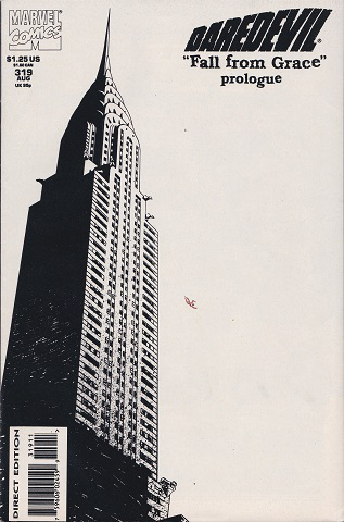
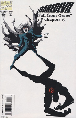
Fall from Grace is one of those stories that can get lost in the annals of Daredevil stories. Its first fault is that it was neither written nor drawn by Frank Miller. Second fault is that it is more remembered for the Armored Suit than for the story itself. This is a shame because it is really a good story that massively effected Matt’s life.
A virus that allows the person administering it to genetically alter the victim via telepathy, is lost in the New York subway at the end of the 1960’s. In present day the Snakeroot clan is searching for it so that they can fuse the psychic imprint of Elektra left in the fractured mind of John Garrett to the body of Erynys. But Daredevil, Hellspawn, Mobius, Venom, S.H.E.I.L.D., and the Chaste all have their own plans for the virus. If that sounds confusing don’t worry, it is only so in a plot summary. The comics themselves do a great job of providing all the needed information without info dumps.
What I really enjoy about the story is that several issues end in cliffhangers, and instead of picking up next issue right at the cliffhanger, they jump ahead just a little in the events. This has become a very common tactic in TV, Game of Thrones is very good at doing this. A perfect example here is early in the story when Daredevil and Siege both battle the Snakeroot, the story ends with them squaring off after they have won. The next issue doesn’t open with their fight, instead they have resolved their issue and are now working together to save Bensinto from the Hand as he has offered them his help. This helps keep the book from getting bogged down especially as the plot itself is not as straight forward.
Artistically, from the beginning of this story we get the distinct Scott McDaniel’s style that would be his hallmark. There are a couple examples I wanted to single out (forgive the quality my scanner isn’t amazing).
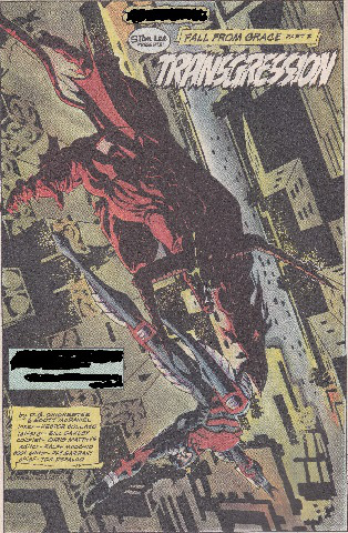
The heavy lines, the dark shading contrasted with the lighter colors, especially in the background versus foreground. But not only that, the perspective makes it very dynamic. You are looking birds eye down on the city as Daredevil jumps from one roof to another. Look at the angle though for Daredevil, he is moving in such a way that you know this is a swing, not a leap. Contrasting Daredevil’s graceful move is Hellspawn’s more grasping posture, almost as if he is attempting to tackle Matt as he shadows him to the virus.
Another thing I love about Scott’s art is what I call, panel collage.
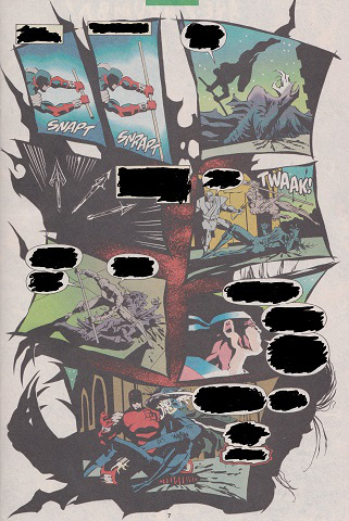
Here you have 8 panels, over a full black and white of Mobuis falling after being hit by the arrows. So the main picture is a half way point of the panel progression, giving the big moment the major space without having to lose the detail in the smaller panels. I love this style of comic art.
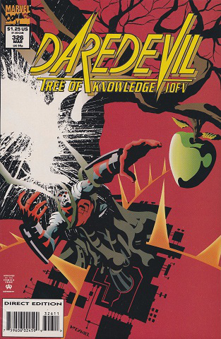
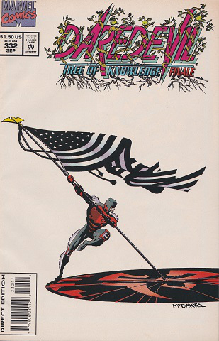
I’ll admit that while the story is a fun read, the plot is a little confusing. The basic plot is easy enough, cyber themed villains are trying to crack some telecommunication clipper chips. What makes it confusing is more the villain’s motives. This was during the time that Hydra had moved from a Nazi stand in, to an anarchist movement.
Either way Matt is trying to balance this fight with his new secret identity as Jack Batlin and having to essentially re-earn the trust of the superhero community as they believe him to be dead. I really enjoy the 90’s techno babble, and what might actually be the first 3D graphical MUD.
Again the art is fantastic, but what I really love is the coloring in this story. You can get a feel for the style in the interiors above, but for this story you get more of a red/brown palette. This gave it a very down to earth, less superhero feel.
Annuals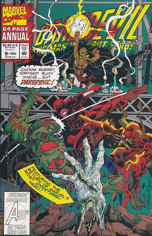
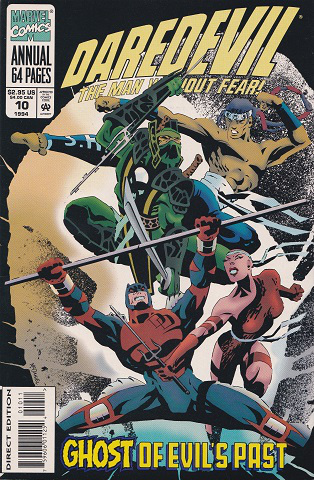
Scott McDaniel only did the covers for the two annuals during his run, but I include them as they show the evolution of his style. Issue 9 is very standard 90’s Marvel house style, but 10 has that signature Scott McDaniel style. Looking at them side by side you might be surprised that they were done by the same artist only a year apart. But even then, if you pull his DC work you can see a further evolution, and maybe we’ll start talking about that next.
Advertisements Share this: