PWell, we got into some discussions on how the web app should look like. It was about the general color of the app. We had four choices.
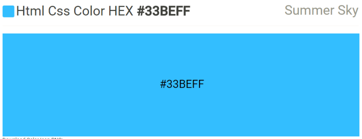
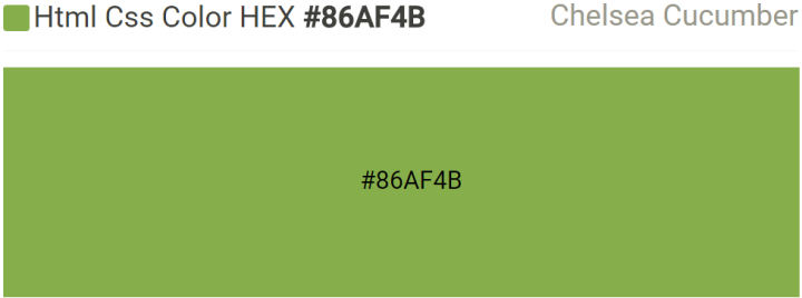
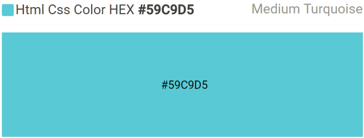
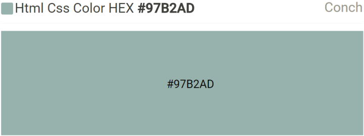
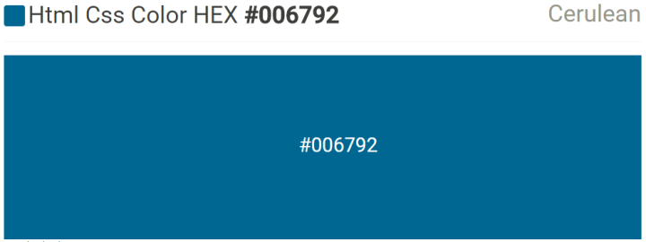
I liked Medium Turquoise, Carlo liked Conch, Kyle and Sir Paxi liked Summer Sky, and Sir MC liked Chelsea Cucumber. To be fair, we’re going with Cerulean. So at least the color doesn’t feel bad.
Before we asked our superiors though, we spent at least half an hour on it; which consisted of trying one color and then looking for another, then over again. It was both fun and exasperating.
Anyway, I’m working with Carlo on the UI and UX so it’s certainly helpful that we have a general color (“General Color” *salutes*) to work with. Of course, we still have to complete the palette and apply to what we already but that’s getting ahead of ourselves—at least as I write this anyway.
P.S. I find it really funny that the Greenery I got from Pantone, which I used the color picker on MS Paint to get the color values. returned Chelsea Cucumber on Color Picker.
P.S.S. The color names I used are based on http://www.htmlcsscolor.com so it might be different to names on other sites.
Advertisements Share this: