David McCandless, a data journalist I’ve been following for years after I StumbledUpon his website, is a pro at visualizing information – facts, data, ideas, issues, statistics, questions – in graphical ways anyone can understand.
He’s the mastermind behind Information is Beautiful, a website that uses graphics & visualisations on facts & data to tell stories – and he does this with strategy and grace.
To describe what data journalism is and why we need it, I must first show you what it is:
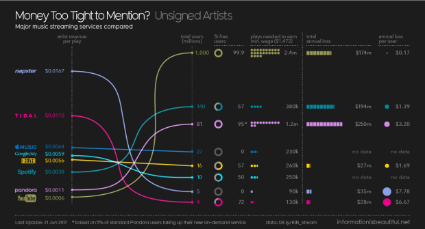
This data tells a story without saying more than a few words — how much streaming apps pay the music industry and how the size and popularity of a service impacts the likelihood of musicians earning a living from it. David created this infographic based on credible data and revealed connections, patterns and the stories hidden underneath the numbers.
Data journalism allows us to tell complex stories through engaging infographics, making the most difficult of concepts easily understood by a wide audience. It also can be thought of as using data to find a story that isn’t visible on the surface. The future is bright — it’s already become a prominent category in the world of journalism, and as more people read and request it, the bigger the spotlight will be.
Quartz describes data journalism as “exciting – it can elevate our knowledge, enliven statistics, and make us all more numerate.” It’s a great way to double check things we think may be true, but don’t have the sources to back it up.
But, just because a story or infographic is based on data, doesn’t mean it shouldn’t be analyzed through a critical process lens.
It’s very possible data can only highlight a single perspective, thereby restricting the stories that are created with it. It can contain inherent bias, and could easily fall into the “opinion” category of journalism as well. Data is also always changing, so it’s important to ensure the data used is up-to-date.
As with all journalistic pieces, it’s vital that we accept nothing at face value and always dig a little deeper to find credible takeaways. Even the best of journalism that’s 100% based on data is subject to human error and bias.
Share this: