Disclaimer: I have not had a prototype of the Karoo. This is not a classic hands-on, nor is it a full review. It’s a comment based on promotional materials I have seen. Also, this post has been updated on January 6, 2017, to reflect recent information that has come to light.
Among cyclists, I’m an outlier. I’m on Strava like everyone else, but I don’t use a dedicated bike computer. No Garmin Edge, no Wahoo Elemnt, and no alternative device from Lezyne or anyone. I just use a simple and free app on my phone (OruxMaps). I’ve been pretty satisfied, and for years I have found myself surprised that Garmin managed yet another time to find a market for what I consider a highly inferior product with just two valuable benefits: a rugged case and a longer battery life. – It’s the training features, stupid. Some say. I think it’s me-too and the lack of a cool alternative.
This summer, I experienced the lack of ruggedness of my phone first-hand. (Or, more accurately: what happens if you don’t react to early warning signs of structural failure of your rugged protection.) I then switched to another new phone that I like very much for everything but its inferior GPS accuracy. I might have understood why so many people did not make the switch to phone-based navigation yet. At about the same time, two new names appeared on the market for bike computers: Xoss and Hammerhead. For the first time, I started to consider to give up on the phone as my primary bike computer.
I initially backed the Xoss Sprint on Kickstarter, but cancelled my pledge before the campaign ended. The Xoss will disappoint. Big time. I don’t think we will ever see a second generation of it. Even though apparently it’s not coming from a tiny startup, as I once thought. The Hammerhead Karoo, however, hashad the potential to stir up the market. Big time. I love the Karoo. I think it’s going to be the best dedicated cycling computer on the market. But for 399 USD retail price (or 299 USD pre-sale price) it’s not my product yet. I will explain.
[Update: recent developments put this into question. In the below, I maintain my focus on navigation and mapping, which is enough of a reason for me not to buy it. Aside of that, any potential customer should check if all the other quality problems have been solved. Some doubt they ever will. For instance, at the time of writing this update, map downloads don’t work bug-free, ANT+ connectivity is missing, and GPS accuracy without a SIM card has been put into question.]
I really compliment the Hammerhead guys on their marketing strategy. [Update: all the way until they blew it up by lying to their customers.] Their occasional updates are never annoying, but rather insightful beyond their own product. At this moment, it’s the only newsletter that makes me happy when I receive it. I almost never react on newsletters and unsubscribe to most of them; theirs is the absolute exception. They have been amazingly transparent. [No, they haven’t. They have been impressively deceiving.] Without any backers that would demand transparency on a public crowdfunding forum. You kind of know the product they are going to launch. [Or so you thought.]
As with the Xoss, my core issue is with mapping. Even though mapping on the Xoss and the Hammerhead will be like night and day. Imagine that the two stand to each other like a Chevrolet Matiz and a Ferrari in terms of horse powers. [Or more like a Chevrolet Matiz and a Ferrari without an engine.] For comparison, look at the two screenshots below. Mapping on the Hammerhead has the potential to beat anything on the market by a margin in terms of usability and visual appeal. Except… OpenAndroMaps on OruxMaps.
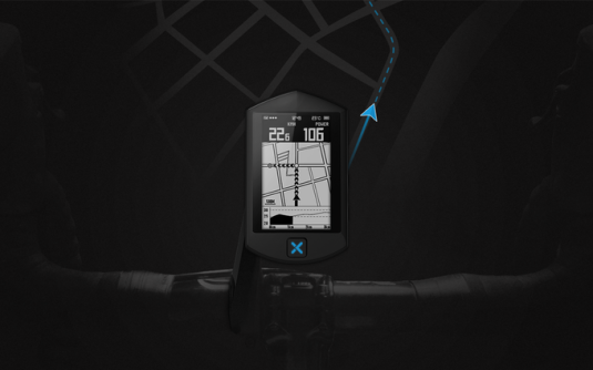

My opinion is based on the new preview videos of the Karoo user interface that Hammerhead has released yesterday on its Vimeo channel. The first one explains how users can adjust which data fields they see on the screen.
I took a screenshot from this video. In this case, the data screen originally contained seven data fields, and then Laurence from Hammerhead deleted three. The Karoo automatically adjusts font sizes and tries to give the largest font to the highest data fields. So, if you want to see heart rate in a larger font, you just need to move it up. Since the Karoo is based on Android, this works as easy as a similar task on you smartphone – it’s just drag-and-drop. If you reach six data fields, they will all have the same font size, and if you go beyond, the Karoo will display some next to each other (starting from the bottom). You can also add additional data screens if one is not enough. Just like on the Garmin, you would swipe to move through them.
From a design perspective, I’m a bit puzzled that the main color of the user interface design (other than black and white) is green, since Hammerhead’s entire visuals so far have been focused on an intense yellow. I could imagine that this can be customized, however. Should be straightforward. So maybe Laurence just likes green.
Their second video showcases the creation of a route on-the-go. It’s as intuitive and simple as setting up your data fields, but allows for much more complex route creation than a Garmin device would offer.
The most basic case is entering start and destination. On the Karoo, you can enter the address or select a point on the map. Entering the address requires an online connection; the Karoo can connect to mobile networks without a phone. (It cannot make phone calls, however, so you’ll still carry a phone with you.)
Imagine that you’re not happy with the route suggestion. Say, you’ve just entered Milan and Bozen, but you want to go on a flat route via Lago di Garda and along the Adige rather than on a mountain route via Passo Tonale (which would be the shortest route). In that case, you create the route step by step: You enter the start in Milan, then add Brescia, Peschiera del Garda, Malcesine, Torbole, Rovereto, and finally Bozen. I cannot see from the YouTube video if you can also edit and add intermediate goals between points that you already have created.
Now, I’m personally very skeptical about route creation on-the-fly. It’s already a non-trivial task for cars. For bikes, you just really depend on the underlying quality of the map. Does it take into account road surface? The type of cycle lane? Traffic intensity? Or just simply how attractive is the route with respect to panoramic views and sites? With the best automatic online routing for bicycles that I have seen (many might say that’s Komoot, but in my opinion, it’s BikeMap.net), you still end up getting route suggestions that a more manual approach (e.g. planning on OpenCycleMap with GPSies.com) would outperform easily. For instance, there’s a spot here east of Milan where all routing tools that I have used would force me into a detour, because a particular street is officially designated as a footpath. With local expertise, I know that I can go straight over this footpath, because it is a 20m wide pedestrian area that is open for cyclists.
But there are situations in which on-the-fly is very helpful. Say, commuting. Being lost. Having to abort the route in unknown territory and to get to the nearest train station as fast as possible. Having to bypass unexpected road closures. And so on. In these situations, I’d rather use an interface like on the Karoo, conditional on the underlying quality of the map (which I can’t evaluate).
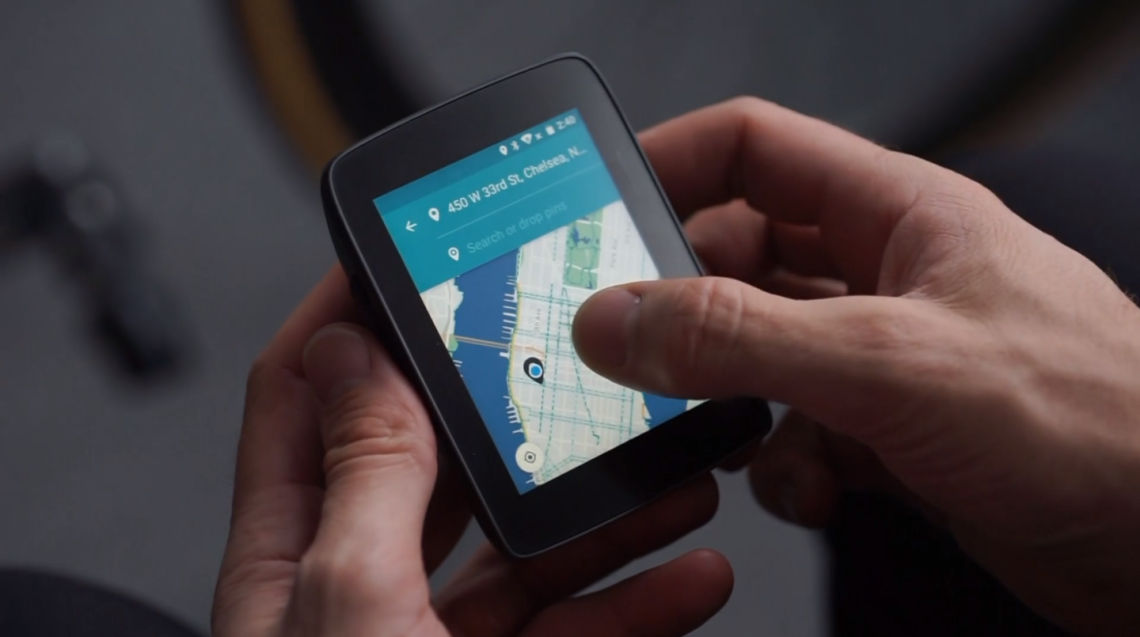
The Karoo offers the ability to download offline maps. To that end, a bit more than 8GB are available. In the above video, Laurence downloads a specific map section, but unfortunately it’s unclear how large each tile is. You select map downloads from a map screen: you move a square tile over a map, and you adjust how much you want to cover with two-finger zoom. (I assume that it then automatically downloads the map in all necessary zoom levels.) You assign the name yourself.

Now, that’s equally simple as anything else, but it’s also limited to a very general concept: I am at point X, and I will cycle around point X, so a square is great. For the majority of use cases, that might be accurate. If I look at my cycling adventures in Lombardy, very likely I had started with a square around Milan. I then had added a square around Lago di Como. Lago di Maggiore. Bergamo. Then… Lago di Lugano? That might overlap with the squares fo Lago di Maggiore and Lago di Como. (It’s undocumented whether this will download overlapping areas twice.) But there might be a bit of map left out around Mendrisio. Over time, my tiles become increasingly complex. I might have done better in downloading one big square at first.

Let’s say I was intelligent enough to download a square of all of Italy. That sound’s great, but unfortunately Italy is not very square. That square would contain a lot of map that’s nothing but water; a waste of storage space. Hence, I recommend to Karoo that they offer predefined country- and region-based maps that accurately reflect their irregular border shapes. It’s not an uncommon feature to find. Also, I would be happy if they added some pre-download information regarding how much storage pace a specific download will consume.
Usability of maps is key for me. The next image is a screenshot from OruxMaps. I originally used it to talk about GPS accuracy of the Samsung Galaxy S7 – this was an example of good accuracy on a fast decent. The Karoo might be better at this. In OruxMaps, I use maps from OpenAndropMaps.
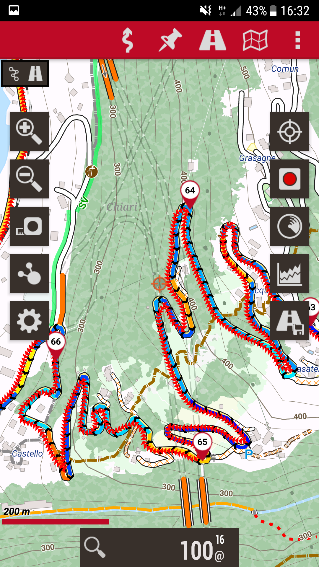
However, there’s a lot of additional information in this screenshot. It’s best to put this in a list.
- OruxMaps offers information on the incline right in the display of the route. Blue tones indicate descents, while yellow and red tones indicate inclines. Where it’s green, it’s flat (it’s not flat in this screenshot). It’s not always perfect, but often it’s spot-on.
- The map includes elevation lines. If I were to think about alternative route, they provide immensely useful information. They also help me to further understand steepness.
- I have information on specific buildings, not just grey areas.
- Roads of different rank have different colors. I can clearly distinguish them. I can even understand the pavement of roads and forest paths, and inaccessible roads are clearly marked.
- Points of interest appear on the map. The screenshot is from a detailed zoom level, but I still find them on a zoom level that’s roughly five times less detailed than the one above. I can select which points of interest I want to have displayed. Commonly, I display public fountains, i.e. spots where I can re-fill my water.
In comparison, below is again a screenshot from the map download selection on the Karoo. It’s a bit of a difficult comparison, because the Karoo renders the map at a (slightly) different zoom level and because it’s two different locations. So, I downloaded OpenAndroMaps for New York (unfortunately, they don’t cover all of the World, but they do cover all of Europe, most of the United States, and more) and took another screenshot from the same area around the New York High Line and Chelsea Park.
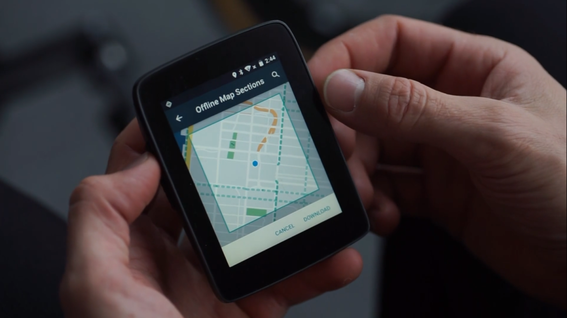

I have street names on my phone. I can better recognize which avenues are carrying heavy traffic, and I also see the bike lane on 9th ave (in light blue). I understand that the path through the High Line park (parallel to the avenues) is not asphalt, while it’s not even fully displayed on on the Karoo. I also see that West 33rd street is closed between 10th Ave and 11th Ave. In comparison, I can deduct that colored streets on the Karoo are equivalent to highways and freeways, i.e. roads I’m likely not even allowed to take. However, OpenAndroMaps on OruxMaps still gives me clarity which roads I might not want to take.
The map on the Karoo might arguably look less cluttered. It’s beautiful in its simplicity. I appreciate that. It’s a helpful visualization for a map in known territory. However, as a map for unknown areas (and isn’t it there where we need maps?), it is not a bad map, but by far not as informative as OpenAndroMaps.
The Karoo might offer me superior GPS accuracy, if they manage to deliver what they showed in their own preview blog. It’s mapping is advanced for a dedicated bike computer, but it prioritizes beauty over usability. My smartphone gives me the best map experience that I have yet seen on any dedicated bike navigation device. (That says a lot. Consider that OruxMaps is a one-man project.) It can’t process GPS information with as much accuracy. So, personally, I face a very simple trade-off: correctly entering every Strava segment that I encounter (for 399 USD) or better finding my way in unknown territory (for free). Carrying two devices or carrying one.
Never say never. But at this point, it’s still the phone for me.
Note: I do not consider training features in this comparison. I don’t mean displaying heart rate etc., but laps, intervals, and these things. I have never used training features on OruxMaps (some rudimentary features exist) and I don’t know (yet) how training features are going to look like on the Karoo. For someone who puts much emphasis on these features, a verdict might look different. Or… as we know by now through the experiences of other… not.
Advertisements Share this: