I’ve long known about my type(s) when it comes to men (hello unwashed-looking, bearded musicians and toned but not beefcakey men with celtic colouring, i.e. dark hair and lighter eyes). But I’m also starting to see a pattern in the books I pick based on ‘looks’ alone.
A recent trip to the library produced these entirely impulsive picks:
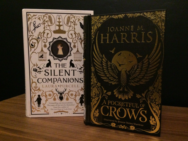
Look how pretty they are.
That eye peeking through the keyhole on The Silent Companions belongs to an entire lady lurking menacingly in the end papers. And she is menacing, make no mistake. I’m about 50 pages from finishing it and it’s definitely one of those late night reads where you must go to the toilet before you start reading or you’ll be trapped in bed by the thought of the thing that will grab your ankles if you get out again. I’ll come back to it when it’s done….
But seeing these two lined up next to my bed made me painfully aware how susceptible I am to a certain type of cover. Let’s look in more detail at other books I’ve gathered after I was suckered by a cover.
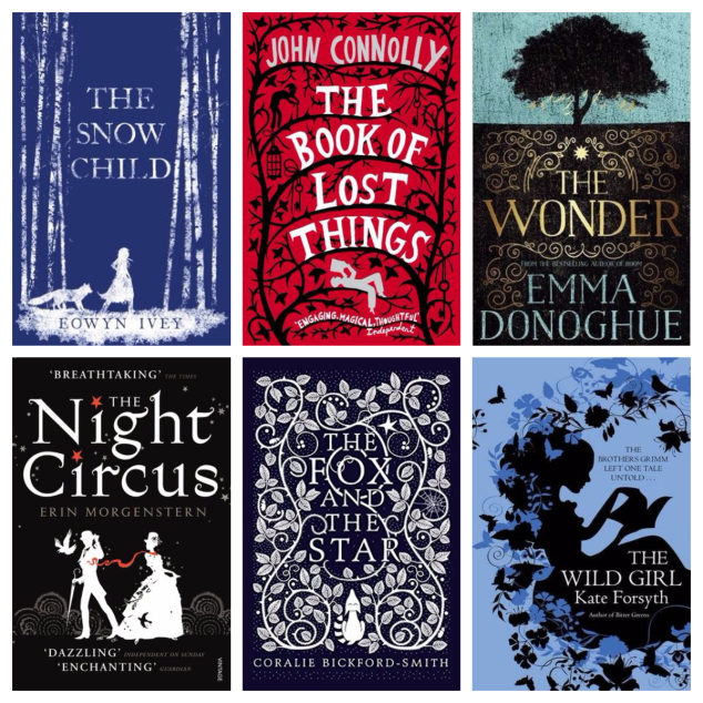
Four of these books are wonderful, and the other two (The Wonder, The Snow Child) may well also be wonderful and I’ll find out once I’ve read them.
But let’s break it down, shall we?
Clearly, if you want to sell me a book, there are certain key elements you need to include on the cover. Silhouetted figures. That one was a surprise. Bonus points if they’re reading a book. Some kind of leafy vine. Check. A smattering of fauna. Metallic accents. Don’t introduce too many colours. If in doubt, go with blue.
And wow. I’ve just noticed this. Start the title with ‘The…’. Ha.
Thing is, there are just a bazillion beautiful, clever covers out there, and so many great books that are also works of art. This just seems to be my particular hook when I’m browsing with intent.
Anyone else with a type?!
Advertisements Share this: