Today’s blog post focuses around a visualisation challenge set by Cole Knaflic, author of the seminal work Storytelling with Data. This year she is setting a monthly challenge, with the first challenge set out here
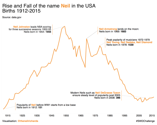
The challenge is simple. Using any data you care to source, create (and share) an annotated line graph. As is my wont, if my visualisation is going to be conventional, at least I’ll try and make my data source unique to me! Here’s my visualisation:
My last post of my 2017 visualisation recap contained a reminder to (sometimes) keep it simple, so this challenge seems an ideal opportunity to do just that. I’m looking forward to seeing the variety of submissions and in particular to get feedback from Cole on my submission. But in the meantime, I invite feedback from anyone!
So what were my design principles behind this chart? Inasmuch as I had any at all, I wanted to keep it clean and simple, especially as this would be being critiqued in conjunction with Cole’s trademark style, with black and one other colour on white. With a line graph is quite easy to keep to those principles, even for me.
The addition of annotations is probably the main design complication here. How many annotations do we add? Where do we put them? How much space do we take up with them? How do we format them? In this case I’ve tried to be succinct and leave the graph clear enough to speak for itself, but have used the annotations to offer up some analytical insight(!) (or a bit of Wikipedia-related guesswork, you choose).
I hope I’ve left enough white space to keep the graph readable and not overwhelming. And it’s white space that I wanted to make the debate topic of this blog post. But there seems to be little written about it, and no real discussion on best practices, use cases, and exceptions. Google anything to do with “white space” in data visualisations and you’ll come back to the same two phrases: “white space is your friend” and “white space is not your enemy”.
Cole Knaflic’s Storytelling with Data book says “We need to get more comfortable with white space” and mentions the “powerful effect that white space used strategically can have on our visual communications”. The Big Book of Dashboards authors (Messrs Cotgreave, Shaffer and Wexler) state that “white space used subtly creates distinct zones on your dashboards” and highlights use in a dashboard where “adequate white space allows the data to stand out and not be overwhelmed by complexity”. Alberto Cairo’s Functional Art website reiterates that “White space is your friend. Empty space is needlessly unused space, white space has meaning.”
It seems to me that the key is to think about usage of space in two ways:
- Consider filled space: Does this space really need to be filled, completely or at all? If not, then using less space, or no space will lead to a clearer and less cluttered visual
- Consider unfilled space: Is this empty space better served by adding in something else, such as annotation, a legend, or additional information? If so, then we’re talking about empty space and not white space. If not, and it helps with the clarity of the pure visual element, then leave it alone.
So there’s the challenge. Consider what my graph would look like without annotation:

It’s even more clean and uncluttered, but there’s no context. I’m not sure here that all the white space is my friend. Some of it is empty space. I made the choice to remove the y-axis in the original submission, because I include the values in my annotations. But without these annotations, we have no idea of scale, and no explanation of peaks and troughs, so the empty space is crying out for the inclusion of an axis, or some contextual explanations.
So, to me anyway, the key element to this challenge is balancing the three elements of empty space, white space and annotation. To answer the question – most people would agree that white space is your friend, but empty space is not. If getting the right aesthetic /functional balance means that I need to make the design decision to leave out the upsurge in popularity of the name Neil in the mid 2010s due to the worldwide mass popularity of British data visualisation artist Neil Richards, then so be it, but you heard it here first!
Share this: