A new month has begun, spring is truly in the air, and I am dying from all the pollen. In times like these, what else is there to do but to stay in and read? I’m also writing a lot too, which is going well, and I plan on writing about my writing here soon (and then it’ll get really meta when I start talking about writing about writing about writing).
I’m pretty excited by the Top 5 Wednesday topics (and you can find out more about the group here), especially this one, as it allows me to mention some books that I like the covers of but dislike as books. Admittedly, there aren’t many, but it allows me to talk about some books I generally avoid. Cover art, for me, is an area close to my heart, as both mum and my stepdad are artists, and I grew up surrounded by art, whether that was at home or at art galleries. Bad covers do sadden me, and as much as I know I shouldn’t, they do make an impact on whether I pick a book or not, which can obviously be detrimental to my reading.
In general, I tend to like fairly simple, graphical covers, which I shall demonstrate below, and I tend to avoid anything too life-like. I like things to be abstract, simple, and nuanced, rather than gaudy and over-decorative, and I especially hate depictions of characters on covers. I want to imagine the characters myself, not someone else’s representation! And of course I hate movie covers, because they are always the worst.
Here, without any specific order, are my favourite science fiction and fantasy book covers:
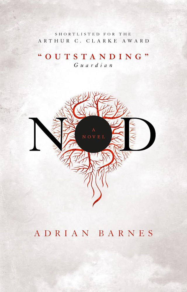
Brave New World by Aldous Huxley, 2007 Vintage Classics edition – First of all, I absolutely adore this book, even though I haven’t read it for years. In brief, it deals with a society that genetically manufactures people into a strict class system, with babies grown in artificial wombs and engineered to fit a certain class (i.e. workers are better adapted to physical tasks but lack intelligence), a drug called soma is used to pacify the population. In all honesty, I haven’t read it in about ten years (insert witty but despairing comment on ageing here) but this was the cover of the version I read, and it fits so well. The simplicity, the colours, the cleanness of line: all of these give the baby a sense of a lack of identity that can be filled in (literally because it’s an outline you can tell I went to uni) for any need the society has. In all fairness, Brave New World has some excellent covers, but I have very good book memories attached to this one.  Nod by Adrian Barnes, 2015 Titan Books edition – So here is a book that I loved the premise of but ended up really disliking; I couldn’t help thinking that so much more could have done with it, and it was a slow and tedious read. It’s about people suddenly losing the ability to sleep, except for the main character and a couple of others, and everyone turning slowly mad and descending into chaos. It’s kind of impressive that Barnes managed to make it so boring, actually. But anyway, the cover is beautiful, so at least I have something pretty on my shelf? Actually I’ve put it in a box under my bed because I have so many books and not enough space, but anyway just look at the nice cover.
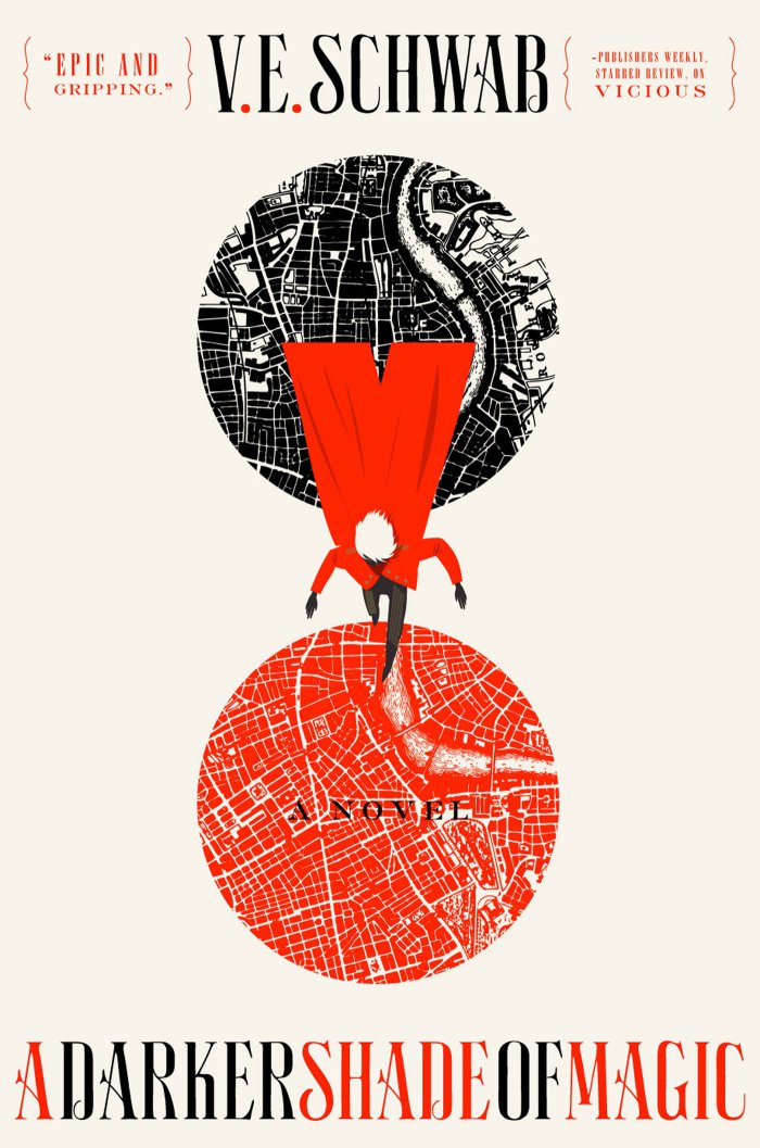
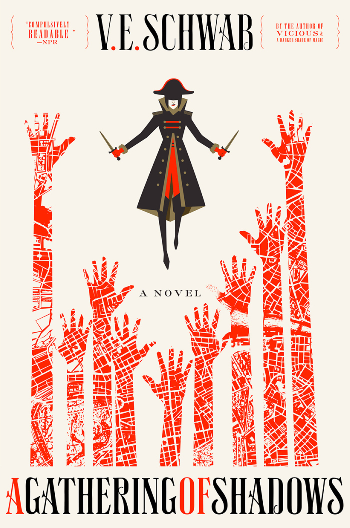
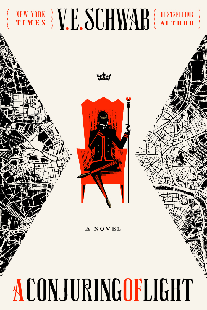
 Shades of Magic series, American editions – I’ve only read the first book in the series, A Darker Shade of Magic, but I’m planning on reading the other two soonish (whenever I can get around to it). Whilst I don’t love the series, I quite enjoy it, and it’s one of the few instances that I prefer the American editions to the UK ones (sorry America). There are several alternate realities with different Londons in them, and some of the characters can traverse between them, which is captured beautifully in the covers. I love this style of cover design, it’s my favourite type of character representation, and I would like to see more books with covers in this style.

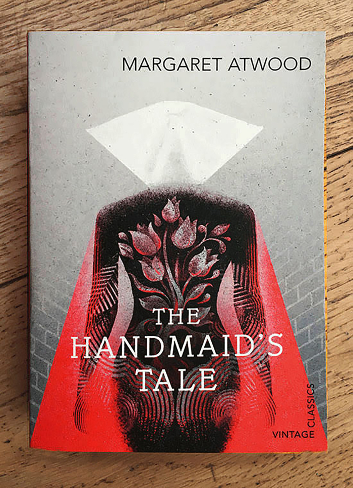
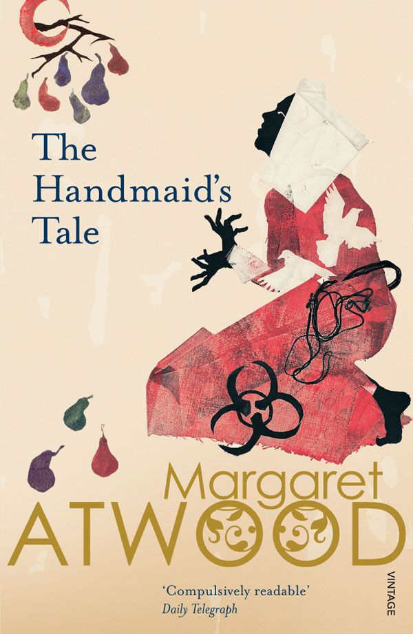
 The Handmaid’s Tale by Margaret Atwood, 2016 Vintage Classics and 2007 Vintage Books editions – This book is obviously very much in the public consciousness right now with the brilliant series being broadcast across the pond (although obviously I’m a good law-abiding citizen so how dare you suggest I’ve seen it) and it has many beautiful covers. I personally couldn’t pick between these too, but with the entrapment of the wall in front of her and the fingerprints behind her in the first cover, and the medieval-like representation and despair in the second, both of them encapsulate the repressed voice of Offred.
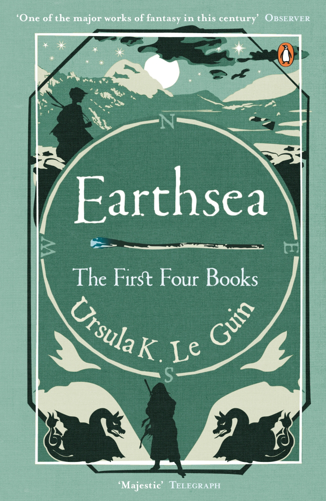
 The Earthsea Quartet by Ursula Le Guin, 2012 Penguin edition – This is one that I have only just started reading, so I can’t really talk about the content, other than it follows the adventures of a wizard named Ged, but just look at that cover. The lush green colour scheme, the simple silhouettes, the mountains reminiscent of Tolkien’s covers. I wish all fantasy covers were so restrained yet symbolic.
So that concludes my list for this week, but there shall be more again soon! Feel free to let me know if you agree with me, or if I’m being too harsh on complex illustrative covers.
Advertisements
Share this:
Like this:Like Loading...
