What was advertised in a colonial American newspaper 250 years ago this week?
 Virginia Gazette (November 12, 1767).
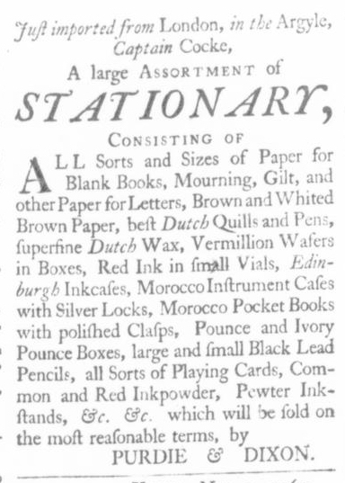
“A large ASSORTMENT of STATIONARY.”
Purdie and Dixon’s advertisement reveals several aspects of consumer culture, commercial exchange, and everyday life in colonial America, yet when considered alone it tells only a partial story of print culture and advertising practices in the eighteenth century. When disembodied from the rest of the newspaper in which it appeared, this advertisement does not fully communicate how readers would have interacted with its visual aspects. Viewers get a sense of the typography – different font sizes, the selective use of italics and capitals, and the deployment of white space – but cannot compare those details to their treatment in other advertisements. Only in examining the entire page or the entire issue does the full significance of the typographical choices become apparent.
When viewing Purdie and Dixon’s notice in isolation, it would be natural to consider the size of the font throughout most of the advertisement to be the standard or default size. The quasi-headline “STATIONARY” stands out not only because it appeared in italics and capitals but especially because the compositor chose a font significantly larger than that used for the remainder of the text. Yet it would be a mistake to assume that font size replicated what was used in other advertisements in the same issue. Throughout the rest of the newspaper, both advertisements and news items appeared in a significantly smaller font, making them appear more dense and more difficult to read. By printing their advertisement in a larger font, Purdie and Dixon called special attention to it.
In addition, this advertisement occupied a privileged place in the November 12, 1767, edition of the Virginia Gazette. The four-page issue featured slightly over one page of news items; advertisements filled nearly three pages. About one-third of a column of news flowed onto the second page before a header for “Advertisements” indicated the purpose of the remaining content. Purdie and Dixon’s advertisement, with its larger font, appeared at the top of the second (and middle) column on the second page. This positioned it at the head of the first full column devoted to advertising, practically implying that the advertisements began there rather than at the header (printed with much smaller type). As a result of these typographical decisions, readers turning from the first to second page likely noticed Purdie and Dixon’s advertisement before their gaze landed anywhere else. Any readers who intended to continue perusing the news could hardly help but notice “STATIONARY” immediately to the right of what little news appeared on the second page. (Purdie and Dixon may have been especially keen to sell as much stationery as quickly as possible since the Townshend Act, which assessed new duties on imported paper, was scheduled to go into effect just eight days after their advertisement appeared.)
While it may be tempting to dismiss all of this as circumstantial, keep in mind that Alexander Purdie and John Dixon printed the Virginia Gazette. While they may not have set the type themselves, the compositor would have acted on their behalf as the publishers of the newspaper. The typography benefited their business interests in particular, an element that gets lost when viewing just their advertisement but not the entire page or the rest of the issue in which it appeared. As printers, they exercised power over what appeared in their publication, but they also exercised privilege in the presentation of the selected contents.
To examine the entire issue of the Virginia Gazette, visit Colonial Williamsburg’s Digital Library.
Share this:


