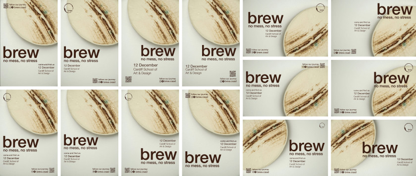
For the posters, we wanted to design two different styles. One creating visual links between our sales stand and one design including product placement and information on the sales event. This was so the audience knew when the event was to increase our sales. Therefore, we felt that it would be a good idea to include product placement, this is to provide the posters which more context. On the posters I prefer the variations without ‘come and find us on’ as I don’t think it is needed. I think that just having the date and location visually works better although the rest of my group preferred it with the ‘come and find us on’ as they thought it sounded more intriguing. Because of this we decided to go with the majority favourite, this is a way that we made lots of our decisions and I think that it worked well. By doing this we came across no arguments or disagreements.
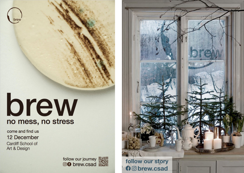
As well as having the poster with the product placement and information about the sales day we also decided to put up our previous advert which we made. We decided to do this as not only does this show a christmasy theme which suggests how our product would be a good gift for Christmas. It will also provide context for our sales stand as this advert we designed is going to be inspiration for our sales stand.
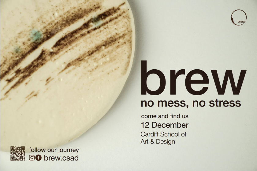
The second on screen advert we decided to do a print based ad, this is because we felt like the animation last time was successful and gave more of an insight into our brand. Where as this time we wanted it to provide more information into the sales event. I have used the context from our posters which are printed around uni and have changed the layout. This is because the on screen advert in the heart space work better as a landscape. I think that by having a still advert the audience will be able to digest more information as it isn’t on screen for long.
Advertisements Share this:
