Vertigo is a graphic styled novel which Ward created in woodcuts to highlight the Great Depression in America. The novel portrays a very important fragmented View of Chicago dominated by the Great Depression.
One of the ways in which it does that is through the sense of renewal portrayed in the form of this novel.
The basis of reading this novel is to view the images, there are no words aside from the chapter titles, and seasons title. This allows for the reader to create their own interpretations and to make their own connections, creating their own narrative. In his article ‘Vertigo a Graphic Novel of The Great Depression’ Joseph writes:
“Ward’s use of homologous images […] adds an additional binding element to Vertigo, and invites readers to pause in their forward reading progress and “click” back and forth between corresponding images.”(p.6)Joseph implies that readers are active in their reading experi—if you can even call it that— they have the freedom to ‘pause in their forward reading process and “click” back and forth between corresponding images.’ There is no linearity in the way the novel is read because there is the option for “readers” to go back and forth. Moreso this ‘liberty’ allows for “readers” to renew their memories of the previous images, and perhaps get a better understanding of the storyline. Joseph further writes:
“Under this sort of hypertextual reading strategy, multiple narrative points are free to evolve simultaneously, and the reader’s experience of the meaning and relationship of non-contiguous parts of Vertigo is shaped by a continual process of revision and renewal.” (P. 6)This adds to the fragmentary view of Chicago, as the novel uses a ‘hypertextual strategy’ that allow for the evolution of ‘multiple narrative points’ through the many interpretations readers make. With this aswell, there is the ‘continual process of revision and renewal’ where “readers” can go back and explore images in a new light. I think this is intentionally done by Ward to portray the way in which Chicago during this time, went through a lot of difficulties and plans to recreate the city. It is easy to ignore seeing certain things…
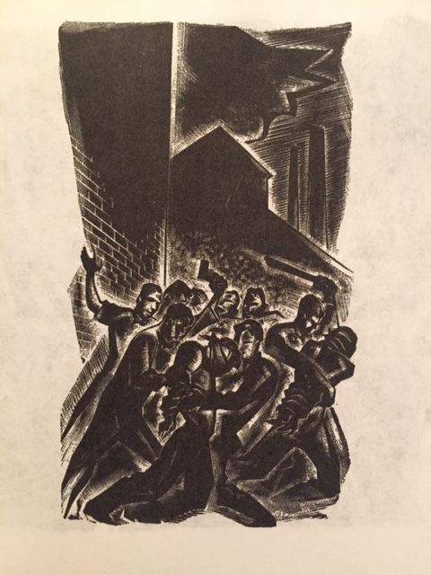
Such as this image below,
 Union Strikers attacking the Parole officer
On first glance, you see that someone is attacked, however when you look at it again you notice who these people are, and when looked at the third time, you make this connection with a previous image. The more you look at the image, you begin to pick up more clues that ‘renew’ your impressions. This very renewal of image can help us understand social issues during the time, especially the way things during the Great Depression were readily ignored. Joseph comments:
‘Depicting the physical assault upon union workers, the medium image cuts against the emotional power of the scene, to contrast tone with contents. The choice of image size implies that the public has turned a blind eye toward the violent acts regularly perpetrated against unions and striking workers: that these unconscionable actions had become a normal part of everyday.’
The fact that it takes a while for readers to pick up the cues of the action portrays how ‘the public has turned a blind eye toward[s these] violent acts.’ It has ‘become a normal part of every day’ to a point where society has normalized these actions. Ward has captured this by demanding readers to review it multiple times to really see what is going on. In this way, this image is intentionally portrayed so that we naturally turn a ‘blind eye’ towards it, but must be reviewed to really see what is going on. This demonstrates that events that occurred, especially during the Great Depression, were largely ignored, and intentionally ‘not seen’ as the public decided to turn a blind eye towards the city.
Advertisements Share this:


