…or can you?
I certainly do. My bookshelves are full of books that I fell madly in love with on the shelf because they were so darn purdy… only to find myself sadly disappointed with the contents. Sigh. In design, this would be referred to as “Attractiveness Bias.”* Now the text book definition applies this principle to people – we tend to like good looking people, and view them as nicer, smarter, and more trustworthy than not-so-attractive people. Not really fair is it? But it’s the way we are hard-wired, apparently – we’re looking for anotomical features that demonstrate health and virility. I would argue that this bias to pretty people crosses over into pretty objects too, but based on different factors such as colour, symmetry, scale, etc. We tend to think something beautiful is going to be better.
So let’s look at some attractive covers that I am personally biased towards, based on their use of my favourite design trick, colour. When used skillfully, colour can attract, illustrate meaning, and help group elements. These are both books that I bought after only skimming the back cover synopisis. I didn’t really care what they were about at the time, I just had to have them.
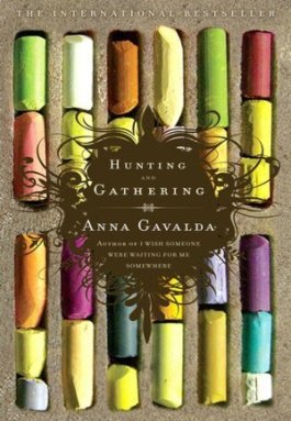
First up is Hunting and Gathering by Anna Gavalda, with cover design by Ben Gibson. This one definitely grabbed my attention with all the colours used in the photo of the pastels. It doesn’t follow any prescribed colour-scheme, it’s just a mix of every colour in the rainbow. It brings to mind a messy artist studio, and it’s in keeping with the main character being an artist.
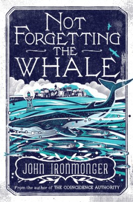
Next is Not Forgetting the Whale, by John Ironmonger. Unfortunately, I don’t have the book any more so I’m not sure who designed it. This one uses a monochromatic colour scheme of lovely blues to denote that the story takes place by the water, features a sea creature, etc. But looking at the colour blue through the eyes of Western culture, blue also tends to mean loyalty, depth, strength, but also somewhat conversely, can indicate sadness, depression – having “the blues.” The dark blue of the sky in the cover brings to mind a storm brewing, and unsettledness. All of these are played out in the story as well.
I’m not going to tell you which book lived up to its beautiful cover. I’ll let you figure out which one is “pretty on the inside.” And while you shouldn’t judge a book by its cover, it seems like it’s just inevitable – who wants to read something that doesn’t appeal to you visually?
What’s been your favourite book cover?
*Design principle discussed refers to Universal Principles of Design, by William Lidwell, Kritina Holden and Jill Butler.
Advertisements Like this:Like Loading... Related