The house looked a little empty today,
with the Christmas color packed away.
Even though the day was sunny and bright,
I’m too tired and lazy, to set things right.
From my favorite chair, I took to the net,
to see what inspiration I could get.
Color and clean lines are two boosters for me,
add some great displays to make it three.
Enjoy the pics and explore the source links. They’re sure to jump start your January!
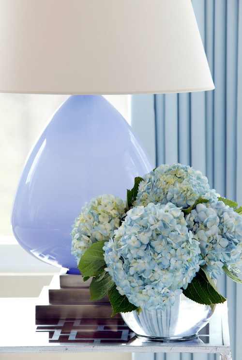 Spaces by Little Rock Interior Designers & Decorators Tobi Fairley Interior Design
Upon discovering this photo quite some time ago, I literally gasped and knew it had to be saved for a future post. A wonderful example of how display can be so very simple but achieve such breathtaking reactions.
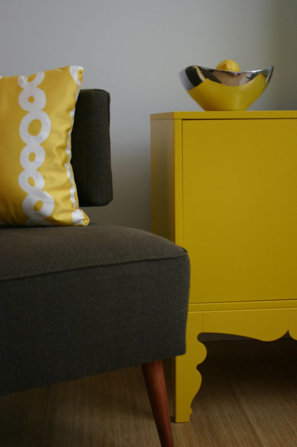 Contemporary living room design by boston interior designer Emily Elizabeth Interior Design
This is from one of my HOUZZ Ideabooks “Color”. It’s really In Your Face but in a nice way.
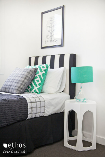 Contemporary bedroom design by townsville interior designer Ethos Interiors
Ah, can I ever stress “Simple” enough? Substitute “easy” if that’s the word you prefer. Either way, this look could be done by anyone, It just made me smile.
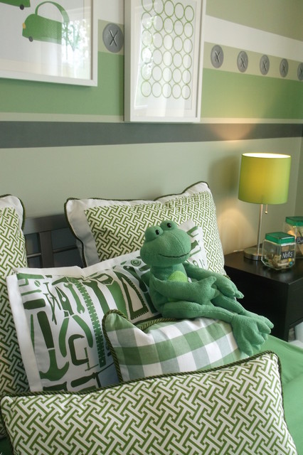 Traditional kids design by other artist and artisan Anita Roll Murals
Speaking of smiling.
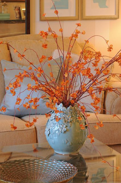 Traditional living room design by chicago interior designer Tiffany Brooks, HGTV Host & Interior Designer
Simple, simple, simple but so effective! Okay, you get the idea.
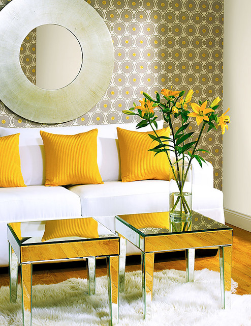 Contemporary family room design by boston paint and wall coverings Brewster Home Fashions
Everything just fantastic here and it all works together perfectly. Wonderful display with my three “C’s” Clean, Comfortable, Colorful. Wow.
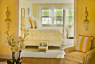 Traditional bedroom design by baltimore interior designer Bountiful
I’m not even much of a “yellows” gal but how could anyone not enjoy this (at least just to look at)!
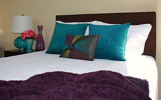 Modern bedroom design by new york interior designer Ella Design Group
And MORE color here! Ahh. And once again, simple. Start with a neutral wall color (will work with lots of themes), choose an inspiration piece (the beautiful toss pillow), bring in colors from that item and finally add an accent color for some extra pizzazz. Here it’s the coral flowers on the nightstand. This is also a great example of some of the “rules” I use. The nightstand has 3 simple items at 3 different heights. There are 3 smaller toss pillows and yes, only two bigger pillows BUT together, you’re still working with an odd number in your display. Unlike what we’ve always been told, ODD is good, DIFFERENT is delightful.
Remember decorating is personal so make it “YOU”. And don’t forget that decor rules are the stairway to your design, but it’s OK to skip a few steps. My Magic #3 is a suggested place to start, but once you get your motor revved up, take off down your own road.
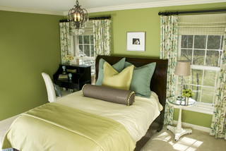 Contemporary bedroom design
Think my guests would appreciate this guest room. I sure would.
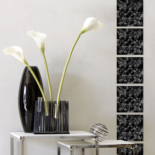 Contemporary family room design by tampa interior designer CNW PRODUCTION
And finally, sometimes we just need things to be black and white.
This is such fun, I could go on forever, but have to get going on my house. Well, I’m cheered and this has kicked me into, if not HIGH Gear, at least to a bit more driven speed. So I best get goin’ while the gettin’s good!
January can sometimes be gloomy, but find ways to stay positive and you’ll stay productive too! We’ll talk again soon. Leave a comment and it’ll be even sooner


