guest blog by Carol E. Leever
My writing partner Camilla writes another series with our friend Bonita Gutierrez. The Werewolf Whisperer is urban fantasy about two awesome women fighting their way through the werewolf apocalypse. It is predominately set in modern day Los Angeles and other parts of California. Camilla and Bonita have lived most of their lives in California (so have I for that matter) and they write about places they know with such clarity that the setting becomes a character unto itself in the stories.
Recently they asked me to do a cover for their story No Beast So Fierce. They kicked around various ideas for what they wanted on the cover, and I made a couple of attempts at painting something. But none of it was quite right.
And then they came up with a rather ridiculous idea — why not just do a cute werewolf plushie? (Word of caution — The Werewolf Whisperer series is violent and dark, filled with dystopian brutality. And while there is humor in the story — it is not cute.)
The setting for No Beast So Fierce is the Folsom Renaissance Fair near Sacramento, California. The story actually does feature a stuffed werewolf child’s toy wearing a Renaissance costume, complete with a full Elizabethan collar.
While I was a bit skeptical of the idea, painting a child’s toy was actually on my list of things to do. I keep a list — a long list of things I want to paint. Some of them are paintings of images and scenes I want to illustrate, but many of them are things I want to paint for the learning process alone. These are what artist call ‘studies’ and often consist of painting random things, or copying the various paintings of the masters, all in an effort to improve your technique. Every beginning artist should be doing studies. (From what I gather even the professionals who have been painting for years still do studies.)
A child’s toy was on my study list specifically for the process of learning how to paint different materials — the soft fur of a toy (not the same as cat fur), as well as the different texture of clothing, and the hard surface of button or glass eyes. So the request lined up well with my planned practice, and I was happy to get started.
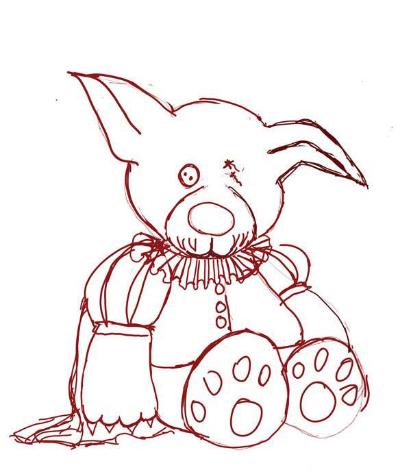
The first step was coming up with a basic design. This was my initial sketch — I’m a terrible line artist, and like I’ve said before, most of my paintings start out as something a child would draw. Camilla has seen some of my horrible sketches and understand the process I go through to get to a finished piece, but poor Bonita looked at it and immediately went ‘uh oh’. (To be fair, that is also my reaction — every single painting I start makes me want to give up. They’re REALLY bad for the first 10 hours or so.)
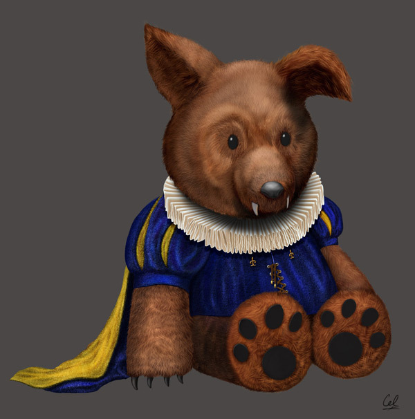
Now while the final image was meant to be the poor little toy after the climax of the book (the toy does not fair well), I decided to do a a clean, pristine version of the toy first (image at the top of the article). The Elizabethan collar in particular was time consuming. Drawing anything that is ‘white’ is tough; you can’t really use white as a color — it isn’t a color (okay, technically it is considered a color without hue, but that wasn’t the point). White is a highlight. To paint something that is white, you have to use a different color — some sort of shade of gray (I could do a whole blog on ‘gray’ — it’s an awesome color).
Between the collar, the tunic and the fur I got my full share of ‘materials’ to study. And I was pretty pleased with the final results. The eyes actually took me the longest time — not because they were hard to do (they’re just black ovals) but because I tried about a dozen different designs before deciding on the simplest version possible. At one point he even had googly eyes.

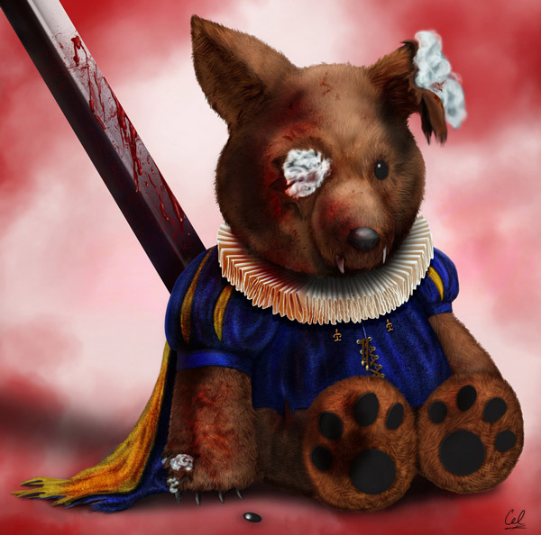
Once the ‘clean’ version of the toy was done, I had to tear him apart. This also allowed for another material study as I needed to draw the stuffing coming out of the tears. That meant more white that can’t actually be white. I’m not sure the stuffing was as successful as the collar was — but in the end he looked sufficiently pathetic.
The blood splatters were the last thing I painted. The drips on the sword were just painted normally, but the splatter on the collar was done using a few red swipes of paint on an overlay layer that blended the color into the existing material nicely. Last minute, I decided to put his missing eye on the ground beside him.
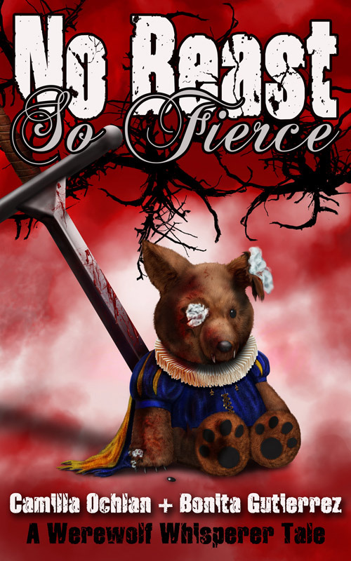
You can download the book for free here: Book Funnel. And here’s the final version of the cover.
You can find us many places:
ofcatsanddragons.com
www.facebook.com/ofcatsanddragons
http://www.werewolfwhisperer.com
www.facebook.com/werewolfwhisperer/
Camilla:
Twitter @CamillaOchlan
Instagram: www.instagram.com/camillaochlan
Pinterest: www.pinterest.com/CamillaOchlan/
Tumblr: https://camillaochlan.tumblr.com
Carol:
http://caroleleever.deviantart.com
Bonita:
Twitter: @BonitzMG
Tumblr: https://bonitamg.tumblr.com
Advertisements Share this:
