David Whitehouse, who is Science editor for the Global Warming Policy Foundation, has an article in the The Spectator, apparently presenting the truth about the global warming pause. It is, to be polite, very confused. For starters, it defines the pause as being a period over which the trend was no longer statistically significant.
Well, this is silly, because (as this post higlights) the intrinsic variability means that there will always be a period over which the trend will not be statistically significant (defined as the uncertainty in the trend being large enough that you can’t rule out that the trend is 0). If you give yourself the freedom to change the start point of your trend calculation, then you can always claim to be in period where warming has paused. This is essentially what Skeptical Science’s Escalator was developed to illustrate. Even though there are likely to be periods when surface warming is slow does not mean that there is not some long-term surface warming trend. Just to be clear, the long-term trend is just over 0.18oC per decade, and there are no indications that this is slowing.
What’s slightly worse, is that to supposedly illustrate his point, David Whitehouse showed two graphs of global surface temperatures; one from January 1997 to December 2014, and the other from January 2015 to May 2017. However, what he didn’t make clear is that the y-axis scale on the latter graph was not the same as that on the former graph. Hence, his presentation (as Roger Jones pointed out) hid the incline. His two graphs made it appear (as was clearly his intent) that there had been little warming between January 1997 and December 2014, and that there was then a rise, and a comparable drop, between January 2015 and May 2017 (i.e., little warming overall).
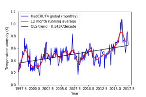 However, if you look at the figure on the right (which shows both periods on the same graph) it’s clear that there has been warming, and if you use the Skeptical Science Trend Calculator, it is statistically significant (i.e., it is almost certainly not 0). Furthermore, HadCRUT4 shows less warming than all the other surface temperature datasets (it suffers from coverage bias). Berkeley Earth, GISTEMP, and HadCRUT4 with kriging all show warming of around 0.18K/decade, while NOAA suggests around 0.17K/decade. So, it’s clear that even though surface warming may have been slower than was expected over the last decade or so, there is still a long-term warming trend and there is no real indication that it is slowing overall.
This whole the pause may not be over argument is extremely disingenuous. If we continue to pump CO2 into the atmosphere, it will continue to accumulate. If the surface doesn’t warm, or warms slowly, then we will build an increasing planetary energy imbalance. As the Ocean Heat Content indicates, the system continued to accrue energy even during the period when surface warming was slower than had been expected. The only way the system can return to energy equilibrium is through surface warming. The only way that it can be suggested that we may be returning to a pause/hiatus is by changing the start point of the trend estimation.
When it was clear that 2015/2016 were likely to be record warms years, many mocked organisations like the Global Warming Policy Foundation by suggesting that they will start to promote a narrative that there had been no warming since 2015/2016. Even I thought that this was so ridiculous that not even the Global Warming Policy Foundation would be silly enough to go ahead with such a strategy. Of course, nothing really surprises me anymore, so I should probably not be surprised that they are choosing this strategy, even though it is patently nonsensical. It’s almost as if they don’t even listen to their Academic Advisors. Hold on, maybe I have that the wrong way around?
Update:
As Magma points out in this comment, Whitehouse’s article claims that
for the past decade or so, although average global ocean temperatures have slightly increased, the oceans of the northern hemisphere and indeed most of the southern hemisphere have not warmed at all.

Credit: Wang et al. (2017)
The Figure on the right is from Wang et al. (2017) and shows Ocean Heat Content trends for the different oceans, for different time periods, and for different datasets. Although there are some differences between the different datasets (which is partly what the Wang et al. paper was addressing), they all show warming for the period 1998-2012.
Advertisements Share this:


![Heart of the Wolf by [Spear, Terry]](/ai/020/585/20585.jpg)