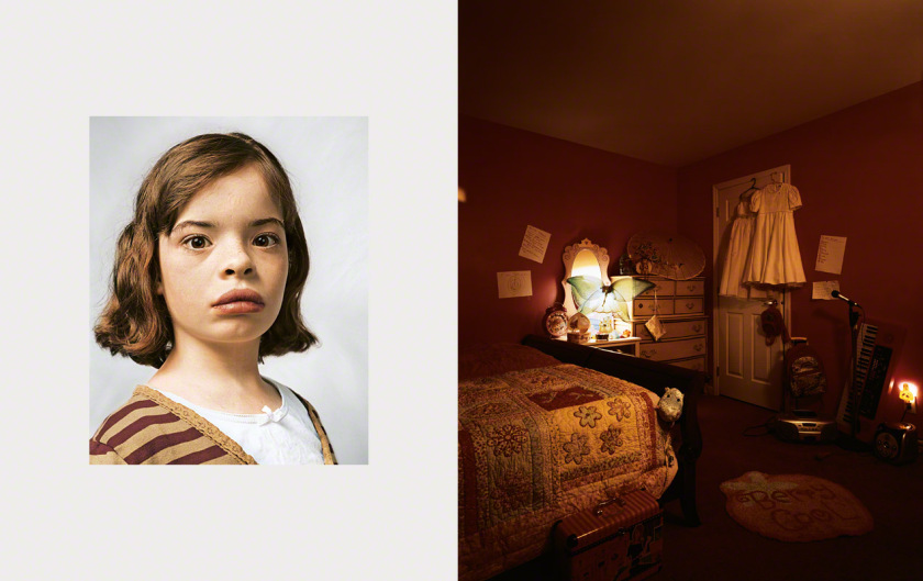
I’m not sure what’s more interesting tin the particular portrait: Delanie’s room on the right or the look of confusion on her face on the left. She looks like she just woke from a nap and wasn’t prepared for a picture. Her bedroom, on the other hand, is orderly and tidy to the point of looking bare. The dark lighting exaggerates this as well. The room is slightly stark and the few items seen look strewn around. Additionally, the room isn’t entirely in the photo and it looks like it was clearly taken at an angle, which makes the photo look off-kilter. But you can tell it still follows the rule of thirds. At first, everything appears off balanced and it’s easy to assume it’s uneven but it’s actually symmetrical. It’s easier to focus on the essential elements in the scene since the whole room isn’t in the photograph.
I had a lot of questions while I looked at Delanie’s room. Why is it so dark? Even if it’s nighttime, isn’t there a window? Why is it so clean? What nine-year-old is that tidy? Why is it so bare? Delanie doesn’t seem like she has a lot of belongings. And why was the picture taken at an angle? You can’t see the rest of the room which makes me wonder what else is there. But on the whole, it looks like the room that belongs to a little girl. Even though it’s dark, you can tell the walls are pink. There are white dresses hanging on the door, a nightlight on the wall, and a butterfly on top of a vanity. There’s also a piano next to the wall, a pink foot mat and a bedspread with flowers on it.
Delanie’s room contrasts heavily with the other photos in the photo essay. Not all of the children have rooms to call their own and obviously live in environments different from Delanie’s. Some of the photos were difficult to look at and it’s hard to imagine a child trying to fall asleep in some of the conditions they’re in. Mollison’s artwork beautifully captures these children’s lives for a moment in his photo essay, but it’s also easy to wonder what their lives are like outside that.
Advertisements Share this:


