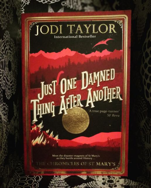
For this week’s Feature Cover Friday I’ve chosen Jodi Taylor’s Just One Damned Thing After Another.
I picked up this book at an event at Llandeilo Book Fair with Jodi Taylor and Jasper Fforde in conversation. It’s quite a striking cover; I like the simplistic colour theme yet there’s plenty of detail going on in there too. Not to mention there’s something about the font that I quite like, it feels like we’re about to go on a vintage adventure. I love the look of the series as a whole (I do like it when series stick to an overall theme but differ in colour, my copies of James Barclay’s Chronicles of the Raven and Legends of the Raven do a similar thing)
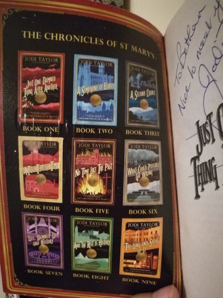
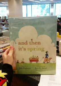
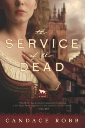
However during the panel, one of the topics discussed was covers; although she is quite satisfied with this one she’s had a great deal of difficulty with covers in the past, describing them as being far too busy. I thought this deserved a google…


She’s not wrong is she! You can see the progression of improvement, and it’s fascinating to see how a cover can evolve. Comparing the first cover to the edition I own, they appear to be two quite different books. There’s clearly quite an important science behind creating the right cover!
If you’re an author reading this, I’d love to hear your experiences with cover design; did you end up with a cover completely different to what you wanted? How stubborn are you when it comes to getting the design you want?
Advertisements Share this: