David McCandless turns complex data sets (like worldwide military spending, media buzz, Facebook status updates) into beautiful, simple diagrams that tease out unseen patterns and connections. Good design, he suggests, is the best way to navigate information glut with our eyes.
We need to design information that matters, shares patterns and tells stories. Information displayed or represented must have a purpose, otherwise failing this can only result of the visualisation being and looking visually appealing, with no meaning.
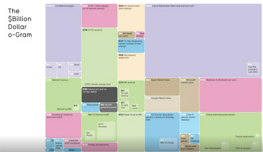 Ted X (2010). The Beauty of Data Visualisation. [video] Available at: https://www.ted.com/talks/david_mccandless_the_beauty_of_data_visualization [Accessed 17 Oct. 2017]. This is the Billon Dollar o-gram. David mentioned that there is too much going on within the context of this visualisation and the only way to understand it visually and relatively. The colours where interesting because they mean something. For example, purple is fighting and red is giving money away and green is profiteering.
David refers to a phrase which he hears all the time which is “Data is the new oil”. Data is kind of ubiquitous resource resource that we can shape to provide new innovations and insights. However, David has altered this metaphor to “Data is the new soil”. Data visualisation, info graphics and visualisation feel like this flower blooming.
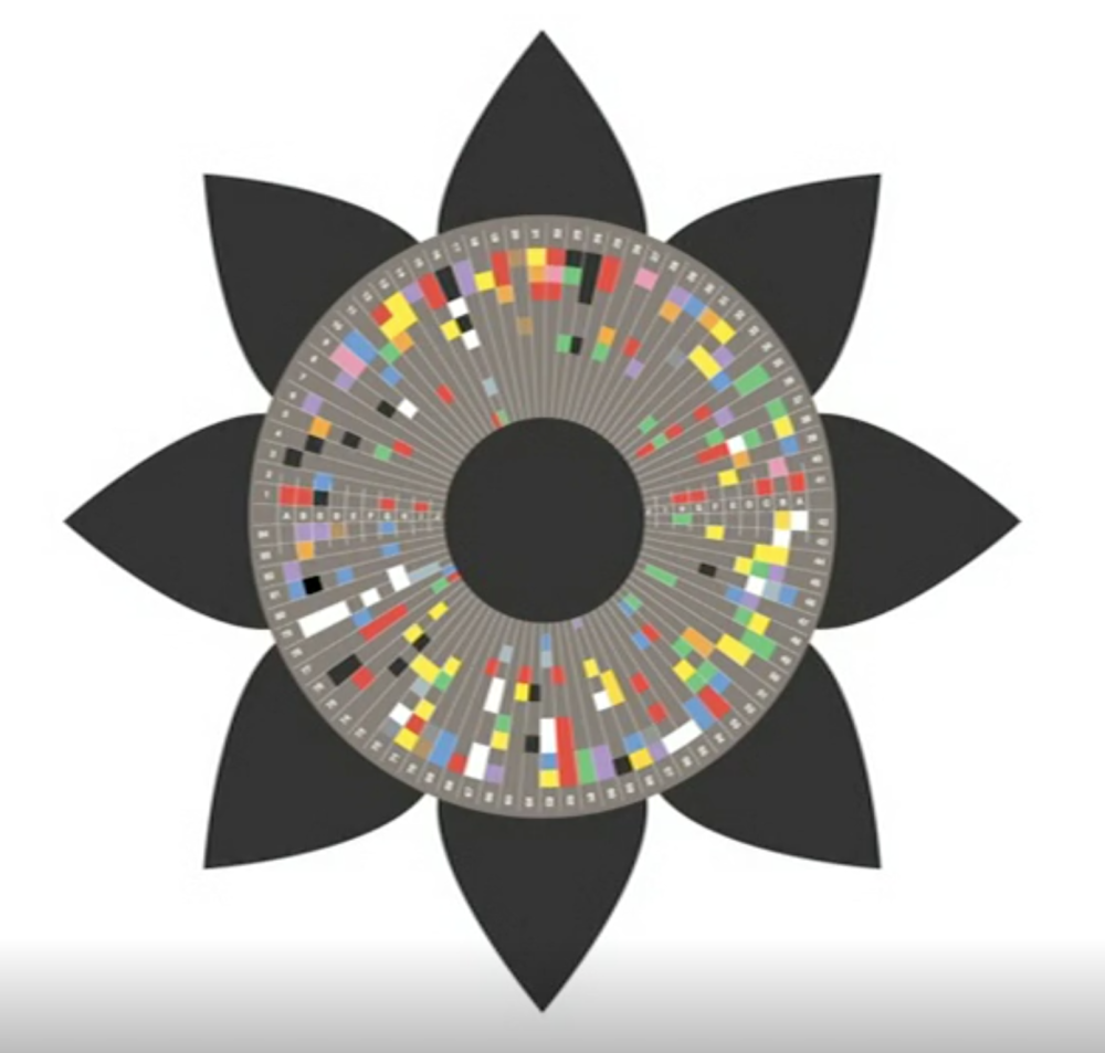 Ted X (2010). The Beauty of Data Visualisation. [video] Available at: https://www.ted.com/talks/david_mccandless_the_beauty_of_data_visualization [Accessed 17 Oct. 2017].If you look and it closely it is just numbers and facts but if you can alter, manipulate certain elements, it starts to reveal patterns and shapes.
Summary of the main points:
- David mentioned that Good design is the best way to navigate information glut and to take this approach on with our eyes.
- Designers need to design information that matters, shares patterns and tells stories. The information that is displayed or represented to a particular targeted audience, must have a purpose, otherwise failing to do so, could end up with the visualisation looking visually appealing, but with no meaning or message behind.
- Data is kind of ubiquitous resource resource that we can shape to provide new innovations and insights.
Reflection:
The most important aspect of this lecture pod was that data visualisation needs to tell a story, give the viewer an understanding and to alter perceptions about a particular context, in either positive or negatives terms. Failing to do so, can just end up leaving the data set looking visually appealing, but have to meaning and or message related to it.
Advertisements Share this: