In this post, I will reflect on representations of time in graphic narratives. In particular, I will focus on Art Spiegelman’s ‘Maus’ (2003) and Richard McGuire’s ‘Here’ (2014).
I choose these graphic narratives due to the way they intertwine time; the past and present in single comic pages. There is also a connection between the authors; Spiegelman published McGuire’s original 6-page strip of ‘Here’ in his comics anthology magazine RAW in 1989.
Maus (2003) Maus is a graphic novel by American cartoonist Art Spiegelman. It depicts the experiences of Art Spiegelman’s father, Vladek, during World War II as a Polish Jew and Holocaust survivor.The book weaves between two timelines. In the narrative present, Spiegelman interviews Vladek in New York from 1978 to 1979. In the narrative past, Vladek’s tale unfolds from the mid-1930’s through to the end of the Holocaust in 1945. Representing Past and Present in Maus
In her article, “The Shadow of a Past”: history and graphic representation in Maus, Hilary Chute analyses how Maus represents history through the time and space of the comics page.
Chute (2006) examines Maus, P.12 of chapter 1 “The Sheik”, to illustrate Spiegelman’s representation of both past and present in a single comics page. She identifies the use of signifiers from both time periods to frame and contextualize the narrative.
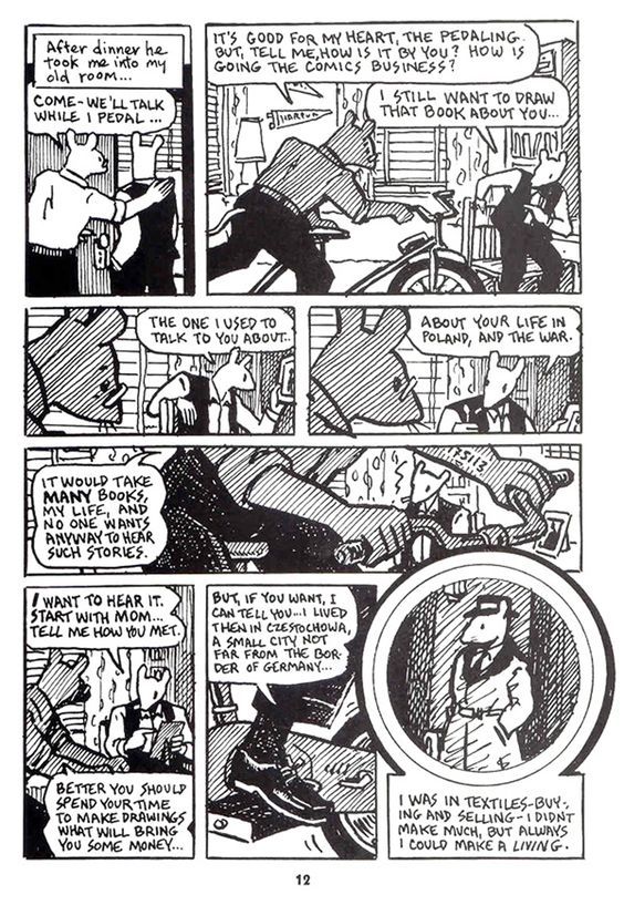 Fig.01: P.12 from Art Spiegelman’s Maus. The page contains signifiers of both the past and present such as tattoo’s, photographs and the characters themselves. The architecture of the page also represents the imposition of past over the present.
In the middle panel of P.12, we see a space that was once Artie Spiegelman’s bedroom, an old college pennant is seen still pinned to the wall, while his father, Vladek cycles in a stationary position on an exercise bike.
Vladek’s Auschwitz tattoo is visible on his left arm and his body frames Artie, a signifier of the present, who sits looking small in the distance. Vladek signifies the past, a past that dominates the narrative and the lives of those within the story, including Artie, who is overwhelmed by it.
To illustrate this dominance or overpowering of the past on these characters, Spiegelman plays with the scale of signifiers such as Vladek. Vladek doesn’t just take up this one panel while cycling but appears across the page. His head in panel four, torso in panel five and foot in panel seven illustrate that dominance and in turn the past. (ibid)
Another signifier of the past is a framed photo of Artie’s dead mother, Anja, which is placed on a desk to the right of both men. According to Chute (2006), this represents an object of desire and a rebuke. Artie is therefore surrounded by markers of the past, a past that both haunts and intrigues him. Chute continues
In a speech balloon on the left that echoes the photograph and tattoo on the right, as if the past-articulated (spoken), inscribed (tattooed), documented (photographed)-were flanking both men, closing in on them, Vladek proclaims: “It would take many books, my life, and no one wants anyway to hear such stories” (12). (Chute, 2006)
Chute (2006) identifies another representation of the past imposing on the present in the form of the iris diaphragm of the final panel. Within the panel, we see a young Vladek from the early 1930’s but the panel is more than a framing device. It pushes up and overlaps the middle rectangle panel of the present, hitting the handlebars of the exercise bike. It can be read as the wheel of the bike, and we the reader enter the past for the first time through this wheel. It is a visual intersection of past and present illustrated through the architecture of the page.
The following video essay, by NerdWriter1, provides a closer look at how Art Spiegelman designed this page in his graphic novel Maus (2005).
Here (2014) Here (2014) is a graphic novel based on Richard McGuire’s original comic strip of the same name, published by Art Spiegelman in RAW magazine in 1989. The original strip collapsed time and space to tell the story of the corner of a room and its inhabitants between 500,957,406,073 BC and 2033 AD. The graphic novel expands on the concept, reimagined in full colour, with 280-pages instead of six.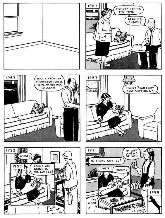 Fig.02: “Here” (1989) page 1 of the original 6-page comic strip published in Art Spiegelman’s RAW Volume 2 #1.
Representing Past and Present in Here
Here is a groundbreaking experiment with the formal properties of comics. The original strip had a profound influence on the work of Chris Ware. In his review of ‘Here’ (2014) for The Guardian newspaper, Ware stated
“Here” blew apart the confines of graphic narrative and expanded its universe in one incendiary flash, introducing a new dimension to visual narrative that radically departed from the traditional up-down and left-right reading of comic strips. And the structure was organic, nodding not only to the medium’s past but also hinting at its future. (Ware, 2014)
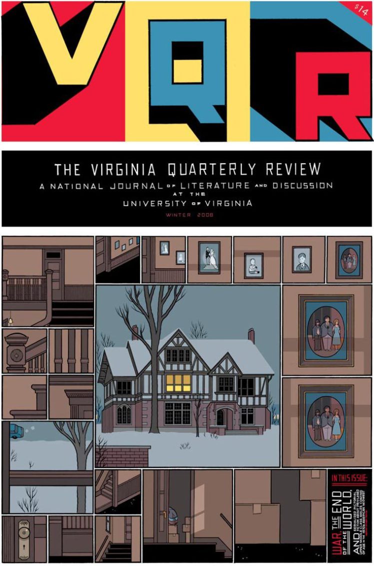 Fig03: The Virginia Quarterly Review; Winter 2008; By Chris Ware
An example of Chris Ware riffing on the concepts from the original ‘Here’ (1989). A comic strip about a space.
In Maus (2003), we saw the importance of time regarding the narrative and plot. Spiegelman used signifiers of the past and present and the interplay of these elements to enrich the meaning and storytelling. But what if you have no plot?
Richard McGuire’s ‘Here’ (2014) is one such example. It has no internal plot but instead tells the history of a space. Although McGuire describes it as a fiction, Laura Monicion (2017) argues in her article, TIME FRAMES: Graphic Narrative and Historiography in Richard McGuire’s Here, that there is a historical and biographical element to the work. She cites that the room in the book is Richard McGuire’s parents sitting room and in its first pages, a panel shows a crib in 1957, the year of McGuire’s birth.
Without a linear narrative, recognizable plot or cast of characters, the book’s consistency comes from its use and subversion of visual conventions of graphic narrative. Here is composed of overlapping dated panels that represent a historical moment juxtaposed with other panels from different times but in the same space. There are some sequences that may run over a few pages but Here requires the reader to organize and interpret the graphic narrative themselves. (Monicion, 2017)
Let’s take a look at an example, a two-page spread from the work.
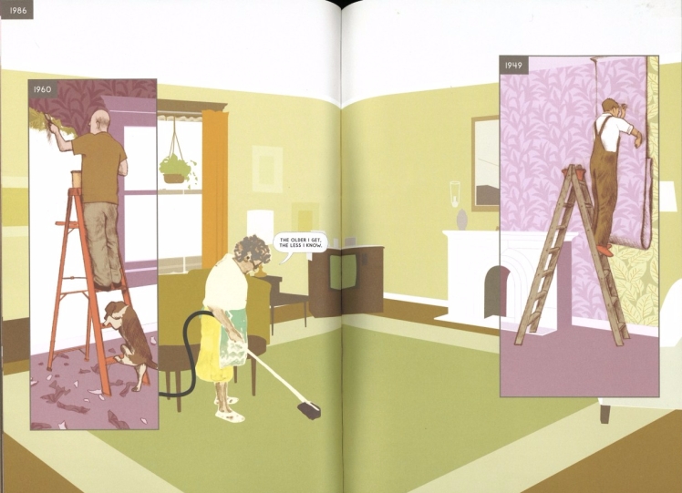 Fig.04: Here (2014) P. 55-56 – These panels show three mundane activities; however when they are put together, the juxtaposition suggests a frivolousness and emptiness to daily human endeavor
On pages 55 of Here (2014), we see a man in 1960 removing two layers of wallpaper and on the opposite page, we see another man in 1949 covering existing wallpaper. The full-page panel shows an old woman cleaning in 1986. Monicion (2017) notes that these panels, in isolation, illustrate mundane activities but juxtaposed, suggest a futility to human activity.
However, she admits that this is only one reading and another would be to contrast the inevitable loss and decay of the left-hand side panel with the optimistic endeavor of the right. The iteration of mundane human activity is a major theme of Here (2014).
A short film based on Richard McGuire’s original ‘Here’ comic strip, produced in 1991, by Tim Masick and Bill Trainor for their senior thesis project. ConclusionIn conclusion, Maus (2003) and Here (2014) illustrate two different methods of how graphic novels can represent the interplay of time, both past, and present. Maus with its use of comics grammar, page design, and signifiers illustrates an intertwined past and present within a graphic narrative. Here abandons linear narrative and subverts the conventions of comics grammar to present the story of a space through time. For me, both approaches are valid.
In researching my keyword; nonlinear, I have discovered comics formalists such as Spiegelman, Ware, and McGuire. Those who push the boundaries of the medium through innovation and subversion of the form. It has inspired me to explore a form-based approach rather than a classicist, animist or iconoclast based one, for now. (McCloud, 232)
FiguresSpiegelman, A. (2003). The Complete Maus. London: Penguin Books, p.12.
McGuire, R. (1989). Richard McGuire Here, P.1, originally published in RAW Vol 2 #1.
Ware, C. (2012). The Virginia Quarterly Review; Winter 2008 By: Chris Ware. [image] Available at: http://in-sequence.tumblr.com/post/19703708251/the-virginia-quarterly-review-winter-2008-by [Accessed 11 Dec. 2017].
McGuire, R. (2016). Here (2014) P. 55-56. [image] Available at: http://bibliobs.nouvelobs.com/galeries-photos/actualites/20150204.OBS1693/ici-de-richard-mcguire-le-meme-lieu-a-10-moments-differents.html [Accessed 11 Dec. 2017].
References
Chute, H. (2006). “The Shadow of a past Time”: History and Graphic Representation in “Maus.” Twentieth Century Literature, [online] 52(2), pp.199-230.
En.wikipedia.org. (2017). Maus. [online] Available at: https://en.wikipedia.org/wiki/Maus [Accessed 10 Dec. 2017].
Nerdwriter1 (2017). Maus – How To Design A Comic Book Page. Available at: https://www.youtube.com/watch?time_continue=333&v=1dQEfL2BfUM [Accessed 10 Dec. 2017].
Ware, C. (2014). Chris Ware on Here by Richard McGuire – a game-changing graphic novel. The Guardian. [online] Available at: https://www.theguardian.com/books/2014/dec/17/chris-ware-here-richard-mcguire-review-graphic-novel [Accessed 7 Dec. 2017].
Moncion, L. (2017). “Time Frames: Graphic Narrative And Historiography In Richard Mcguire’s Here”. Imaginations, [online] 7(2), pp.198 – 213.
En.wikipedia.org. (2017). Here (comics). [online] Available at: https://en.wikipedia.org/wiki/Here_(comics) [Accessed 10 Dec. 2017].
Trainor, B. and Masick, T. (2007). A short film based on the comic strip “Here” by Richard McGuire, RAW Comics V2 #1.. Available at: https://www.youtube.com/watch?v=57hR44mB5u0 [Accessed 10 Dec. 2017].
McCloud, S. (2006). Making comics. 1st ed. New York: Harper, p.232.
Advertisements Share this:


