Pride & Prejudice is, deservedly, famous. It’s my favorite of the three Jane Austen novels I’ve read, but it doesn’t seem to work well in adaptation. It’s long, it’s detailed, it’s subtle. I do love Colin Firth as Mr. Darcy, but I have no particular attachment to other elements of the movies/miniseries/zombifications/etc. I found two separate graphic novel versions on a list of recommendations, though, so I thought I’d give them a try.
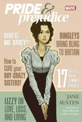 The first, a 2009 release from a line called Marvel Adaptations, is real bad. I liked the softness of the cover art and its styling as an old-fashioned ladies’ magazine, that was one of the main reasons I wanted to read it in the first place, but the cover artist (Sonny Liew) and interior artist (Hugo Petrus) are entirely different. The inside makes all the women look like 2000s TV stars with contouring and brows and glossy lipstick. It’s completely out of place for the time, plus the art is just not good, with dubious facial expressions and cropping that makes you feel hemmed in all the time. I liked how they used reaction shots to help establish what’s meant to be silly (like Mr. Collins), but that’s about all.
Unfortunately the writing/editing by Nancy Butler isn’t very good either, it tries to cram in too many details and would’ve done better to just leave some stuff out entirely. Leave it for when they fall in love with the story and go on to read the full novel, ya ain’t got space for all this! Plus it makes the context even more confusing for a modern reader since it there’s no room for explanation, and the initial reasons Elizabeth and Mr. Darcy dislike each other are super vague, which makes the whole book nonsensical.
 But there’s good news! The next adaptation, a version from Campfire Graphic Novels published in 2013, is way better! The art by Rajesh Nagulakonda is much better, creative and pleasant to look at, more interested in mood and color and conveying a scene. (Again, the cover artist is different). The writing/editing by Laurence Sach is also much more successful, simplifying the details and highlighting the essential plot points so you always know what’s happening. The romantic pacing is much better, and the characters come through more clearly because he doesn’t worry so much about the bit parts. Basically, this version fixes all the problems of the earlier one.
There’s not much to recommend that first one, but the Campfire version is worth a read if you’re a fan. It would also be great as a recommendation for younger readers or students who may be daunted by the full novel. You can still appreciate the story and wit as well as the art for its own sake, and being familiar with a plot can really help you make it through a classic if you’re struggling!
Advertisements Share this: