This deck has been on my radar for a while. A couple of weeks ago, I had family in town, and my mother and I went to see Cyrano de Bergerac at the Metropolitan Opera. (Lincoln Center is one of my favorite places in New York.) We arrived ridiculously early, because the only dinner reservation we were able to get was at 5:00 PM, so we went to kill time in the gift shop.
Lo and behold, the gift shop at the Metropolitan Opera sells Tarot decks.
They only sell two or three decks, but one of them was Kat Black’s Golden Tarot. Somehow, it ended up coming home with me.
I’m really excited about this deck, you guys. For anyone who doesn’t know, the Golden Tarot is a digital collage art deck adapted from late Medieval and early Renaissance works of art. The deck creator went through source images from Western art and digitally altered them to create a complete Tarot deck, and the result is absolutely breathtaking.
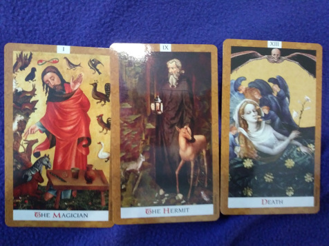 The Magician, the Hermit, and Death.
The deck comes in a sturdier box than you usually see from US Games. The LWB is small, and most of its material is pretty standard–a couple of spreads, basic card meanings, etc. But it also comes with an introduction from Kat Black and a discussion of the source images used in the deck, and the LWB is worth reading for that material alone.
The cards themselves are a sturdy, stiff stock. Plus, they have gilded edges. Anyone who has read my other reviews knows that I am a complete sucker for decks with metallic edges: the Tarot Illuminati,* the Fountain Tarot, and the Prisma Visions Tarot are among my favorite reading decks.
So right off the bat, I liked this deck. The card images themselves are absolutely delightful. I’m not a huge fan of medieval art,** but it really fits with the feeling of this deck. Part of the purpose of the deck, as explained in the LWB, is “a celebration of tarot’s [sic] heritage”. It expresses the symbolism of Tarot using artworks from the time period when Tarot emerged; and even though I don’t have a personal taste for that kind of art, the choice of period totally works. It feels right to see Tarot images painted in the style of the late Medieval period.
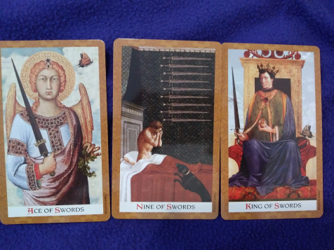 Ace, Nine, and King of Swords.
All of the Minor Arcana are clearly based on the RWS tradition, which makes this a fantastic deck for readers of all experience levels. Just looking at this deck, I can tell it’s going to read like a dream. The images are all digitally manipulated to make the source artworks more closely resemble the Rider-Waite tradition (e.g. by adding in swords/wands/cups/coins). Looking through the deck, I was genuinely and pleasantly surprised by how faithful it is to traditional Tarot imagery.
 Four, Six, and Queen of Wands.
I don’t have many art decks, and one of the primary reasons for that (aside from my general lack of budget to buy ALL OF THE THINGS) is that I always worry I won’t be able to read effectively with a deck if I don’t know the source art well. For example, the Golden Tarot of Klimt is beautiful, but I don’t know Gustav Klimt’s artwork all that well. I worry that I won’t be able to read with that deck to its full potential, because I’ll be missing out on the context of what the original paintings are.
With this deck, though, I really don’t feel that worry. The cards speak for themselves. Part of this, perhaps, is because of the nature of late Medieval art: most of it was religious and didactic, and the concept of the Artist as the source of meaning in a work hadn’t yet emerged. An icon was what it was because it represented the Madonna and child, and not because it was made by a specific artist.*** I have a basic enough understanding of Christian iconography to tell when a thing is Jesus versus Mary versus Francis of Assisi, and that basic level of knowledge is really all I need. Plus, these cards are so close to the RWS that I honestly have trouble remembering that they’re taken from non-Tarot source images.
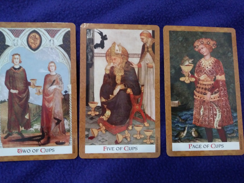 Two, Five, and Page of Cups.
This is a great deck. It might actually become one of my go-to reading decks for other people, because the imagery is clear, accessible, and super traditional without the artwork being boring. (I’m always hesitant to use any deck that veers too far from tradition when I’m reading for people other than myself. I’m of the mind that a Tarot deck should look and feel unambiguously like a Tarot deck.)
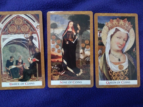 Three, Nine, and Queen of Coins.
The one downside to this deck is a perpetual problem with art decks, collage decks, and any deck that relies too much on digital image manipulation. The fact of the matter is, these source images are not originally Tarot cards, and some of them had to be manipulated pretty severely to fit the Tarot tradition. Particularly with the addition of suit markers to the Minor Arcana, the photoshopping does show sometimes. On some cards, it looks a little forced, like the cups have just been glued onto the top of a preexisting image (which, in effect, they have).
Personally, I don’t find this egregious; there are only a couple of cards where it sticks out to me, and in many cases I had to remind myself that the images had been photoshopped at all. But it’s something that might turn off potential buyers, so I figured it would be worth mentioning.
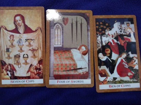 Seven of Cups, Four of Swords, and Ten of Coins.
That’s about all I have to say here. This deck is an absolute home run, and I recommend it without reservation to any Tarot reader or collector. It’s damn cool, it satisfies my compelling need for conformity to tradition, and it still manages to do something innovative. The cards themselves are lovely, and the artwork really makes sense for a Tarot deck, even if the source images are the sorts of things that I wouldn’t spend much time with on a visit to an art museum. I expect the Golden Tarot is going to become a fast favorite in my collection.
*No review of this one; I acquired it before I started this blog. I know this deck gets a lot of hate because its colors are hypersaturated and the cards are all cluttered with imagery, but I love it and I find it reads beautifully.
**I’m generally uninterested in art before the development of linear perspective.
***Roland Barthes is orgasming in his grave right now.
Advertisements Share this: