A Tourist From America, is a chapter from the book ‘Londoners: Londoners: The Days and Nights of London as Told by Those Who Love It, Hate It, Live It, Long for It, Have Left It and Everything Inbetween’ written by Craig Taylor.
Ryah and I were given this chapter, and firstly we read it a few times and then began to write some notes on what pieces we could use to put in our trailer. We picked out key points such as the landmarks he visits and what he does in London. We struggled with the decision of whether to make the trailer serious, or comedic and we decided to go down the comedy route as that would be far easier than having a car bomb explode in the middle of London.
Together we storyboarded, wrote the script, which ended up only being a couple of lines as we only had our actor speak twice at the very beginning and middle of the trailer. Finding an actor was difficult as we preferably wanted someone who had an American accent already and who was willing to make a fool out of themselves on camera and in public. However, we had people who were up to it, then when it came down to speaking to strangers in a different accent, or getting on a bus and trying to pay with dollars, people felt as though they would be embarrassing themselves and dropped out. This left us in an awkward position as we needed an actor as we had two weeks left to film and edit our trailer. As you can see by our storyboard we had changed a few things by the end of the production, we hadn’t used much of the scripted words. We had added in a few more scenes such as the train station, and rearranged the order of the lion at Trafalgar Square and the beefeater who was actually on a horse. Luckily enough when we were filming, Sam had slipped off the back when trying to climb down from the lion and we were able to use the footage to make the trailer funnier.
Whilst filming, we both took it upon ourselves to each take turns in filming separate parts so we were both able to be included in the production. I filmed Sam (our actor) coming out of the airport which had become a challenge as we sneakily had to film very quickly as we had security coming up to ask us what we were doing and to stop filming. I had to discreetly hold the camera in front of my body, and lower down to cover it slightly whilst keeping it steady and in focus, luckily the first shot was all we needed. The two other clips at the airport were slightly easier as they were out of the way, but had to also be done discreetly and as quickly as possible. As it was our first day shooting and we were in a hurry to get out of the airport, we soon realised we had forgotten to turn on the mic, so no sound had been recorded. We overcome this mistake by replacing some clips with the backing track and then with the trolleys we were able to record a voiceover from Sam saying “goddam cart” to use over the footage.
We filmed at multiple landmarks, one being at the London Eye, however because it was an extremely touristy area, when filming Sam was lost in a sea of people, or if we were too close to him you would be able to see that he was in front of the London Eye, which was key for the joke to be made.
Using the GoPro was easy, and worked out extremely well for the bus scene as if we were to get on with a camera it would be too obvious that it was a joke, but with the GoPro it was subtle and believable. The main problem we came into was with the camera battery dying on us mid-shoot, we did not realise that CLR don’t charge the batteries prior to us using them and ended up having to film on our phones for parts of the trailer.
In post-production, we had split it up into segments, Ryah did the first part at the station, decided whether to use the woman or the man, and correctly chose the man because he had better conversation and was also the one who was in focus. When I edited my parts I had to unlink the sound to the footage and delete that, then input the sound which was recorded on the mic which was hooked up to Sam when he was at a distance. Some of it wasn’t needed because we had found a backing track to go over the top of the trailer.
Also I used after effects to create the British and America flag combined, it took time, however I was able to effectively make the flag wave. I had to use fractal noise, to create the illusion of the flag moving, having to resize, tilt and brighten and darken areas in which to make it seem the flag is actually moving. Originally we had the title as “A Tourist From America”, therefore I used Illustrator to create the title and used a font called ‘prisma’ which was a multi-line font and I individual selected each line to match the book cover which symbolised the different tube lines. However, once speaking with my tutors, they recommended to change the title to “An American In London” which I then had to go back and change the lettering and the colouring.
Furthermore, I also used after effects to create the title of the book to link the book and the trailer together. I had the each individual colours and words, to look like the book front cover and then have the come in from the outside inwards to for the book as a whole as though they’re actually tube lines pulling into the station.
We positioned the music to start right after the man had stop speaking and just before the next clip of Sam walking out of the airport had started. We had it gradually rise in volume as it would go from being someone talking to a very upbeat soundtrack. We also used pictures from the day as Sam being a real tourist, and we inserted them right after the clips shown where the photographs had been taken to enforce punctuation of the trailer. So there isn’t too much happening in the space of 1 minute, it gives people time to process what is going on, and ideally what the tourist is actually doing.
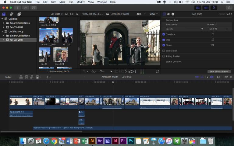
After editing the trailer, we had honestly forgotten all about the website, we had less than 48 hours to be able to produce a website. Ryah did the first half of the website and then I did the second half and in turn we both helped each other giving ideas of how to use it. The most important thing was to remember spacing and guidelines as that is key to make it look perfect. Next time we need to remember simplicity in a website, because at first we had everything clustered in together to make sure we had everything visible not the page. At first we had the banner as black, the font was white / blue and the background was a light grey. We then decided to try and link it to the book and have the banner as the colours of the book, changing the font to white only and making it bolder.
Advertisements Share this:
