by Taylor Anderson
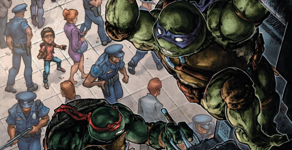
This article contains SPOILERS! If you haven’t read the issue, proceed at your own risk.

Chances are, if you’ve ever shown an interest in comics or graphic novels, you’ve come across Chris Ware’s work. In some ways, it could be argued that he’s America’s most well-known comic artist, given his widespread acclaim and the fact that his work frequently shows up in places like the New Yorker. However, one place I’d never expect to see his work is in a Teenage Mustant Ninja Turtles issue, but lo and behold: issue 18 of TMNT Universe.
So wait, you might be saying, did Chris Ware actually do the artwork for this issue? Well, no, that was all a ruse to get you to read this article. Yet, while he didn’t do the artwork here, what the real artist Tyler Boss did does look strikingly like Ware’s work. But before discussing that, just to cover our bases, know that this issue is about the turtles getting stuck in an old building that has been repurposed as a fallout shelter for New Yorkers to escape the Triceraton invasion. The turtles struggle with getting out of the building undetected and evading a couple of kids hell bent on finding the “monsters” lurking within the shelter.
As the turtles try to escape, they go through several plans, all of which fail for various reasons. This is where Boss’s imitation of Ware is so useful and successful. In various panels Boss uses a cutaway image of the building, similar to Ware, to show what’s happening to the turtles inside it, like in the panel below.
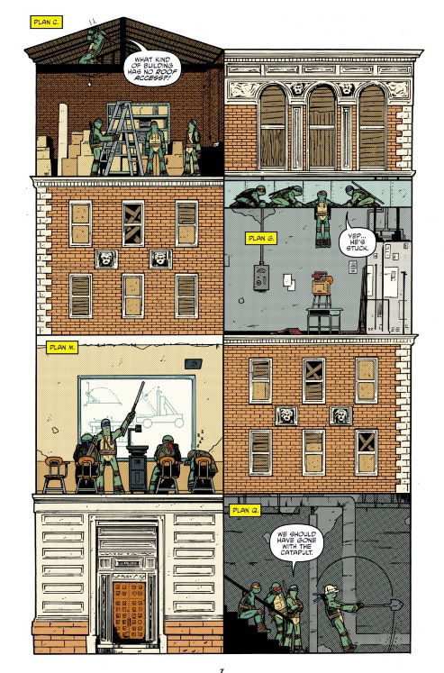
Each room in this panel depicts a different plan tried by the turtles and a different moment in time. The clever thing about this is that the different rooms effectively act as different panels which make up a larger picture at the same time.
While this is appealing on an aesthetic level it also enriches the tone of the issue as well. Ware’s work is best described as being simple, clean, and somewhat two-dimensional. For Ware, this symbolic style of artwork helps create a tension in his work, for the plots of his stories are usually full of angst and depression. This tone is offset by the style of his artwork which you might expect to see gracing the pages of more lighthearted fare. In this issue, Boss fulfills those expectations and the result is artwork that perfectly matches the playful tone of writer Paul Allor. This issue is meant to be fun and funny and Boss’s art helps to convey that idea very well through his use of bright, clean colors, simplified design, and fun cutaway imagery.

The conversation doesn’t stop there. What do you wanna talk about from this issue?
Advertisements Share this: