I like judging things. So I decided to go to my Goodreads read shelf, set it on random and then judging the covers of the first n books. Until I get bored, basically. I’m going to rate each cover out of 5 stars and I will divide the rating in two: 2.5 stars for aesthetic and 2.5 stars for relevance to the book.
1. Tunnels by Roderick Gordon and Bryan Williams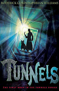
I think this is a pretty good cover. It’s got pretty colours, an interesting font and it tells you something about the book. Based on this cover, you know that the characters go in some kind of tunnel, underground place and there are ominous looking guys with vicious dogs chasing them. Which gives you an idea about what to expect. All in all, thi book gets 2 stars for aesthetic and 2 for relevance, a total of 4/5 stars.
2. The Fault in Our Stars by John Green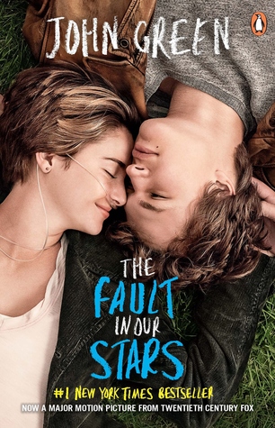
I own this movie tie-in edition of the book, which as far as movie tie-in editions go, is not hideous. I’m not really a fan of movie-tie ins because they usually have faces on them and faces on book covers just… don’t work that well. But I don’t hate this one. I like the colour scheme and it gives you a decent idea of what the book is about and it’s also not overly dramatic, as book covers with faces on them tend to be. I would say it 1.5 stars for relevance and 1 star for aesthetic, a total of 2.5/5.
3. The Maze Runner by James Dashner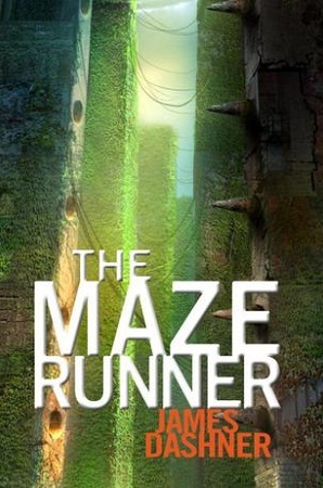
I’m not a fan of this cover. The first thing I think of when I see it is jungle. It kind of gives me an Indiana Jones, lost treasure vibe and that’s just completely out of the scope of the book. If you’ve read the book and you pay attention, then you get the cover, but if you haven’t read the book, it doesn’t really tell you much about it, especially at first glance. I’m also not a fan of the font and that orange is the final nail in the coffin. It gets 1.5 stars for relevance, and 0.5 for aesthetic, with a total of 2/5 stars.
4. The Diabolic by S.J. Kincaid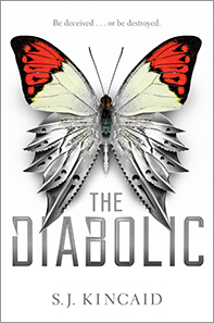
Ok… what even is this cover? I mean, it’s pretty, I’ll give it that. It’s actually really pretty. I’m happy to give it the full 2.5 stars for that. But… what does that have to do with the book? Is it a book about evil cyborg butterflies? Or maybe about a sadistic bastard who likes torturing butterflies? Or maybe he has an army of cyborg butterflies that shred people with their knife wings? It just tells you nothing about the story. At least not about this story. You could argue that maybe the two halves of the butterfly represent the two girls, but you wouldn’t get that until after you’ve read the book. It does give off a sci-fi kind of vibe, so I’ll give it 0.5 for relevance because of that, with a total of 3/5 stars.
5. City of Fallen Angels by Cassandra Clare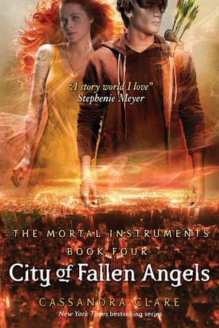
I’m usually not a fan of orange, but I don’t hate this one. I would like it better if it didn’t have the faces on there, but at least they’re not just pictures of people. I like the font a lot and the city landscape. You have the quiver there that tells you it’s got some warrior or hunter aspect to it, which is relevant to the story and the city landscape alongside the mystical looking swirly lights and glowy tattoos give you a good idea about the genre. I don’t think that Alec is necessarily the most relevant character to be on this cover, but it does give you an idea of the book. I’m going to give it 1.5 stars for aesthetic and 1.5 for relevance, with a total of 3/5 stars.
6. The Hobbit by J.R.R. Tolkien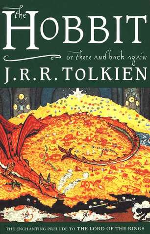
This is one of the editions of this book that I own, I do have another one as well, but I will rate this one. It has a nice, classic feel to it, it’s got a nice font with the alternate title included there as well, and I really like that forest green background. It also tells you quite a lot about the story, you have the dragon on top of its hoard of gold and a little silhouette there sneaking around trying to steal something, because why else would you sneak around in a dragon’s lair? I give this cover 2 stars for aesthetic and 2 for relevance, with a total of 4/5 stars.
Advertisements Share this:
