In order to please my employer (professor) on this project, I had to create a three-page original layout for a magazine using an article found on LDS.org. I was at liberty to determine the headings, take the photos, and design the layout.
Target Audience
For this project, my target audience was all genders, college aged (18) or above. I chose the article “Return and Receive” by M. Russell Ballard purposely, as to not only be meaningful for those of the LDS faith but also those who are of other faiths. This layout can appeal to my audience due to being an inviting, upbeat design. Colors were chosen to keep a “light” feel to the project and flowed throughout the piece.
Design Process
I started first by constructing sketches of different ideas for the layout, as seen below.
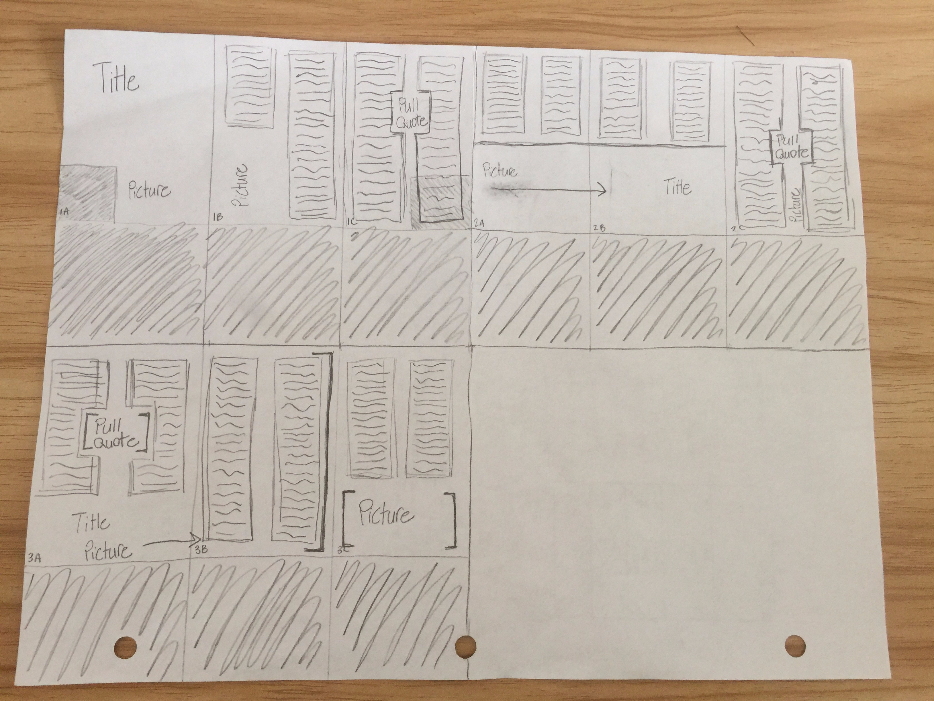
Once I opened InDesign and started to piece together a layout, I discovered which of my sketches I felt would go the best with the pictures I took to accompany the project (sketch 3). After my layout was completely done, I added in pictures, text, and color.
I started first by inserting my pictures. For my full spread, the background is a full-bleed picture. For my single page I simply just added my second picture between the two brackets I had designated earlier to highlight the picture. I then started to design my title. I knew the placement that I wanted for the title so it was simply a matter of finding fonts that I felt would go with the piece while also fitting where I wanted it to. I used two fonts to construct the title: Bouledoug (Decorative) and Aliens and Cows (Decorative). I then inserted my text using Minion Pro (Serif) as my font and by trial and error, decided on which size would fit best into my layout. Lastly, I reread my article and chose my pull quote. I then emphasized specific words in the quote using the font Bouledoug again, while the rest remained Minion Pro. I made sure that my typography was fun and inviting while also being contrasting from one another so that specific text could be emphasized.
Each design element I implemented into my layout was carefully placed and considered so that the message I wanted to convey to my audience was evident.
Design Draft
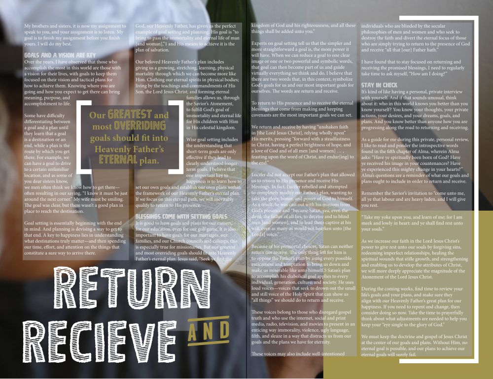

After receiving critiques from my peers, I changed a few elements of my design. It was pointed out that “Receive” was spelt wrong in my main title. This could have been a crucial mistake and I was glad to have a fresh pair of eyes notice before it was too late. I myself also noticed small spacing issues and quickly fixed those as well.
Final Design
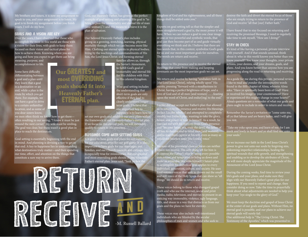
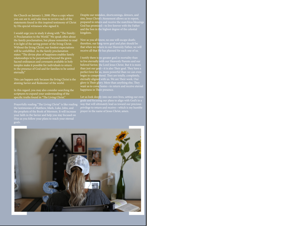
Overall, I am happy with the final design. Each element of the piece came together to construct what I had in mind and nicely unified the piece as a whole.
Photography Attribution
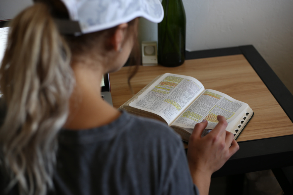
Photo taken by Tanner Hillier.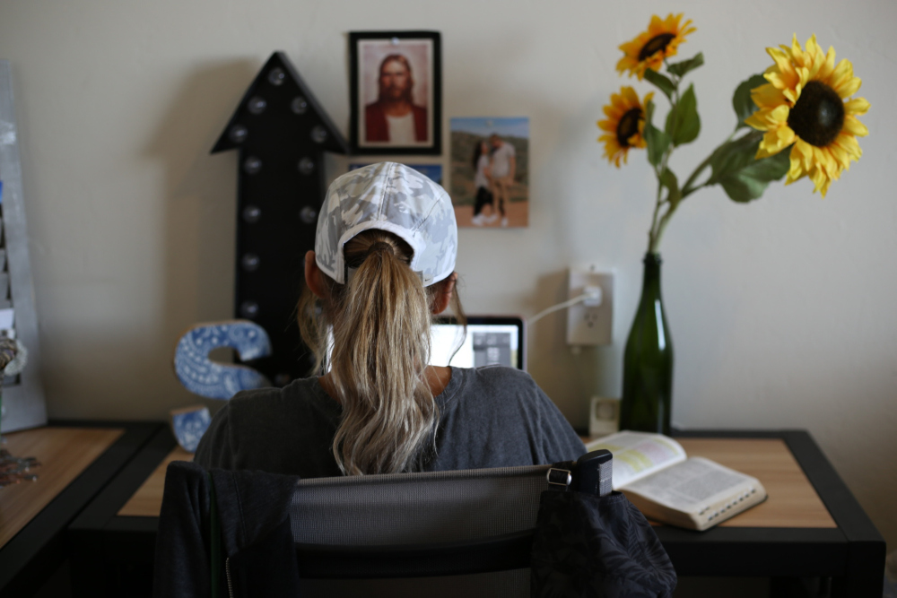
Photo taken by Tanner Hillier.
Advertisements Share this:

