If you’ve been anywhere near the internets recently you know that animated gifs are ubiquitous. Never one to miss a trend, I decided to make an animated gif – of a map of course. Actually, gifs can be a good way to show movement in maps and charts. Here are some nice examples and tips.
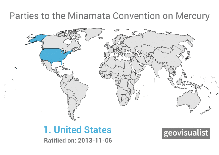
The animation shows which countries are Parties to the Minamata Convention. They appear in order of ratification.
The inspiration and method for this animation came from Alasdair Rae:
I finally did a 'how to make a geogif' blog post, just after the market has peaked, with 2017 US state populations used as the example. Read on if you want to see the method: https://t.co/WnQvWA6JPS #QGIS #geogif #maps #dataviz pic.twitter.com/5JGY3XmOBm
— Alasdair Rae (@undertheraedar) December 27, 2017
Alasdair wrote a useful tutorial on how to use QGIS to create amimated map “geogifs”. I’d been looking for an excuse to play around with QGIS (a free desktop GIS application) for a while. In general I found QGIS quite easy to use and feature-rich. My only complaint is not limited to QGIS but applies to all graphical user interface apps. While they are much easier to get started with, they lack the ability to create a reproducible workflow. If I had to make the map again from another dataset I’d have to remember and recreate all the pointing and clicking I did to make the first map. Whereas with something like R one could write a script and use it to reproduce future maps. But perhaps there are some features in QGIS that I am unaware of that could help with reproduciblity.
Data for the map came from my existing Minamata Convention map on CARTO. I exported the shapefile and used it to create the layers in QGIS. My approach differed a bit from Alasdair’s because in my map not all the polygons are highlighed, only the countries that have ratified.
Incidentally, I was not able to create this animation in CARTO because it only allows animation for points, and I needed to show polygons (country borders).
After exporting 84 frames I used gifmaker.me to make the gif rather than the GIMP or Photoshop. Worked just fine.
Advertisements Share this: