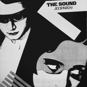
Wow I haven’t done one these in a while…anyway I looked back on old manga and anime and found that the art in them was much simpler than the art we have now. Its definitely more cartoon like and reminiscent of 1930s cartoons.
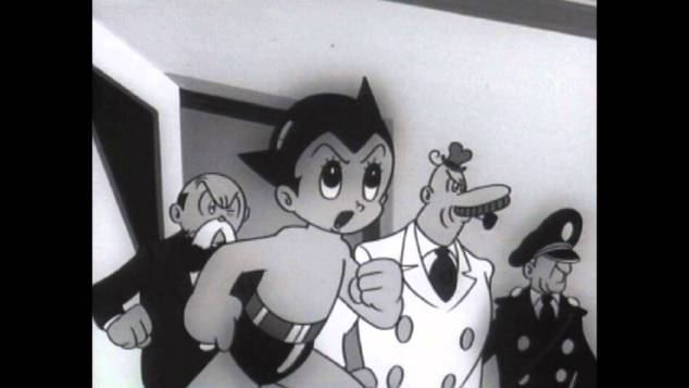
This is a screenshot from Astro boy.…in 1963. We can assume this was before manga got its signature style since the creator of Astro boy, Osamu Tezuka, is often credited for making the first “real” manga after World War II in 1947 titled “Shin Takarajima” or “New Treasure Island”
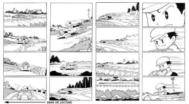
Funnily enough, Tezuka’s main sources of inspiration were Disney comics and movies. It’s said that he saw Bambi 80 times.
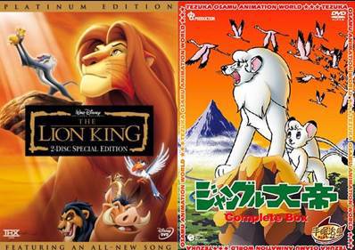
One interesting piece of trivia is that Tezuka made “Kimba the White Lion” (1965) and that no doubt served as inspiration for Disney to make the movie The Lion King (1994).
Anyway, in 1968 the manga “Judo Boy” had an art style that comes closer to what we’re familiar with.
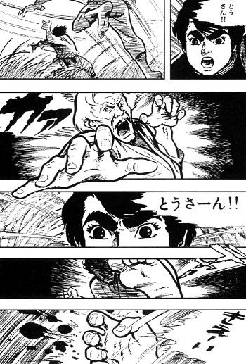
An art style similar to this is now the standard and I’ve always wondered why that is.
Personally I think the art style changed from cartoonish to a bit more sophisticated because manga artists wanted to differentiate themselves from all the cartoonish looking manga of the time. This art style also allows for more serious storytelling like we see above.
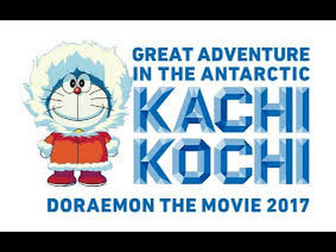
Will we ever see a return of this kind of art style or will it remain untouched by others and only used by long-running series such as Doraemon (1969), Sazae-san (1969) and with rare occasions like Crayon Shin-chan (1990).
But what do you guys think? Why did the art style shift indeed?
Advertisements Share this: